Soft autumn is the season most people misidentify, not because it's hard to see, but because "warm" and "muted" look like opposites until you understand they're two different dials. Warm autumn turns the warmth dial to 8 and the saturation dial to 7. Soft autumn turns the warmth dial to 6 and the saturation dial down to 3. Same family. Different volume.
The mis-typing that keeps showing up across every color-analysis community isn't about warmth. It's about saturation. Most Pinterest boards tagged "soft autumn" run 40% warm autumn palettes. That matters before you buy anything, because the soft autumn palette is a narrow band of medium-value, warm-undertone, desaturated hues that flatter one kind of coloring and drain most others. Camel instead of rust. Sage-olive instead of forest green. Dusty rose instead of terracotta. Warm colors with the air let out.
This guide walks through who soft autumn fits, the 24+ canonical hex codes that define the palette, the colors to avoid, and three celebrities who show up as soft autumn across every color-analysis community that publishes typed lists. If you've been told you're a warm autumn but keep feeling washed out in rust and cinnamon (and you've already dropped $300 on a cinnamon sweater that drains your face), you're probably in the wrong subtype. Here's how to tell.
Who soft autumn fits
Soft autumn coloring is warm, muted, and medium in value, which sounds vague until you check your hair, eyes, and skin against the three anchors of the 12-season system.
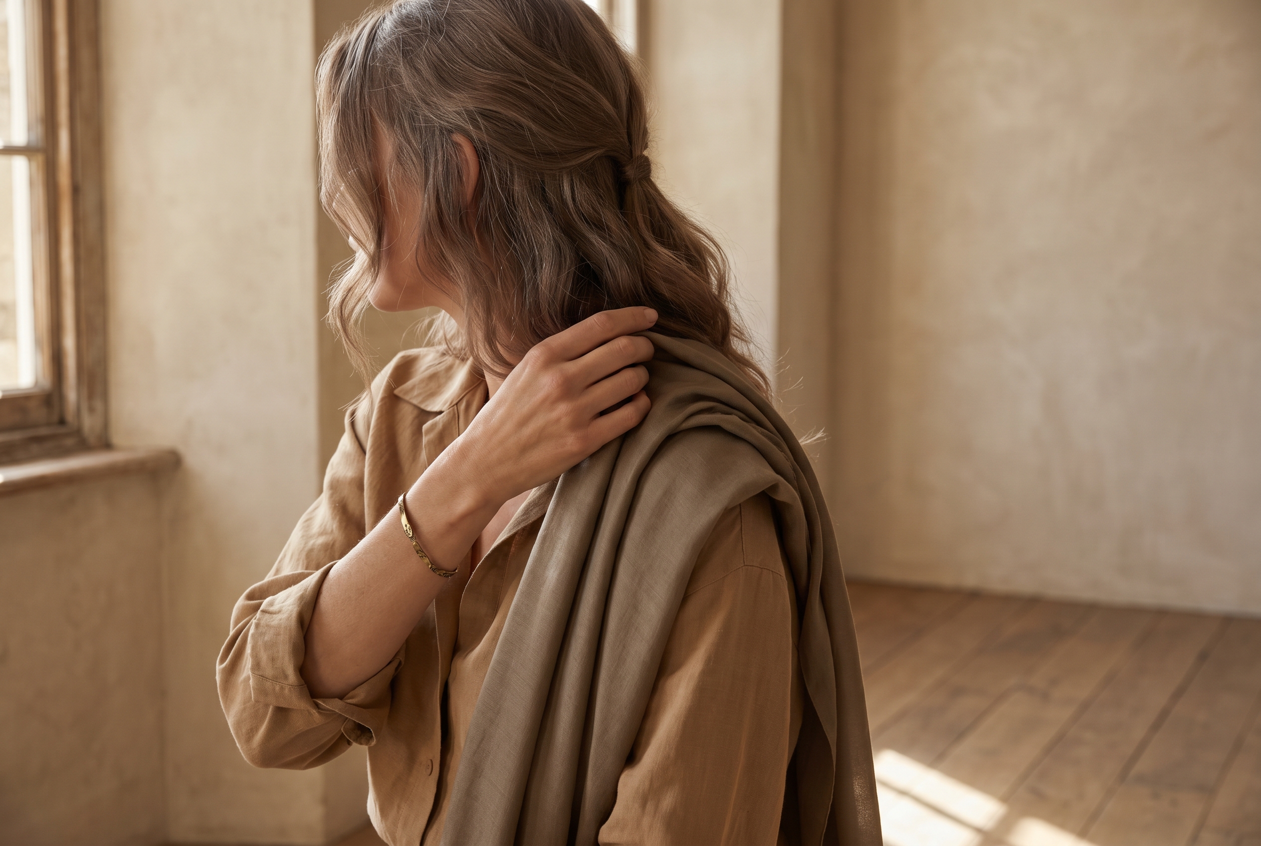
Hair. Soft autumns almost always have medium-to-dark hair with a warm undertone. Think mousey-warm, dusty brown, or ash-warm blonde. The hair isn't red or auburn the way true autumn's often is, and it isn't platinum or silver the way soft summer's can be. If you've ever been told your hair is "hard to describe" or "a weird in-between color," you might be a soft autumn. The muted warmth is the whole point.
Eyes. Hazel is the most common soft autumn eye color, but it's not the only one. Soft green, grayish-warm brown, and muted blue-green all fit. The giveaway is that the eye color looks softer up close than you'd expect: the saturation pulls back, even in bright light.
Skin. A soft autumn's skin has a warm undertone but not a bronze one. "Warm but delicate" is the descriptor most professional analysts use. You likely tan slowly, burn occasionally, and look best in gold jewelry rather than silver.
Contrast level. Low to medium. Hold a photo of yourself up against a high-contrast outfit (stark black next to stark white) and you'll notice the outfit looks louder than you do. Soft autumn's contrast is gentle across all three features, not dramatic.
If three of the four match, you're likely soft autumn. If two match and the other two skew warmer or deeper, you might be a warm autumn. If two match and the other two skew cooler, you're likely soft summer. The comparison section below covers these distinctions in detail.
The soft autumn color palette
Here's the full palette: 24 hex codes organized by role. Every color sits in the muted-warm zone, with saturation staying below 40%, value sitting in the medium range (roughly 55-75% lightness), and hue leaning warm.
How to read this palette
A 24-color hex grid is useful, but it's not a wardrobe yet. To turn it into one, the palette splits into three structural roles. Once you can name which role each color plays, the shopping decisions get faster.
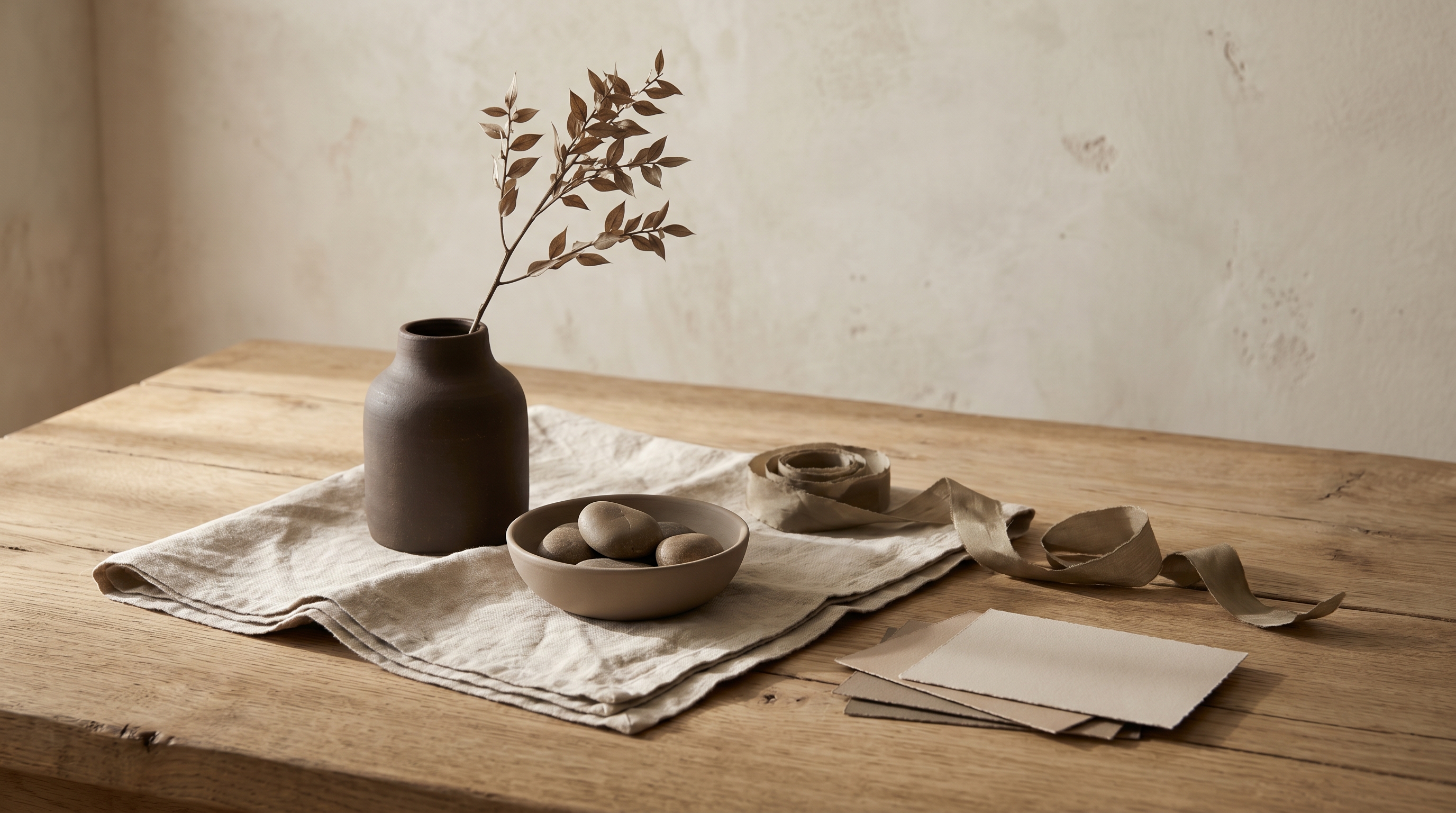
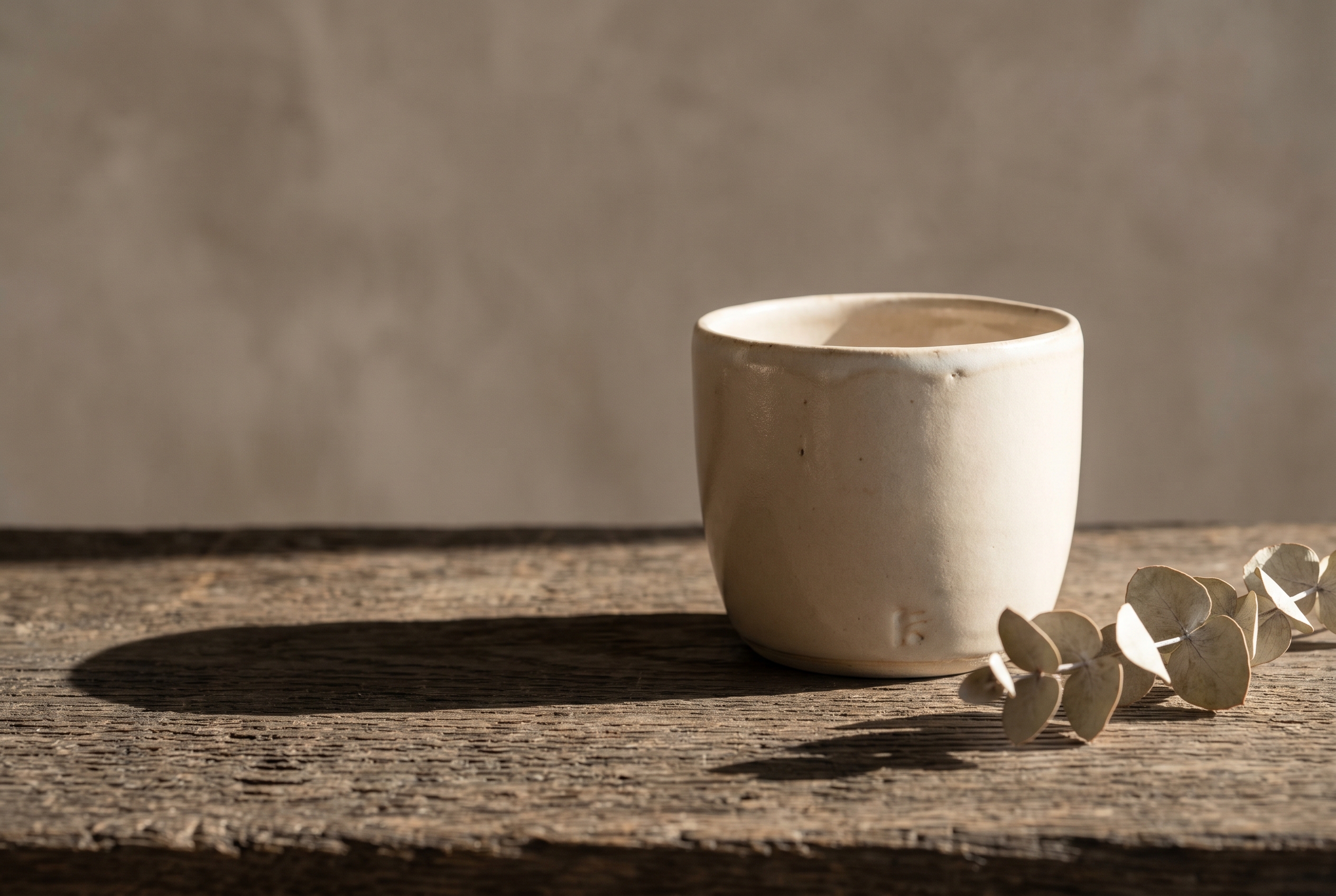
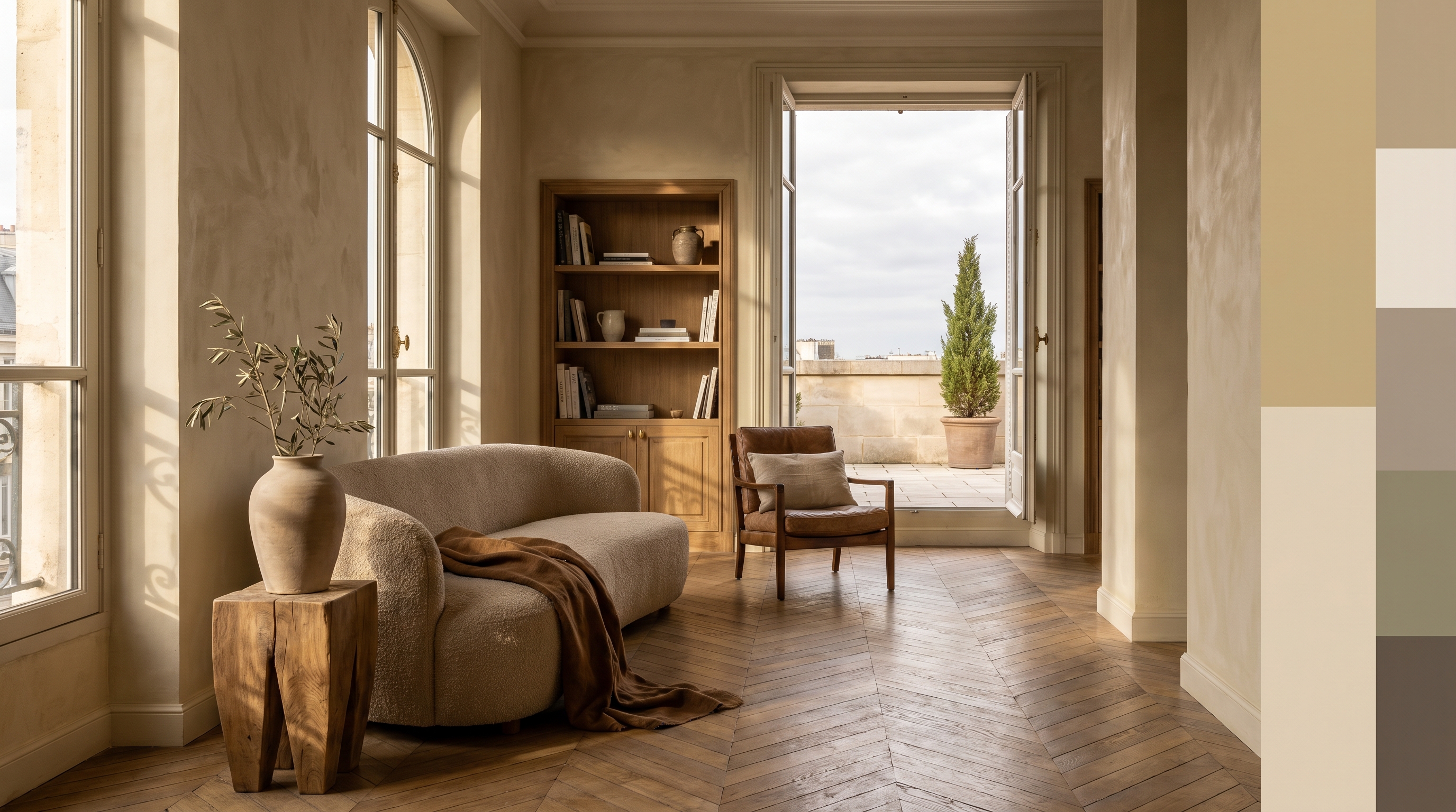
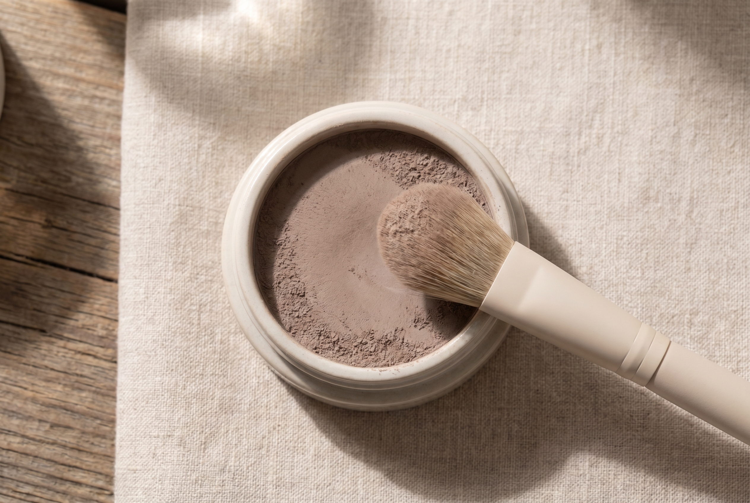
Anchors (the foundation, roughly 8 colors). Camels, warm creams, mushroom taupes, dusty khaki, soft brown. These are the colors you wear most days. Anchors should make up roughly 60% of a soft autumn wardrobe; they're the base layer everything else sits on top of.
Accents (the personality, roughly 12 colors). Sage-olive, dusty rose, burnished gold, soft teal, terracotta, deep soft moss. Accents are where a soft autumn wardrobe gets interesting without breaking the muted register. One accent piece per outfit is usually enough. Two if the values are close.
Grounds (the depth layer, roughly 4 colors). The deeper soft browns and dusky olives that sit underneath everything else. Grounds replace black in a soft autumn wardrobe. They're the shoe, the belt, the structured outer layer that creates depth without spiking contrast.
A useful test: try building a head-to-toe outfit using only anchors. If you can put something together that feels complete with no accents and no grounds, you're working inside the soft autumn band correctly. If you need a stark contrast to "rescue" the look, you've probably wandered into a different season's palette.
Every hex here would clash if placed next to a pure black. The colors want each other's company, not competition from saturation. Pair a camel with a dusty rose and the eye reads them as related. Pair the same camel with electric blue and the eye reads the blue and ignores the camel.
Neutrals for soft autumn
The neutrals are where most wardrobes live, so it's worth being precise. Soft autumn neutrals are warmer than summer's gray-based neutrals and softer than true autumn's deep espresso-and-charcoal range.
#B8A282· soft camel: the foundation. Pairs with every accent in the palette.
#E8DFD3· warm cream: the "white" of this season. Never use pure #FFFFFF when you can use this.
#A89685· mushroom taupe: the mid-tone neutral. Works as a blazer, a trouser, or a throw.
#928A6E· dusty khaki: slightly olive-shifted. The most "autumn" of the neutrals without tipping into warm autumn's saturation.
#6B5D4F· soft brown: the deepest neutral. Replaces black. Grounds everything.
These five neutrals, plus the 19 accents in the hex block above, give you everything you need to build a wardrobe. Nothing else is required.
Colors to avoid
Five hex codes actively fight the soft autumn palette:
#000000· pure black: too stark. The contrast is louder than your coloring can sustain. Swap for soft brown #6B5D4F.
#FFFFFF· pure white: too bright. Cools the skin and flattens the warmth. Swap for warm cream #E8DFD3.
#FF1493· fuchsia: too saturated. Dominates every face it sits near. Swap for dusty rose #D4A5A5.
#00BFFF· electric blue: too cool and too vivid. The double-whammy clash. Swap for soft teal #6B9B95.
#FF4500· pure orange: too bright for this palette's muted register. Swap for burnished gold #C9A96E or soft terracotta.
The pattern: anything above 60% saturation clashes, and anything with a strong cool undertone drains the warmth. These aren't ugly colors. They're just wrong for this coloring. A saturated fuchsia that drowns a soft autumn will look stunning on a bright winter.
Celebrity examples
Three names show up as soft autumn across every color-analysis community that publishes typed celebrity lists: theconceptwardrobe, four seasons studio, and truth-is-beauty. When the same name appears on three independent lists, that's not subjective typing. That's convergence worth anchoring on.
Drew Barrymore. Classic soft autumn coloring: medium-warm hair, soft hazel eyes, warm-but-gentle skin. Her most flattering looks sit in the camel-to-soft-brown zone with dusty rose lips. Her best red-carpet pulls are sage-olive dresses and warm cream knits with gold jewelry. When she's styled in high-contrast black-and-white, the styling fights her coloring and you see the outfit, not her. Her recent blonde era is also worth studying: when she goes too ash, the warmth dial drops and she reads more soft summer than soft autumn. The natural warm-mouse base is the right anchor. Drew is the textbook reference for soft autumn at a lighter-skin depth.
Kate Winslet. Soft autumn with slightly more depth than most. Her warm-mousey hair and soft green-hazel eyes put her firmly in the subtype, though some analysts push her toward warm autumn when her hair is colored redder than her natural base. Look at her pre-2010 press photos for the clearest soft autumn reference. She's wearing the palette without fighting it: camel coats, warm beige knits, dusty rose lips, gold-bronze eye shadow. The Mare of Easttown era is also useful, where the muted earth tones of the costume design happen to land squarely inside the soft autumn band. When she's been styled in jewel-tone gowns at award shows, the gown reads first and Kate reads second.
Rachel Weisz. Soft autumn's darker end. Her medium-dark warm hair, muted green eyes, and warm-but-low-contrast skin fit the subtype even as her depth skews deeper than Drew Barrymore's. Rachel Weisz is the proof that soft autumn isn't a "light" season. It's a muted season. Depth and softness coexist. Her best looks lean into deeper soft browns, burnished golds, and sage-olive paired with soft-brown leather, and they consistently work. When she's been put in stark black or bright jewel tones, the same disappearing effect happens. The clothes wear her instead of the other way around. Use Rachel as the calibration point if your own coloring runs deeper than the typical pale-haired soft autumn reference photo.
A few names pop up on some lists but not others: Eva Mendes, Jennifer Aniston, Marion Cotillard. If you see someone claimed as a soft autumn on one site but a warm autumn on another, the disagreement is usually about saturation, not hue. Treat those as edge cases rather than anchors. Jennifer Aniston in particular gets typed across both warm autumn and soft autumn depending on which decade of press photos the analyst is working from, which means she's not a clean reference for either.
If none of these three look like you, don't overthink it. Celebrity lists skew toward a narrow band of skin tones and ages because that's what mainstream media photographs most. Your soft autumn coloring may look different at a different skin depth, age, or ethnicity than any of the anchors above. The dials stay the same even when the surface changes: warm undertone, muted rather than saturated, medium contrast rather than stark.
Use the palette as the reference, not the faces.
Makeup and wardrobe recommendations
The soft autumn palette translates directly into wardrobe and makeup decisions. The rule in both is the same: warm undertones, muted saturation, medium depth.
Foundation. Warm or warm-neutral undertone. Avoid anything labeled "cool," "pink," or "rosy." Most major brands label these "warm," "golden," or "honey" in their undertone naming. MAC's NC range (NC15 through NC40 depending on depth) typically lands in the warm-undertone band most soft autumns sit inside. NARS Sheer Glow in shades like Punjab and Stromboli is a frequent soft autumn match. Avoid the cool NW range, which pulls pink against soft autumn warmth.
Lip. Rose-brown, warm nude, muted coral, dusty rose, soft terracotta. The lip-shade sweet spot for soft autumn is "warm muted." Charlotte Tilbury's Pillow Talk Original sits inside this band. NARS Dolce Vita is another perennial soft autumn pick. Avoid true red, berry, and pure pink. They sit too saturated against the palette and pull the eye off the face.
Eye. Bronze, copper, warm taupe, soft olive, muted gold. Shimmers should be gold-based, not silver. The Urban Decay Naked Heat palette and the Charlotte Tilbury Pillow Talk eye quad both run warm-muted enough to fit. Avoid cool grays, silver, icy blues, and anything in the smoky-black register. They fight the warm-soft undertone every time.
Hair color (if dyeing). Warm browns, honey blonde, caramel, auburn that stays muted rather than saturated. Think dusty caramel rather than bright copper. Avoid cool ashes, platinum, and jet black. They fight the natural palette and create the kind of warmth-versus-coolness clash that makes the skin look tired.
Jewelry. Gold, brushed bronze, antique brass, soft copper. The rule: metals should match the temperature of your coloring. Soft autumn runs warm, so warm metals land. Sterling silver fights this palette every time, and no amount of stylist insistence makes it work. If you want a "white" metal, choose pale rose gold or muted champagne rather than true silver.
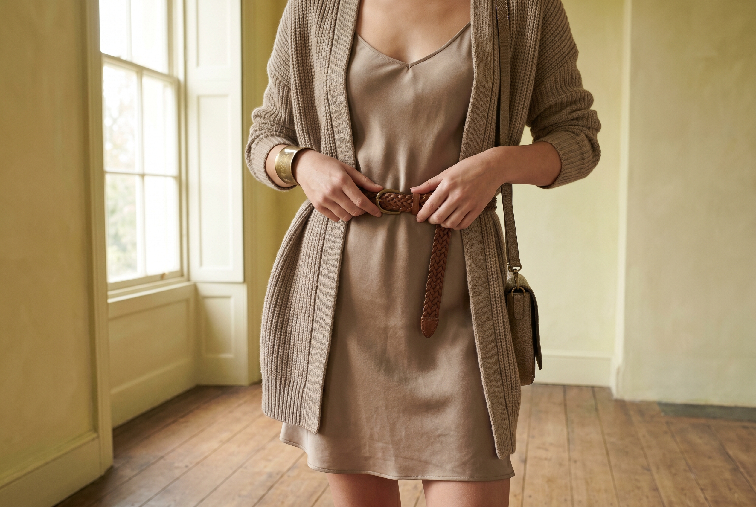
Wardrobe basics (everyday). Camel trench, mushroom-taupe trouser, warm cream knit, soft-brown leather boot, sage-olive jacket. Every piece lives inside the palette. No black. No stark white. No neon. Retailers with a heritage-leaning catalogue (Toast, Massimo Dutti's autumn collection, Eileen Fisher's earthy seasons) tend to carry pieces that sit naturally inside this band.
Wardrobe accents (statement pieces). Dusty rose silk blouse, burnished gold jewelry, soft teal scarf, terracotta wrap dress, sage knit cardigan. These introduce color without spiking saturation. Aritzia's Wilfred line often carries muted camels and dusty roses worth checking during seasonal drops.
Prints and patterns. Tone-on-tone florals, low-contrast tweeds, faded earth-tone stripes, brushed houndstooth in warm browns. Scale should be small-to-medium with low internal contrast. Avoid bold graphic prints with stark black-and-white contrast. The contrast overrides soft autumn coloring every time.
For a wardrobe built on these principles, generate a palette in the Soft Autumn direction and use the hex output as your shopping filter.
Comparison with adjacent seasons
Four adjacent subtypes get confused with soft autumn most often. Each comparison turns on a single dial.
Soft autumn vs. warm autumn (the saturation dial). Warm autumn runs at 65-75% saturation; soft autumn sits at 20-40%. If your natural warmth is vibrant rather than dusty, you're warm autumn. Warm autumn can wear soft autumn colors and look muted; soft autumn wearing warm autumn colors looks overwhelmed. The practical test: hold a saturated rust like #B7410E against your face, then a muted camel like #B8A282. If the rust energizes your face, you're warm autumn. If the rust feels louder than you do and the camel feels settled, you're soft autumn.
Soft autumn vs. soft summer (the warmth dial). Both seasons are muted, so the tiebreaker is undertone. Soft summer's palette has cool-shifted dusty roses and soft blue-grays; soft autumn's palette has warm-shifted camels and olive-sages. Hold a camel next to a gray-brown and whichever lights up your face identifies your season. A second test that often resolves the border case: gold versus silver jewelry. Soft autumn faces brighten under gold; soft summer faces brighten under silver. If the metal test gives a clear answer, the palette decision follows from it.
Soft autumn vs. true autumn (the depth and saturation dials together). True autumn is both deeper and more saturated than soft autumn. If you can wear rust, burgundy, and forest green without looking weighed down, you're probably true autumn. The most common mis-type goes the other direction: a soft autumn dressed in true autumn colors looks tired by mid-afternoon. If your favorite rust sweater seems to drain you no matter how many compliments it gets in the changing-room mirror, the lighting may have been flattering it more than you. (True autumn page is deferred until the hub ships.)
Soft autumn vs. dark autumn (the depth dial alone). Dark autumn is the deepest autumn subtype: same warm-muted register as soft autumn but pushed darker in value. If your hair is dark brown to near-black with warm undertones, your eyes are deep hazel or warm dark brown, and you wear deeper soft browns and burnished olives more comfortably than mid-camels, you may be a dark autumn rather than soft autumn. The dial moves on depth alone. Saturation stays muted in both seasons. Rachel Weisz is sometimes typed across this border, which is why some analysts call her soft autumn and others place her at the soft-to-dark autumn transition.
The full 12-season comparison chart will live on the seasonal palette hub once that page ships.
Frequently asked questions
How do I know if I'm a soft autumn? Check three anchors: your hair should be medium-to-dark with a warm undertone, your eyes should be hazel or soft green, and your skin should have a warm but gentle undertone. If three of three match, you're almost certainly soft autumn. If two match and the rest skew warmer, you're likely warm autumn instead.
Can soft autumn wear black?
Not well. Pure black #000000 overwhelms the muted palette and creates contrast that fights soft autumn's low-contrast coloring. Use soft brown #6B5D4F or deep espresso as a functional substitute. You can wear black in small accents (a belt, a shoe) without issue. The problem is black as a main-garment color.
Can soft autumn wear navy?
Pure navy #000080 is usually too cool and too saturated for soft autumn. The contrast is too sharp against muted warm coloring, and the cool blue pulls against the warm undertone. A softer, warmer-leaning navy with a touch of green or grey (around #3D4A5C) can work in small doses as an accent: a tote bag, a scarf, a structured trouser. As a head-to-toe color, navy fights soft autumn the same way pure black does. If you need a deep blue in your wardrobe, soft teal #6B9B95 or a muted petrol blue sits inside the palette without breaking it.
What's the difference between soft autumn and warm autumn? Saturation. Both seasons are warm; warm autumn runs saturated (rust, cinnamon, deep gold) while soft autumn runs muted (camel, sage-olive, dusty rose). Wearing warm autumn colors when you're soft autumn makes the clothes wear you, not the other way around.
Is soft autumn warm or cool? Warm. The "soft" in the name describes saturation, not temperature. Soft autumn's undertone is warm (golden, honeyed, yellow-shifted), just lower in saturation than warm autumn or true autumn.
What's the best metal jewelry for soft autumn? Gold, brushed bronze, antique brass, and muted copper. The rule is undertone-matching: soft autumn coloring runs warm, so warm metals land. Sterling silver pulls the warmth out of soft autumn skin and creates a temperature clash that reads as "off" even if the wearer can't articulate why. If you genuinely prefer the look of silver, pale rose gold or muted champagne metal gives you a similar visual without fighting your undertone. White gold and platinum should be reserved for cool seasons.
Can men have soft autumn coloring? Yes. The seasonal-color system describes coloring, not gender. Men with medium-to-dark warm-mousey hair, hazel or muted green eyes, and warm-but-gentle skin tones fit the soft autumn profile in exactly the same way women do. The dial settings are identical. The translation into menswear is straightforward: camel coats, mushroom-taupe trousers, warm cream knits, soft-brown leather, sage-olive shirts. Avoid pure-black suiting, stark white dress shirts paired with stark-black ties, and brightly saturated tech-fleece colorways. The market for masculine soft autumn references is thinner than the women's-style one, but the analysis applies cleanly.
What brands use a soft-autumn-aligned palette? Aesop's packaging sits inside this palette: sage-olive, warm creams, muted terracottas. Not a coincidence. In the apothecary-as-luxury category, the soft autumn band reads "heritage" rather than "trendy." Burberry's heritage line does the same with camel and warm tan. Same palette, same register, same reason.
Related palettes: Soft Summer · Seasonal palette hub (coming soon) · Sage Green hex guide (coming soon) · Beige hex guide (coming soon)