Of the twelve seasonal palettes, soft summer is the one that gets mis-typed more than any other, and there's a genuinely specific reason for it. People try soft summer and decide they must be cool summer because it's cool. Or soft autumn because it's muted. Or light summer because it's low-contrast.
It's actually all three at once. A narrow band that reads like something else until you know the dials.
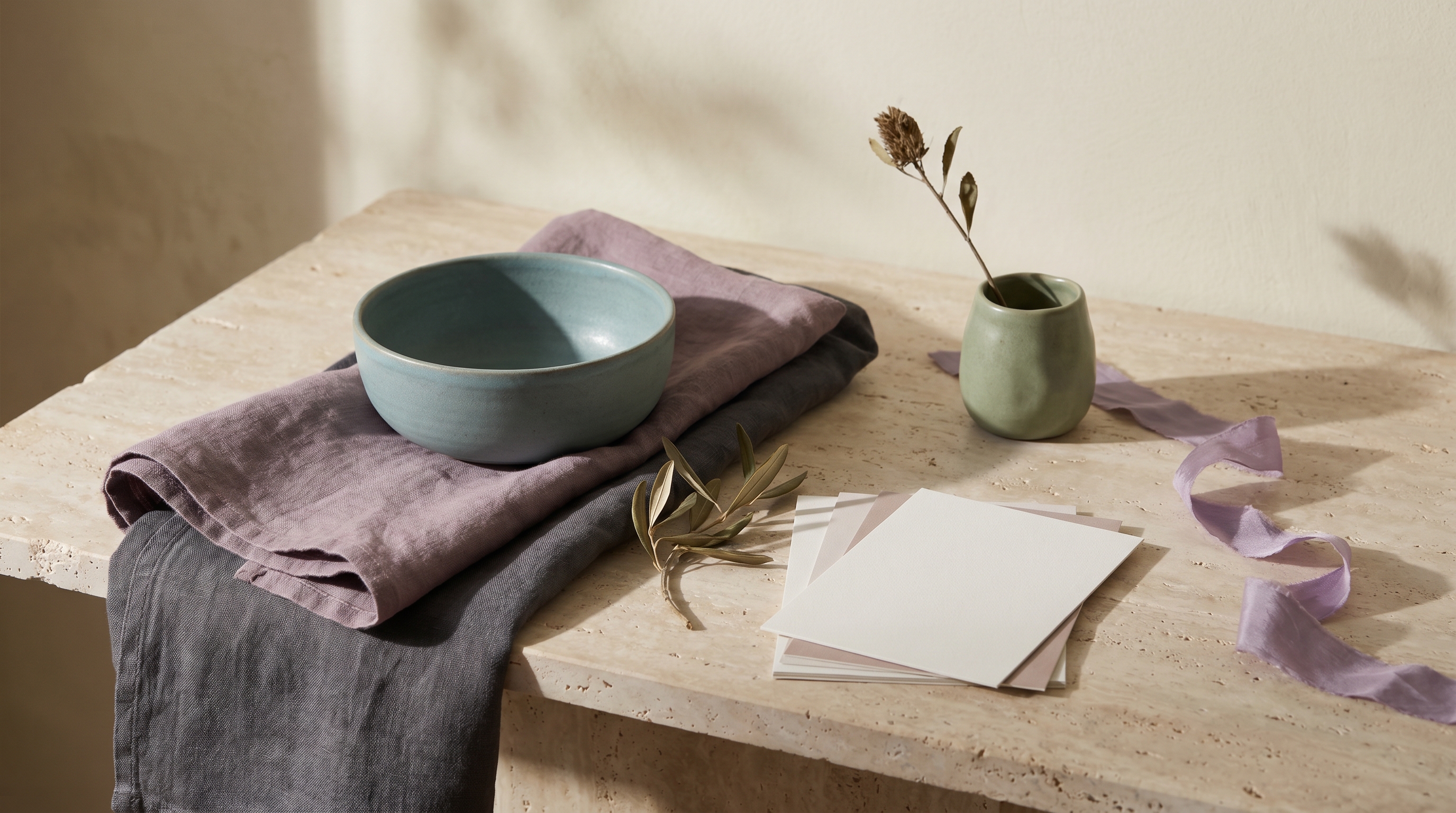
Pantone's 2026 Color of the Year sits inside that band like it was designed for it, which is part of why this year is a genuinely good year to figure out if you're a soft summer. Cloud Dancer is a soft off-white, #F0EEE9, and it lives comfortably next to the palette's dirty whites and lavender-greys. Pantone also published the SS26 trend palette alongside Cloud Dancer: Misty Rose, Burnished Lilac, Amethyst Orchid, Sage Green. All soft summer colors with different names. For one year, the mainstream color conversation is a soft summer conversation.
This guide covers who soft summer fits, the 24 hex codes that define the palette, colors that drain it, five celebrities who show up as soft summer across every color-analysis community that publishes typed lists, and a handful of opinions that most seasonal guides won't commit to. If you keep hearing you're a cool summer or a soft autumn but nothing quite works, you're probably sitting in this narrow band.
Who soft summer fits
Soft summer is muted, cool, and low-to-medium in value. What that looks like on a person:
Hair. Ash tones only. Ash blonde, ash brown, or medium-dark ashy brown. Never the golden or red-tinged warmth of autumn hair. If anyone has ever described your hair as "that weird in-between color with no highlights," you're probably in ash-summer territory.
The muted quality isn't an accident of lighting. It's the dominant characteristic.
Note: hair dye doesn't count. Whether you're a soft summer is about what your hair does without the salon. If your current color is balayage-blonde or warm brunette but your roots come in ashy, you're probably still soft summer.
Eyes. Most soft summers have grey, grey-blue, or grey-green eyes. Some have a muted hazel that skews cool. The telltale sign is what the eyes do in bright light. Warm eyes brighten and saturate. Soft summer eyes get grayer. If your iris reads more like sea-glass than jewel-tone, that's soft summer.
Skin. Neutral or neutral-cool with an ashy undertone, sometimes a soft pink tinge. The skin doesn't tan easily into bronze; it tans cool. Soft summer skin gets compared to olive or ivory more often than to peach or honey. If you've been told you're neutral-cool but your skin sometimes looks warmer than expected in summer sun, you might still be soft summer. Soft summers can read warmer than true summers, especially at deeper skin depths.
Contrast. Low to medium. Your features don't have that stark light-dark contrast that makes a winter palette work. Hold a photo of yourself next to a high-contrast outfit and the outfit looks louder than you do. That's the soft summer tell. The clothing fights for attention.
If three of these four match, you're almost certainly soft summer. If two match and the rest skew cool-and-sharper, you're probably cool summer. If two match and the rest skew brighter, you might be light summer. If two match and the rest skew warm, you're probably soft autumn, not soft summer.
One more common mis-typing path: soft summers with warmer-reading skin often get typed as soft autumn. The way to tell is the warmth direction. Soft autumn skin has gold underneath. Soft summer skin has pink or neutral underneath. Hold a gold fabric against your face, then a silver one. Whichever lights up your face is the direction your undertone leans.
A practical note on self-typing. Do this test in natural daylight with no makeup on, hair pulled back so it doesn't cast color onto your skin. Makeup pulls toward warmth, artificial lighting casts unpredictable tones, and hair color frames the face in ways that can tip a reading in either direction. The color-analysis communities on Reddit specifically ask for "natural light, no makeup, hair back" photos because any one of those variables can flip a seasonal read. If your self-typing keeps changing between sessions, lighting is usually the culprit.
The soft summer color palette
Here's the full palette, 24 hex codes organized by role. The filter rule: saturation stays under 35%, lightness sits between 50% and 75%, hue leans cool or cool-neutral. No warmth, no brightness, no high contrast. Muted all the way through.
Read this like a jewelry box. Lavender-greys and dusty pinks anchor the lighter end. Muted teals and sage-greens sit in the middle. Soft plums and deep cool greys close out the dark end.
Nothing screams. That's the whole point.
The filter rule matters more than the specific hex codes. Memorize the rule — saturation under 35%, lightness 50 to 75, hue cool or cool-neutral — and you can spot soft summer colors in any shop, any catalog, any Pinterest board. Colors that don't meet the rule aren't soft summer, no matter what the label says.
Pantone 2026's Color of the Year, Cloud Dancer (#F0EEE9), sits here as one of the palette's lighter neutrals. The SS26 trend colors Pantone paired with it read like a soft summer paint deck: Burnished Lilac, Amethyst Orchid, Sage Green, Shale Green, and Misty Rose. The mainstream color conversation for 2026 is, effectively, a soft summer conversation.
This matters for two practical reasons. First, retailers follow Pantone. Wardrobes at Everlane, COS, Arket, and Aritzia in 2026 will lean heavily on the Cloud Dancer palette, which means soft summers will find more in-palette pieces on the rack this year than in any year since 2022. Second, the specific shades Pantone highlighted (Misty Rose for accessories, Burnished Lilac for knits) are a short-term styling shortcut. If a designer pulled colors from the Pantone palette, those pieces are likely to sit inside your band. Use 2026 as a year to build your core wardrobe in the palette; the market is friendlier than usual.
Neutrals for soft summer
The neutrals are the workhorses. Soft summer's neutrals are cooler and softer than soft autumn's warm-brown range, and less ashy-severe than cool summer's blue-greys.
#A4A0B0· lavender-grey The signature soft summer neutral. A soft, slightly purple-toned grey that reads as sophisticated without being cold.
If you own only one soft summer neutral, make it lavender-grey. The others are optional. This one is load-bearing.
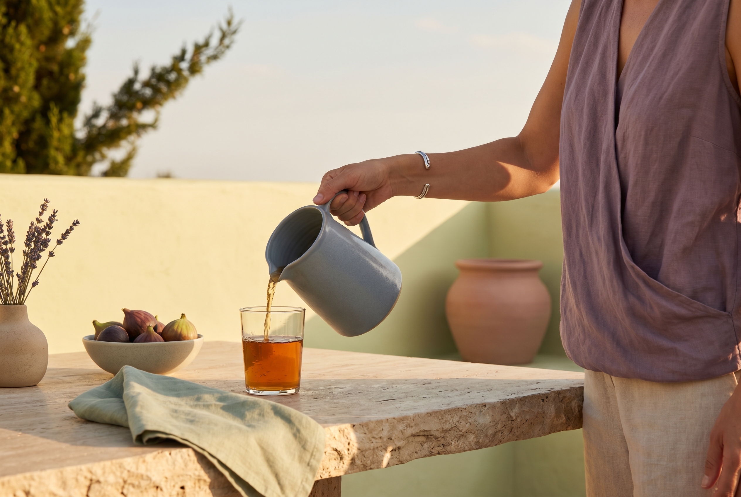
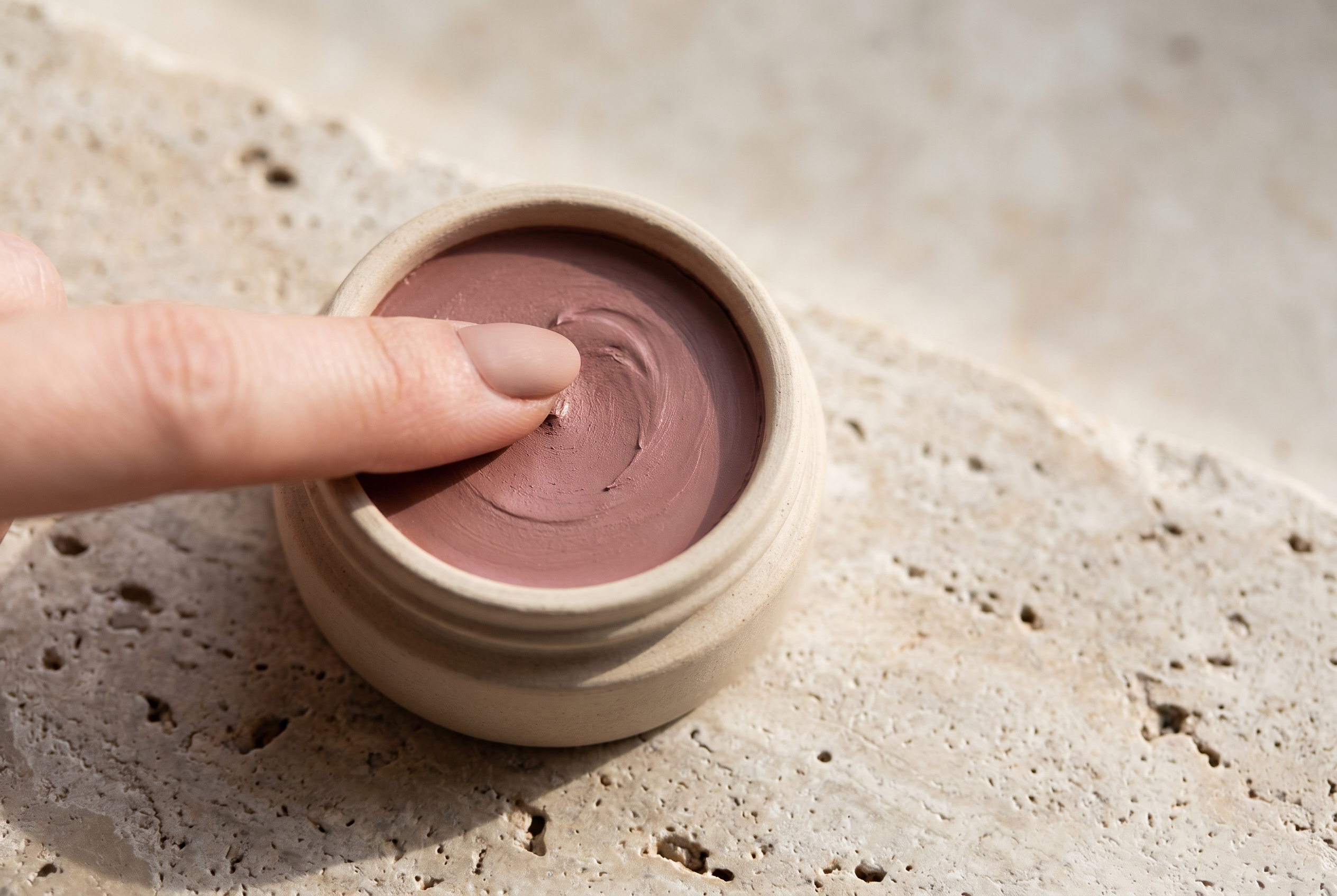
#F0EEE9· dirty white The soft summer "white." Never use pure #FFFFFF; it will flatten your coloring. This is the same shade Pantone crowned Cloud Dancer for 2026, and it's the right white for soft summer eyes, skin, and palette. Use it where other people would use stark white.
#C4B8A8· oat beige The warmest of the soft summer neutrals, but still cool-neutral. Reads as cashmere. Works as a trouser, a coat, a throw.
#6D5868· muted plum-brown A deeper neutral that substitutes for brown. Dusty, unsaturated, with a trace of purple. Good for leather goods and structured pieces.
#5B5E64· soft charcoal Replaces black. Slightly cool, slightly muted. Grounds every outfit without overwhelming the way pure black does. If you need a dramatic base, start here, not at #000000.
These five neutrals plus the 19 accents in the palette above are a complete wardrobe. Nothing more is required.
Colors to avoid
Five hex codes actively fight the soft summer palette:
#000000· pure black Too stark. The contrast collapses every feature. Soft summer's coloring is gentle, and pure black doesn't share that quality. Use soft charcoal #5B5E64 or muted plum-brown #6D5868 as a functional replacement.
#FFFFFF· pure white Too bright. Acts like a spotlight against soft summer skin and flattens instead of flattering. Swap for dirty white #F0EEE9.
#FFD700· warm gold Too warm. The gold pulls at soft summer's cool undertone and makes the skin look tired. If you want a metallic, silver and brushed steel are natural. If you want a warmer glow, try pewter or muted bronze instead.
Gold never works on soft summer. Every time it seems to, look closer — the person is actually soft autumn. And the soft summers who keep buying gold because it's what their mother wore are the ones who never understand why their styling never quite lands. Sell the gold. Buy silver.
#FF1493· saturated fuchsia Too loud. Fuchsia and soft summer is a full-volume conflict. Swap for dusty rose #B89B9B or muted mauve.
#FF4500· pure orange Too warm and too saturated. Rust, terracotta, and warm oranges belong to the autumn palettes. For a warm-ish accent in a soft summer wardrobe, try muted coral like #C89B9B.
The pattern across all five: anything above 60% saturation clashes, and anything with a strong warm undertone drains soft summer skin. These aren't ugly colors. Fuchsia looks stunning on a bright winter. Pure orange suits warm autumn. They're just the wrong colors for this coloring.
Celebrity examples
Five names show up as soft summer across every color-analysis community that publishes typed celebrity lists: theconceptwardrobe, four seasons studio, truth-is-beauty, and spicemarketcolour. When the same name appears on multiple independent lists, that's convergence worth anchoring on. These five are the convergence picks.
Adriana Lima. Triple-confirmed across TCW, four seasons studio, and truth-is-beauty. Ash-brown hair, grey-green eyes, and neutral-cool skin with a soft warmth. This is the classical supermodel read of soft summer. Her best looks sit in lavender-grey and dusty rose. When she's styled in saturated jewel tones, the clothing wins. When she wears the palette, she wins.
Kristen Stewart. Also triple-confirmed. Truth-is-beauty has a pointed note: Hollywood stylists keep putting her in high-contrast outfits, and the contrast outmatches her coloring every time. Her best-matched looks are muted purples and cool-washed greys. Her recent short-hair, ash-blonde era is the clearest visual reference for what soft summer looks like in A-list context.
Bianca Balti. Another triple-confirmed consensus pick. Ash hair, grey-blue eyes, neutral-cool skin with the lightly-ashy quality soft summer is known for. Bianca is what soft summer looks like without any warmth-shift complications, which is rarer than it sounds. Use her as the textbook reference if you're trying to calibrate your eye.
Dakota Johnson. Confirmed across four seasons studio and spicemarketcolour. Four seasons studio specifically calls her a soft summer who "embodies the muted elegance" of the season. Her natural hair is ash brown rather than the warm brunette she sometimes appears as in press photos (which is the common dye-color mis-typing path). Dakota is the current-gen Hollywood anchor. If you want a soft summer reference from a 2020s lens, she's it.
Leona Lewis. Confirmed across truth-is-beauty and spicemarketcolour. Worth including because soft summer isn't a pale-skin-only season, despite what a lot of Eurocentric color analysis implies. Leona has the muted, cool-neutral quality that is the same soft summer character as Bianca or Adriana, just at a deeper skin depth. If every "soft summer celebrity" image you find looks like a pale-haired fashion model, look at Leona's styling choices instead. She wears the palette as well as anyone.
A handful of edge-case names show up on one source but not the others: Jennifer Aniston, Emma Chamberlain, Cara Delevingne, Denise Richards, Miley Cyrus. Treat those as "maybe" rather than anchors. Jennifer Aniston in particular gets typed across both soft summer and soft autumn by different analysts, which means she's not a clean reference for either. Stick to the convergence list above when you're looking for a calibration point.
If none of these five look like you, don't overthink it. Celebrity lists skew toward a narrow band of skin tones and ages because that's what mainstream media photographs most. Your soft summer coloring may look different at a different skin depth, age, or ethnicity than any of the five anchors. The dials stay the same even when the surface changes: cool or cool-neutral undertone, muted rather than saturated, medium contrast rather than stark.
Use the palette as the reference, not the faces.
A related opinion: stop looking at Instagram color-analysis accounts for your typing. Most of them type everyone as the same two or three seasons because they only know how to run a few drapes and the algorithm rewards confident answers. The convergence list above exists because the analysts who published these names disagree with each other on edge cases and agree on the core five. That kind of agreement is rare and meaningful. Instagram consensus isn't the same thing.
Makeup and wardrobe recommendations
The rule for both is the same as the palette rule: cool-to-neutral undertone, muted saturation, medium-low contrast. Everything translates.
Foundation. Cool or neutral-cool undertone. Avoid anything labeled "warm," "golden," or "honey." Most major brands use "cool" or "neutral" in their undertone naming; some use "rosy" or "pink," which usually tracks for soft summer too.
Lip. Soft mauve, rose-brown, muted coral, dusty rose. Misty Rose is the 2026 shade color forecasters keep pointing to as the standout lip for soft summer, and they're right. It hits the cool-muted sweet spot. Avoid true red (too saturated), fuchsia (too loud), and anything with a brown-orange base.
Eye. Soft taupe, cool grey, muted plum, silvered green. Shimmers should be silver-based, not gold. Avoid warm bronze, copper, or orange-tinted browns, which pull at the undertone.
Hair (if dyeing). Ash tones, always. Ash blonde, ash brown, cool light brown. If you want to go darker, cool-toned brunette with no warmth. Avoid golden blonde, honey, caramel, red, auburn, and jet black. All of these fight the natural palette.
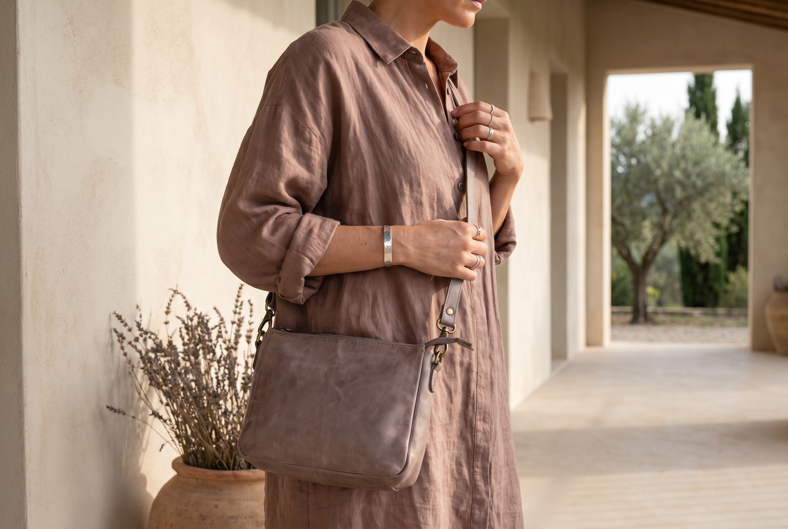
Wardrobe basics. Lavender-grey blazer, oat-beige trouser, dirty-white knit, soft-charcoal boot, muted plum bag. Every piece sits inside the palette. No black. No stark white. No saturated jewel tones. Retailers with a Scandinavian-minimalist leaning (COS, Arket, Everlane) tend to carry muted neutrals in their core ranges, which often sit in the soft summer band.
Wardrobe accents. Dusty rose silk blouse, muted sage cardigan, lavender scarf, soft teal wrap dress. Colors that introduce depth without spiking saturation. Aritzia's Wilfred line runs muted neutrals and dusty accents most seasons; check their seasonal drops for pieces in lavender-grey, oat, and dusty rose tones rather than anything saturated.
Jewelry. Silver, brushed steel, cool white gold, pewter. If you want warm metal, choose muted bronze rather than yellow gold. The rule: metals should match the temperature of your coloring. Soft summer runs cool, so cool metals land. Yellow gold fights this palette every time, and no amount of stylist-insisting-it-works changes that.
Prints and patterns. Small-to-medium scale with low internal contrast. Pinstripes on lavender-grey, tone-on-tone florals, faded pastel stripes. Avoid bold graphic contrast like stark black-and-white geometric prints, which override soft summer features.
For a wardrobe built along these lines, generate a palette in the soft summer direction at the palette generator and use the hex output as a shopping filter.
Comparison with adjacent seasons
Three adjacent seasons get mis-typed as soft summer. Each comparison turns on a single dial.
Soft summer vs. soft autumn. The warmth dial. Both seasons are muted. Soft autumn has warm undertones (gold, honey, yellow shift); soft summer has cool or neutral-cool undertones (pink, lavender, silver shift). Hold a warm gold fabric against your face, then a cool silver one. Soft autumn faces light up for gold. Soft summer faces light up for silver. If you've been told you're a soft autumn but gold makes you look tired, you're probably soft summer.
Soft summer vs. true summer (page coming soon). The muting dial. Both seasons are cool and summer-based. True summer is more saturated and slightly clearer; soft summer is more muted and slightly greyer. True summer can wear a medium-saturation dusty rose like #C88FA0 and look fresh. Soft summer in the same color reads a bit overbrightened. If your best colors are toward the cooler, clearer end of the summer band, you're probably true summer. If your best colors pull toward grey-tinged and muted, you're soft summer.
Soft summer vs. light summer (page coming soon). The lightness dial. Both seasons are cool, but light summer's palette is brighter and more delicate. Soft summer runs darker and duskier. Pastels that sit right on a light summer tend to wash out a soft summer. If you look best in pale-airy pastels, you're probably light summer. If pastels feel thin on you but rich muted tones feel settled, you're soft summer.
If you're still unsure after running through the three dials, professional color-analysis communities are remarkably consistent on border cases. Post a question on r/ColorAnalysis or r/femalefashionadvice with two well-lit photos, one in natural daylight, no makeup, hair back, and you'll usually get a clear read within a day or two. The border cases matter less than getting roughly the right quadrant. Once you're inside the cool-muted zone, most palette decisions become obvious.
The full 12-season comparison chart will live on the seasonal palette hub once that page ships — useful for anyone who's not sure which quadrant they sit in.
Frequently asked questions
How do I know if I'm a soft summer? Check four anchors: ash or cool-toned hair, grey or grey-tinted eyes, neutral-to-neutral-cool skin, and low-to-medium contrast. If three of four match, you're almost certainly soft summer. If most match but your skin reads gold-warm, you're probably soft autumn instead.
What's the difference between soft summer and soft autumn? Undertone. Soft autumn is warm-muted (gold underneath); soft summer is cool-muted (silver or pink underneath). Both are muted. The tiebreaker is what happens when you hold gold fabric next to silver. Whichever lights up your face is your direction.
What's the difference between soft summer and true summer? Saturation. True summer is cool and medium-saturation; soft summer is cool and desaturated. True summer can wear a medium-clarity dusty rose and look fresh. Soft summer needs the same rose pulled further into grey.
Is soft summer cool or warm? Cool or cool-neutral. The "soft" in the name describes muting, not temperature. All summer seasons are cool or cool-neutral, and soft summer is the muted end of the summer band.
Can soft summer wear black?
Not well. Pure black #000000 creates contrast that soft summer's gentle coloring can't match. Replace with soft charcoal #5B5E64 or muted plum-brown #6D5868. Black in small accents is fine; black as a main garment overpowers the face.
What colors should a soft summer avoid? Pure black, pure white, warm gold, saturated fuchsia, and pure orange. Anything above 60% saturation clashes. Anything warm-tinted drains the skin. These aren't bad colors. They're wrong for this coloring.
What brands use a soft-summer-aligned palette? Everlane leans heavily into soft summer neutrals (oat beige, dusty pink, soft charcoal). COS sits inside the palette for much of their core range. Brands in the "quiet luxury" register often pull from this zone because muted cool reads as refined rather than trendy. In the Explorer database, the pattern repeats across cashmere brands, skincare brands selling to neutral-cool audiences, and heritage-Japanese label partners.
One last thing. The mainstream color world has been underrating soft summer for years. It's the "boring" season in most guides, the afterthought between cool summer and soft autumn. That was never right, and 2026 is when the conversation finally catches up. If you're a soft summer, this is your year to build the wardrobe you actually want.
Related palettes: Soft Autumn · Seasonal palette hub (coming soon) · Sage Green hex guide (coming soon) · True Summer and Light Summer (coming soon) · Pantone 2026 Cloud Dancer (#F0EEE9) sits natively in the soft summer palette as its dirty white.