Corsair pairs a very dark base with one yellow. Bambu Lab pairs black with one green. Same move, different signal color, and it's one of three patterns that keep showing up in brand color palette examples from tech: black plus one signal color, one brand color that owns everything, and one hue in three depths.
Tech is a good place to look because most of its brands lead with blue, black, or near-black. You don't have to make hardware for it to apply. The same patterns show up in cameras, gaming gear, streaming devices, and 3D printers. They carry over to any consumer brand that sells things people use every day, like chargers, keyboards, and smart plugs.
Brand color palette examples: the three patterns
Each pattern comes from a tech brand that shipped it. Copy the pattern, not the hex codes.
- Black plus one signal color. A dark base, with one loud color for everything you want noticed. Bambu Lab and Corsair do this.
- One brand color owns everything. One color carries the brand, and the neutrals stay quiet. Roku does this.
- One hue in three depths. A dark, a mid, and a bright version of the same color. Arlo does this.
A signal color is the one loud color a brand keeps for the things it wants you to notice: a button, a status light, a logo mark.
What the whole database shows
We keep a database of more than 5,000 real brands and the colors on their sites. A brand's lead color is the main color our database records for it. In the BrandColors Explorer's 5,062 browsable brands, neutrals lead 42.2% of them (2,135 brands). We count black, near-black, white, gray, and cream together as neutrals.
A neutral base usually gets a real color on top: 84.2% of the neutral-led brands that have an accent use one (1,135 of 1,348). Blue, orange, and yellow are the most common accents at 15.7%, 14.7%, and 13.1%, close enough that no color owns the role. We counted on September 29, 2026, with the same color-family rule the Explorer uses. Live sites change, so treat the numbers as a snapshot.
Tech leans the same way. Blue and the dark neutrals, black and near-black, lead more tech brands than any other colors. Blue is also its most common accent. So the neutral base is the shared default, and the accent is where a brand actually chooses.
Pattern 1: black plus one signal color
Bambu Lab: black and one green
The swatches below are the colors our database records for each brand, so a hex code can sit a step or two from what the site shows today.
Bambu Lab makes 3D printers. Its site runs on black and white with a single green, used for the things it wants you to notice. The green is the only color on the page, so it's the only color you remember.
Corsair: a very dark base and one yellow
Corsair makes PC parts and gaming gear. It pairs a very dark base with one yellow. Same move, different color: the base does the quiet work, and the yellow carries the brand.
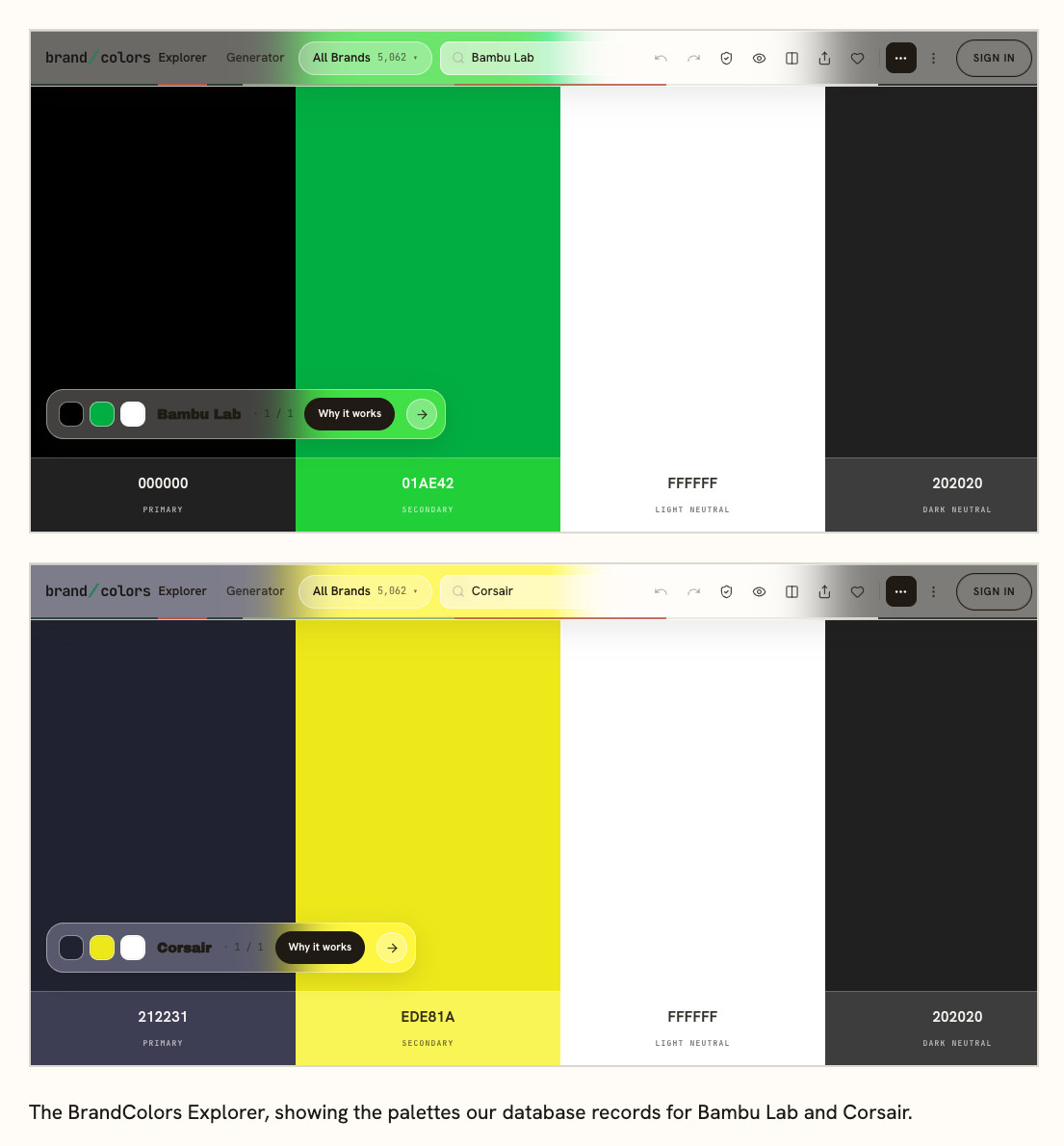
A quiet base leaves one color free to do the remembering. The catch is that you get one signal color. Choose it before you build anything else, and check it against the brands next to you.
Pattern 2: one brand color owns everything
Roku's purple owns the brand. Its recorded palette is purple, charcoal, and white, and the home page uses the same purple (#662d91) and charcoal (#333333). Purple leads far fewer tech brands than blue does, so it stands out without saying anything.
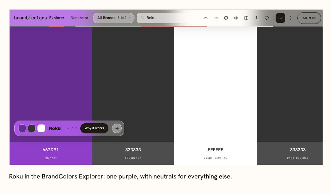
White and charcoal do the reading and the boxing, and the purple marks the brand. That split is the whole pattern: one color for identity, and quiet neutrals for everything else. When one color does all the work, you don't need a second brand color. The neutrals are the supporting cast, and every screen, box, and remote can lean on the same purple.
Pattern 3: one hue in three depths
Arlo makes home security cameras, and its site runs on one hue. The database records a dark blue-black, a mid blue, and a bright blue: #132f3d, #1b5a8f, and #2388dd. The live site runs a little deeper on the first two. The small bird in the logo is green, the one exception. In the database the dark is the main color, the mid blue is the supporting color, and the bright blue is the accent.
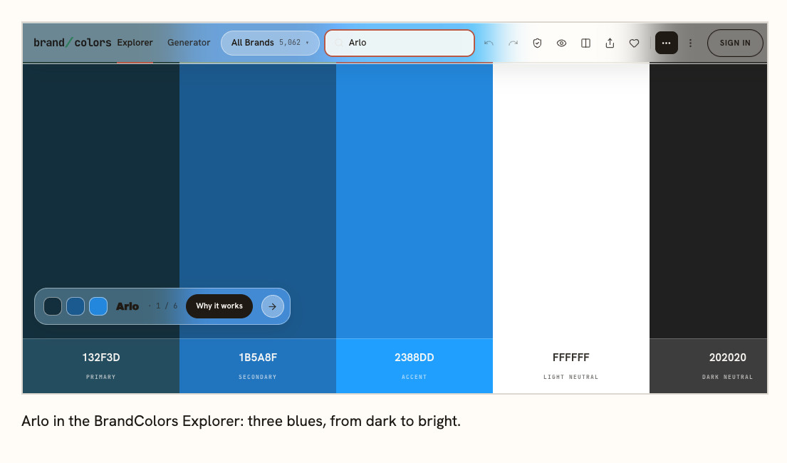
The palette can't clash, because every color is a version of the same hue. The cost is that it sits in tech's biggest crowd, so the depth has to do the work of setting you apart.
Which pattern fits your brand
If you're up against a category of blue and black, pattern 1 gives you one color the crowd doesn't have. If you sell one product line and want people to name your color, pattern 2 keeps everything else out of the way. If you sell software or gear with a lot of screens and states, pattern 3 gives you depth to work with without adding a second hue.
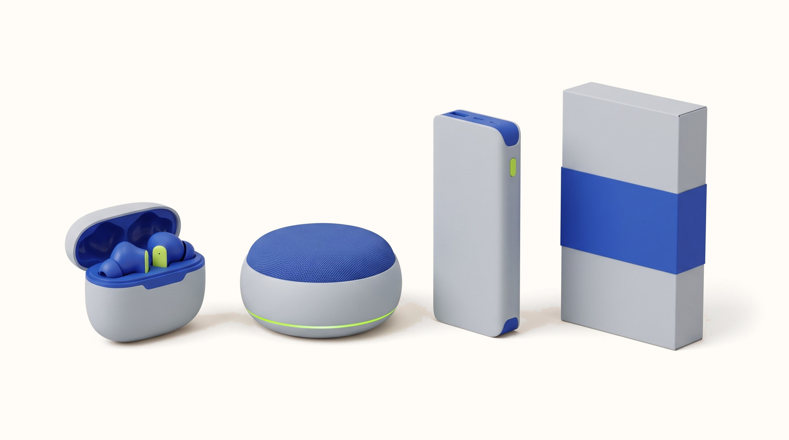
Mixing works when one color stays in charge. Tavo, below, does this: cobalt owns the brand, and lime marks the moments. Our guide to how to choose brand colors walks through the steps. How many colors a brand should have covers when to add more.
Find the palettes in your own market
Tech has eight kinds in the Generator: advanced tech, audio gear, computing gear, e-mobility and outdoor, everyday tech, sleep and wellness, smart home, and software and apps. It asks what you make, then which kind of tech, and it maps the colors real brands in that market use. You can see which pattern your neighbors are on before you choose.
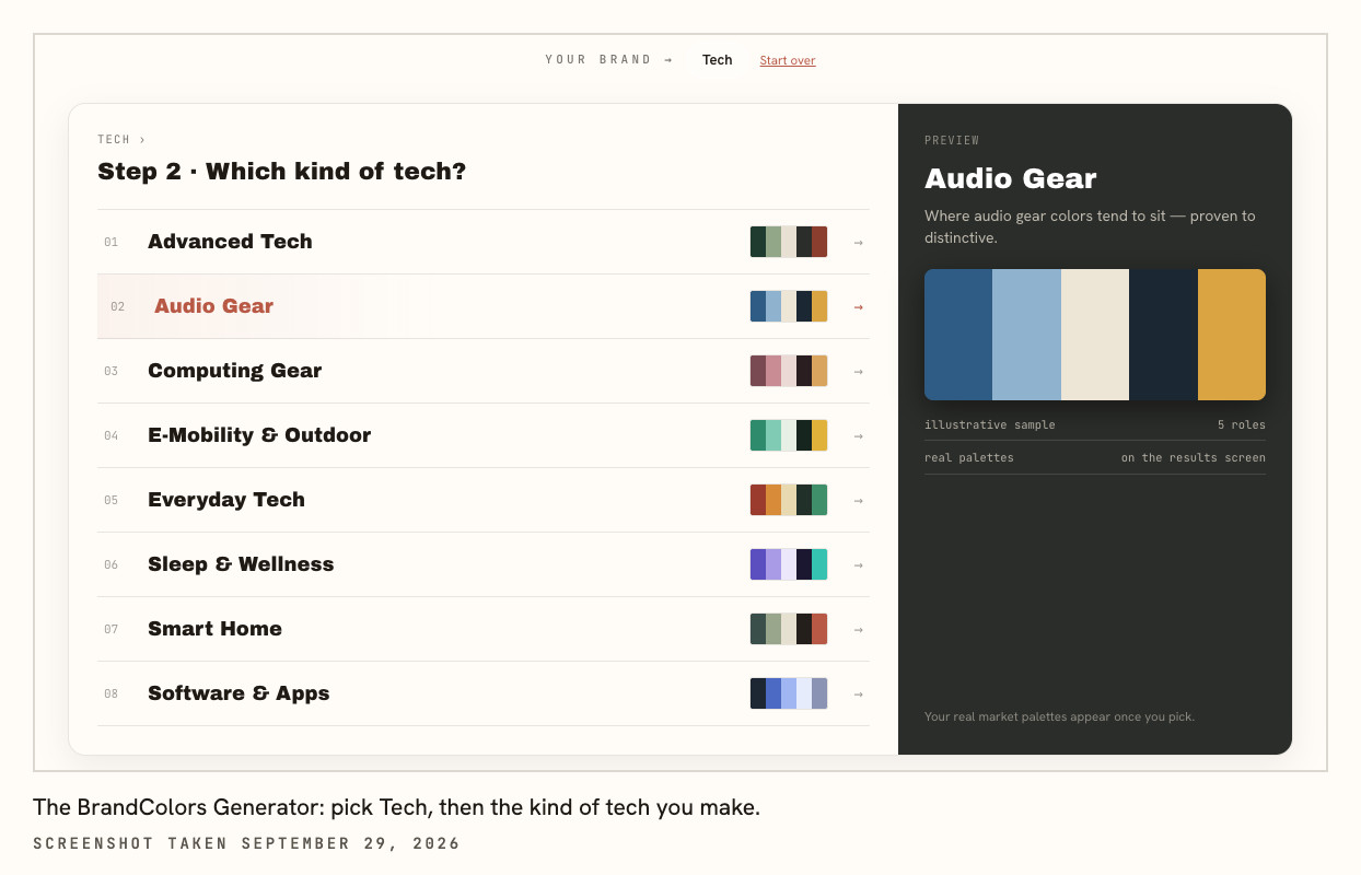
We make the Explorer and the Generator, so we're not neutral about them. The Explorer shows any brand's recorded palette when you search its name. The Generator starts from your market. It takes a few minutes, and that's cheaper than repainting a product line.
Try a pattern on real products
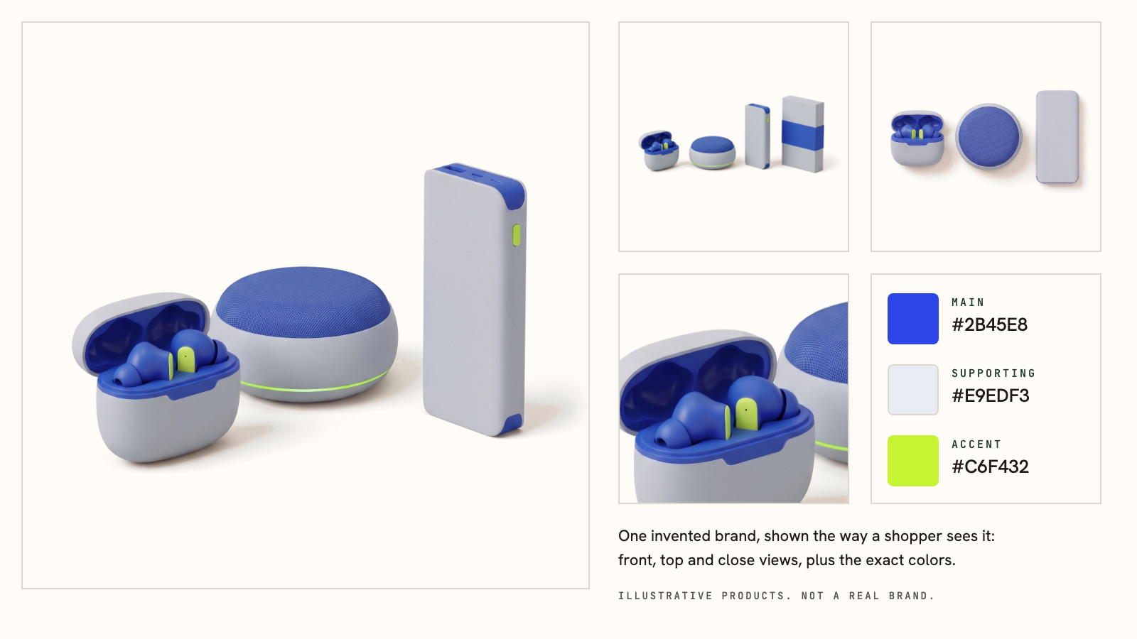
A pattern is easier to judge on a product than on three swatches. Tavo is an invented audio brand we made for this. It sits inside tech's biggest crowd, cobalt blue. It spends its accent on lime: the ring on the speaker, the stems on the earbuds, the button on the power bank, and the Shop button on the site.
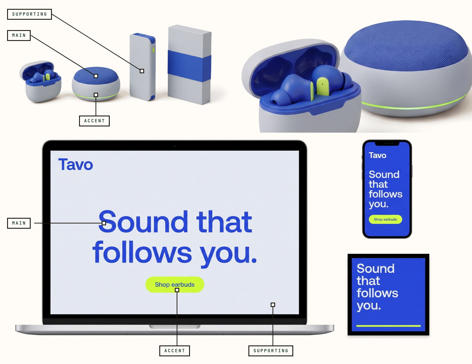
Check the text before you fall for a palette. The web accessibility standard, WCAG 2.1, sets a floor. Normal-size text needs a contrast ratio of at least 4.5:1, and large text needs 3:1 (W3C). Tavo's cobalt (#2B45E8) text on cloud gray (#E9EDF3) is 5.7:1, and cobalt text on lime (#C6F432) is 5.3:1, so both pass (we computed these with the WCAG formula). Lime text on cloud gray is 1.1:1, which fails. That's why lime works as a button fill and a small light, and stays off the words.
What one study says, and what nobody has tested
No study we've found tests which palette pattern sells more, so nobody can honestly rank these three. One well-known finding does explain why a loud accent on a quiet base can work. In a memory study, Smith (2011, Psychology and Aging) had young and older adults study word lists. Each list had one item that didn't belong, like a table among fish names. The odd item was remembered better in both age groups (Smith, 2011; we read it on PubMed Central).
That's the isolation effect. The study used words. It didn't test colors or brands, so treat it as a reason to try pattern 1. It doesn't show that pattern 1 sells.
Four mistakes when borrowing a palette
- Launch with Bambu Lab's green, #01ae42 in our database, and shoppers will see Bambu Lab. Take the move, then choose your own signal color.
- Give Tavo a second loud color, say an orange beside the lime, and the accent stops being the one thing you notice. Pattern 1 works because one color carries it.
- Lime text on cloud gray is 1.1:1, as above, and yellow behaves the same. A light accent belongs on fills and small lights, not on words.
- Arlo's recorded dark blue is #132f3d, and its site runs deeper. Open the brand's own site next to the recorded palette before you build on either.
FAQ
What are good brand color palette examples for a tech brand? Look at three patterns. Black plus one signal color, like Bambu Lab's black and green. One brand color that owns everything, like Roku's purple. One hue in three depths, like Arlo's blues. Choose by what you need color to do.
How many colors does a tech brand palette have? Usually three: a main color, a supporting color, and an accent, plus black or white for text. About 31% of the brands you can browse have no accent at all. Our guide to how many colors a brand should have covers when to add more.
Should a tech brand use blue? Blue leads more tech brands than any other single color, so it's the color your customers see most. If you use it, make the depth or the accent do the work of setting you apart. Arlo does this, and so does our invented Tavo.
Can I copy a palette from a brand I like? Copy the pattern, not the hex codes. Two brands with the same green look like one brand. Choose your own signal color, then test it against the brands next to you and check the text contrast before you commit to it.
Where can I find more palettes like these? Search any brand's name in the Explorer to see its recorded palette with hex codes and roles. Or start from your market in the Generator, which asks two questions, to see the colors real brands in it use before you choose your own.