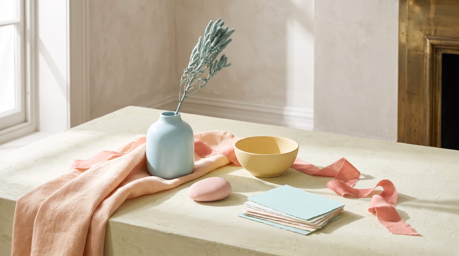
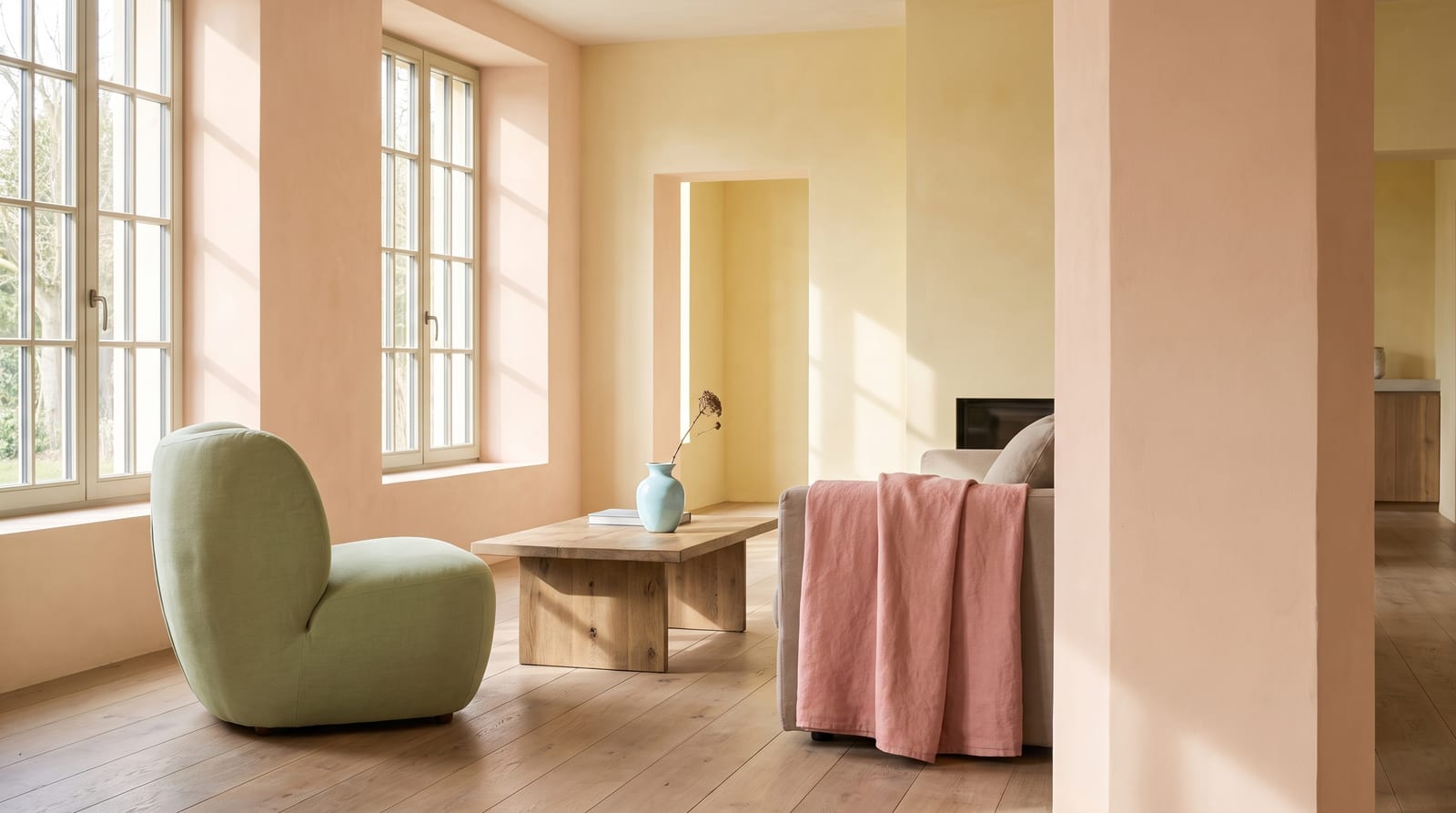
The light spring color palette is warm, light, and gently clear: peach, coral, golden cream, light warm green, aqua, and warm periwinkle. Every color sits at a light value with a warm undertone and low-to-moderate contrast, delicate rather than deep or muted. It's the warm twin of light summer, and telling the two apart is the whole game.
Most light springs have been called a light summer at least once, because the two seasons share everything except the one dial that matters. Both are pale, soft, and low in contrast. Light summer runs cool: rose, lavender, powder blue, dove gray. Light spring runs warm: peach, coral, golden cream, warm apricot. Undertone is the only thing that separates them, and the fastest way to read your own is the metal test. If gold flatters your face more than silver, you're probably reading the warm one.
This guide covers who light spring fits, the 24 hex codes that define the palette, the neutrals and the colors to avoid, and the celebrities who land as light spring across every color-analysis community that publishes typed lists. Light spring is one of the 12 seasons in the seasonal color analysis system, and it's the one people reach for last, because "warm" and "light" get treated as a spring cliché instead of a precise pair of dials. If you've been buying cool pastels because someone typed you a summer, and they keep leaving your skin faintly gray instead of lit up, you may be warm and light rather than cool and light. The rest of this page settles which.
Who light spring fits
Light spring coloring is warm, light, and gently clear. Hair, eyes, and skin each get a say, so run through them in order.
Hair. Light springs almost always have light hair with a warm, golden cast. Think light golden blonde, honey blonde, warm light brown, or strawberry blonde. The warmth is the tell. Light spring hair isn't ashy the way light summer's is, and it isn't deep or heavily saturated the way warm spring's often runs. If your natural color has been called "golden" or "sunny," and it lightens rather than grays in summer, that's the light spring signature.
Eyes. Light and warm, and usually clear rather than hazed. Light warm blue, light green, warm teal, aqua, and light golden hazel all fit. The giveaway is a certain brightness: even a pale eye reads clean and lit rather than soft and grayed. That clarity is what keeps light spring on the spring side of the line instead of drifting into summer.
Skin. A light spring's skin has a warm undertone, often peachy or warm ivory, and it usually freckles rather than tans deep. "Warm but delicate" is the phrase most professional analysts reach for. You likely freckle in the sun, and gold jewelry sits better against your skin than silver.
Contrast level. Low to moderate. Hold a photo of yourself next to a high-contrast outfit, stark black beside stark white, and the outfit reads louder than your face. Light spring contrast is gentle, but there's a freshness to it that soft seasons don't have. The features blend, yet the coloring still looks clear rather than dusty.
Landing three of the four puts you in light spring. Cooler, ashier misses point toward light summer; deeper or more saturated ones toward warm spring or bright spring. The comparison section below works through each fork, and the light summer one matters most, because those two seasons are the same light, soft palette in two temperatures.
Light spring across different skin tones
Most published light spring examples are fair and European, so the checklist above carries that bias with it. The season itself is defined by dials, not by a face. Light spring is set by three of them: a warm-leaning undertone, gentle clarity rather than muted or high-voltage color, and a light overall value with low contrast. The first two have nothing to do with how light or dark skin is.
The third dial, value, is the honest constraint. Light spring asks for light, gentle coloring overall, and deep skin reads light in value less often than fair skin does, so the season does skew lighter than most. That's a real limit: the palette is not evenly distributed across every depth. But "skews lighter" is not "fair only." A warm, luminous, low-contrast medium complexion with golden or peachy warmth and light, clear eyes can absolutely land here.
Deeper skin tends to get filed as deep or winter on sight. In color analysis, "dark" means high-contrast features, dark eyes and hair set against much lighter skin, not the overall depth of the skin. Someone with softly blended, warm, luminous coloring can be a light or soft season at a medium depth, and gets mis-filed on skin tone alone.
Deeper-skin light spring typings are genuinely under-documented across the color-analysis communities, and the flagship celebrity lists are almost entirely white. That gap belongs to the record, not to the season. Wherever your depth sits, drape it: a warm peach or fresh coral under the chin should make the skin glow, and an icy blue or a muted, dusty tone should visibly drain it. If gold also flatters more than silver, the warm undertone is confirmed, pale or not. (There's also a large Korean personal-color audience searching this exact idea, 봄 라이트, and the logic there is the same: warm, light, gently clear, gold over silver.)

The light spring color palette
The 24 hex codes below are organized by role. Every color sits in the light-and-warm zone: a warm undertone, a light value throughout (roughly 64% to 88% lightness, with light camel as the single deepest step), and a clarity that stays fresh without tipping into either dusty-muted or high-voltage bright. For scale, 64% lightness is a light camel; 88% is a cream a shade off white.
If any of this looks familiar, it should. Pantone's Color of the Year for 2024, Peach Fuzz (13-1023, about #FFBE98), is a warm, velvety peach that sits squarely inside this palette. The color the design world reached for that year was a light spring color, which is a useful reminder that these hues read as current rather than as seasonal-theory abstractions.
How to read this palette
Sorting the grid into three working roles is what turns it into a wardrobe. Once each color has a job, buying gets easier.
Anchors (the everyday base, roughly eight colors). Warm ivory, golden cream, pale butter, pale gold, light camel. These are the warm light neutrals you wear most days, the base layer everything else sits on top of. In a light spring wardrobe they carry the load that black and gray carry for other seasons, without the weight.
Accents (the personality, the fresh brights). Peach, coral, warm apricot, golden yellow, light warm green, aqua, warm periwinkle, warm salmon-pink. Accents are where a light spring wardrobe comes alive, and the whole trick is that they're clear without being loud. One or two accents per outfit is plenty. The palette wants freshness, not saturation.
The deepest you go (the ground, one or two colors). Light camel and a warm caramel are as dark as this season comfortably runs. They give a light spring outfit a base and a bit of definition without spiking the contrast. There's no true dark here, and that's the point.
Dress head-to-toe in the warm light neutrals with one accent near your face and check the result. If it feels complete without any deep contrast piece to "anchor" it, you're working inside the light spring band correctly. If the look feels like it's begging for a hit of black or navy to hold it together, you've probably wandered into a different season's palette.
Every hex here would clash beside a pure black. The colors want each other's company, not competition from depth or high saturation. Pair a peach with a light warm green and the eye reads them as related. Pair the same peach with charcoal and the eye reads the charcoal and forgets the peach.
Neutrals for light spring
Light spring's five neutrals do the everyday work, warmer than summer's gray-based set and much lighter than autumn's deep browns and olives. They read as sunlit, not heavy.
: the "white" of this season. Never reach for pure #FFFFFF when you can use this softer, warmer version instead.
: the foundation. It pairs with every accent in the palette and sits under everything.
: the mid-light neutral, a golden cream with a touch more gold in it. Works as a knit, a trouser, or a light jacket.
: the warm sandy neutral, the color of blonde wood and light tan leather. It's the most "spring" of the neutrals without tipping deep.
: the deepest neutral. It replaces black, and grounds an outfit without weighing it down.
With the 19 accents above, those five make 24: the whole palette, and everything a wardrobe needs. Nothing darker earns a spot.
Colors to avoid
Five colors clash with this palette outright:
: too stark. The contrast is louder than light spring coloring can hold, and it drops a hard shadow under the chin. Swap for light camel #C9A57B.
: too cold and too hard. It cools the skin and flattens the warmth. Swap for warm ivory #F2E3CE.
: too dark and too cool. It sinks a light warm face the same way black does. Swap for warm periwinkle #B3C7E6.
: the right hue family, but far too dark and heavy for this delicacy. It overwhelms the palette's lightness. Swap for peach #F6C9A8 or a fresh coral.
: the double clash, dark and cool at once. It drains every bit of warmth from the face. Swap for warm lilac #C9C4E8.
Depth breaks the light rule and coolness breaks the warm rule, and every color on the list commits one of the two. The list is season-relative, not a verdict on the colors: on a bright winter, stark black reads commanding, and deep eggplant belongs to deep autumn. They just don't get on with this one.
Celebrity examples
Five names show up as light spring across the color-analysis communities that publish typed lists: four seasons studio, Soul of Color, truth-is-beauty, and Spicemarket Colour. Each name below lands on two or three of those lists independently, which is what earns it a place here.
Taylor Swift. Three separate communities type her light spring, more agreement than anyone else on this page gets. Warm ivory-to-peach skin, light golden blonde hair, bright light-blue eyes, and low contrast run through her whole coloring. Her best looks live in peach, warm coral, and golden cream, and she reads clearest when the styling stays warm and light rather than forcing her into stark black-and-white. The light summer border that occasionally gets floated for her comes almost entirely from app-based typing sites, not the analyst communities, which makes her a good teaching case rather than a real dispute.
Amanda Seyfried. Nobody illustrates the light spring versus light summer confusion better. Three communities type her light spring, on fair skin with real warmth, light golden hair, and large light eyes. The analyst communities land her light spring; only the non-sanctioned app sites push her toward light summer. If you can see why she reads warm rather than cool, you can see the whole distinction this page is built on.
Kate Hudson. No list disputes her. Warm peachy-golden skin, light golden blonde hair, warm light-blue eyes, low contrast, and famously gold-jewelry-forward, she reads unambiguously warm. That's exactly why she's useful: a light spring wearing the palette without fighting it, no border case attached.
Sophie Turner. Her fair skin with a hint of gold, natural blonde hair, and pale eyes prove light spring includes cooler-looking complexions that still carry warmth. "Fair and delicate" doesn't automatically mean summer. The undertone still leans warm, and the coloring still reads clear rather than dusty, which keeps her on the spring side.
Scarlett Johansson. Two communities type her light spring, on warm golden blonde hair and warm skin, and she looks best in the palette's peaches, warm corals, and golden neutrals. Like Amanda Seyfried, she's most often mis-typed toward a cooler season by people reading her contrast rather than her undertone.
A few names get claimed on some lists but not others, and the disagreement is almost always about depth or clarity, not warmth. Jessica Chastain is typed true spring by four seasons studio and light spring elsewhere, and her auburn hair and green eyes read deeper and clearer than "light," so she can't anchor this season. Elle Fanning sits right on the light spring to light summer border depending on how ashy the analyst reads her blonde. Nicole Kidman gets split between light spring and true spring across communities with no clean convergence. Treat all three as edge cases rather than references.
Those five anchors all skew fair, which is a limit in how the color-analysis world documents its examples, not a limit of the season. Deeper-skin light spring typings are genuinely under-recorded. The one deeper-skin candidate with real analyst engagement is Alicia Keys, and even there both truth-is-beauty and The Aligned Lover frame her as "possible, pending draping," not settled. She's worth naming precisely because she demonstrates the principle the communities themselves state: light spring is decided by draping, warm undertone plus light value plus gentle contrast, not by pale skin. The correct move is to say that plainly, not to invent a diverse anchor on thin sourcing.
Which is the useful way to hold this whole section: the roster is evidence about the season, not a set of faces to match yours against.
Makeup and wardrobe recommendations
Makeup keeps the palette's settings: warm undertones, light and clear rather than deep, gentle contrast.
Foundation. Warm or warm-neutral, in the light-to-medium range. Avoid anything labeled "cool," "pink," or "rosy," which pulls against the golden undertone. Most brands mark the right ones "warm," "golden," or "honey." MAC's warmer NC shades in the light band and NARS Sheer Glow in a warm light shade like Deauville or Fiji tend to land where a light spring sits. Skip the cool NW range, which grays the warmth out.
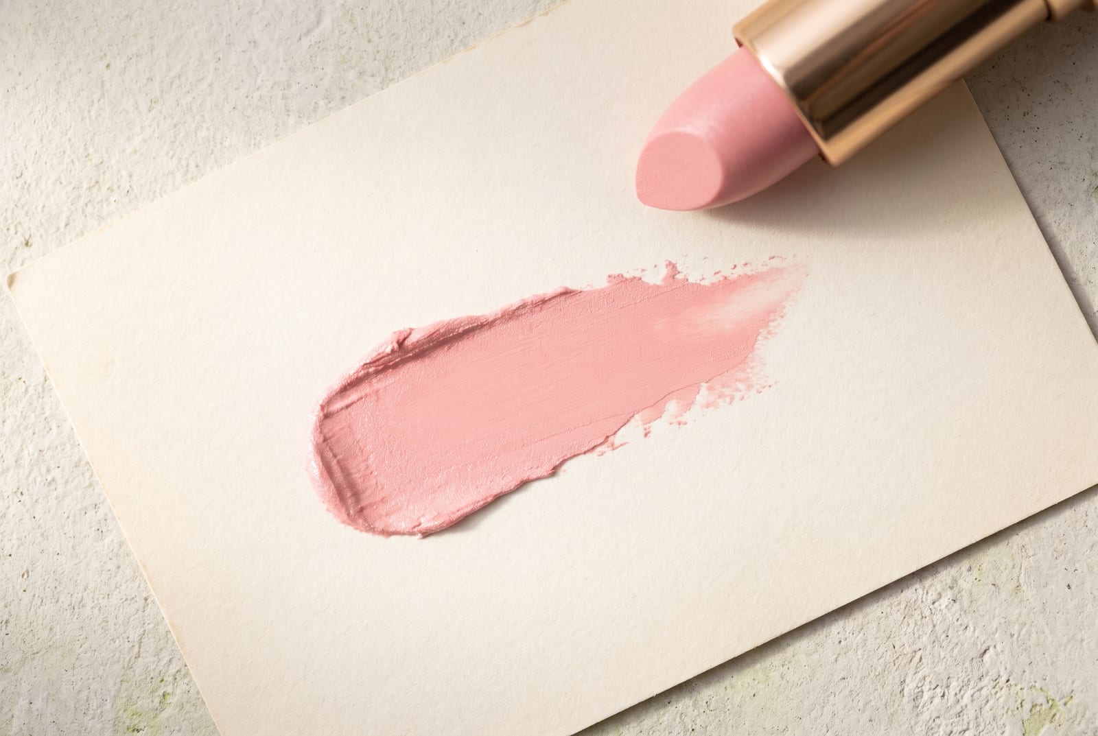
Blush. Peach, warm coral, and warm rose are the sweet spot. A soft peach or a light coral lights the face up the way a cool pink never will. Milani Luminoso and a peachy-coral cream both sit inside this band. Keep it light-handed; the season doesn't want a heavy flush.
Lip. Peach, coral, warm nude, and soft warm pink. The light spring lip is "warm and fresh," not deep and not blue-toned. A warm coral or a peachy nude reads best. Avoid true red, berry, and cool fuchsia, which sit too heavy and too cool against the palette and pull the eye off the face.
Eye. Warm taupe, light gold, peach, soft warm green, and light warm bronze. Shimmers should be gold-based, not silver. For definition, warm brown liner beats black every time, which stays too stark for this coloring. Cool grays, icy blues, and smoky black all fight the warm-light undertone.
Jewelry. This is the fastest tell on the whole page. Rose gold is the hero for a light spring, yellow gold works cleanly, and bright silver or chrome cools and grays the face. If you love a white metal, choose rose gold or a warm champagne finish rather than true sterling. The metal that matches your undertone is the one that makes your skin look lit rather than tired.
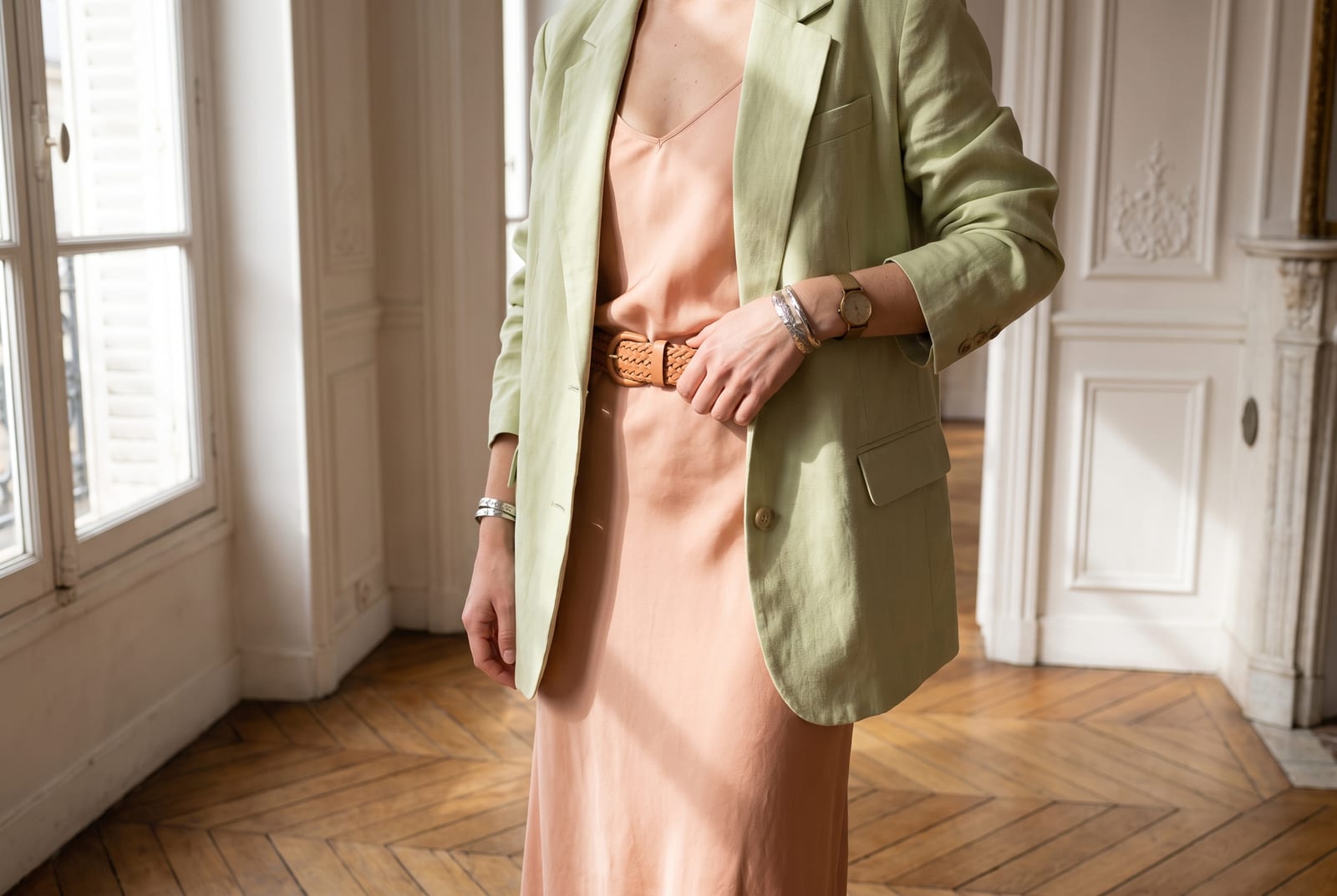
Denim. Light and warm-washed, not dark indigo. A light or mid blue with a soft, faded finish sits closest to the palette, and a warm off-white or ecru denim works even better. Skip raw indigo and blue-black washes, which read too cool and too heavy against light spring skin.
Wardrobe basics (everyday). Warm ivory knit, camel trouser, soft-beige jacket, light-tan leather shoe, light denim. Nothing there steps outside the palette, and black, stark white, and navy never appear. Light warm neutrals do all the work that darker basics do for other seasons, and they keep the whole outfit in the season's light register.
The low-commitment version. You don't have to redo your whole closet. The move that pays off most is bringing the right colors up to your face and letting the rest stay neutral. A peach top, a coral scarf, a warm lip, and a golden-cream knit near the collar will do more than replacing every trouser you own. Color near the face is what the eye reads first. A brand like Glossier built a whole identity on exactly this register of warm, pale peach, which is why that packaging feels easy rather than loud.
Wardrobe accents (statement pieces). Coral blouse, peach dress, light-warm-green cardigan, aqua scarf, warm-periwinkle knit. These introduce color without spiking saturation or depth. The goal is a fresh accent, not a bold one.
Prints and patterns. Warm, light, low-contrast florals, watercolor washes, and small-to-medium ditsy prints in peach, coral, and warm green. Scale should be small to medium with gentle internal contrast. Avoid stark black-and-white graphic prints, which override light spring coloring the instant they get near the face.
For a wardrobe built on these colors, build a light spring palette and use the hex output as your shopping filter.
Hair color for light spring
If you color your hair, the season sets the brief: stay warm, keep it light, and hold the contrast gentle. The whole season runs on lightness and clarity, so hair that's warm and a few shades inside your natural range reads as harmony. Hair that's pushed ashy, dyed deep, or bleached icy reads as a fight.
The directions that work are warm and light: golden and honey blondes, strawberry blonde, warm caramel, light golden brown, and soft warm copper that stays fresh rather than fiery. On the level scale colorists use, where 1 means black and 10 the lightest blonde, light spring lives in roughly the 7-to-10 band. Golden and honey blondes sit at 8 to 10, light golden and caramel browns at 7 to 8. Hand your stylist one of these: "a level 8 or 9 golden blonde, no ash," or "a light golden-brown, level 7, warm not cool."
Repeat "no ash" until it sticks. Golden, honey, caramel, and warm copper are the words that translate at the salon; anything toned ash will read flat and grayish against light spring skin within a wash or two. The same caution covers purple and blue toning shampoos. They exist to strip warmth, and warmth is the whole point of this hair.
Each color on the avoid list breaks one of the two rules. Platinum, icy blonde, jet black, and deep espresso break the light, low-contrast rule, either too pale-cold or too dark for coloring this gentle. Cool ash, cool mushroom brown, and cool burgundy break the warm rule and leave the skin looking tired. Fire-engine copper manages to break both, too bright and too hard at once.
For highlights, keep them warm and low-contrast: hand-painted balayage no more than two or three levels off your base, in golden or honey tones. Chunky platinum streaks and cool foils undo the blended, sunlit look the season depends on. As gray arrives, warm golden or honey blending holds up far better than a cool silver, which washes a light spring out fast.
Light spring for men
Coloring is all the seasonal system reads; gender doesn't enter it. A man with light golden or honey hair, light warm eyes, and warm fair-to-light skin is a light spring, with the same dial settings as anyone else in the season: warm, light, and gently clear. If a warm-toned watch or gold jewelry sits better on you than steel, that's the same undertone tell that works for everyone.
The menswear version of the palette is easy to build. Warm ivory and light-tan basics do the work that white and gray do in most men's wardrobes, without the coldness. Reach for oatmeal, stone, and camel in knitwear and chinos. For shirts, peach, light coral, soft warm green, and a warm light blue all read fresh against light spring skin. A warm light-blue oxford is a workhorse that a stark white one can't be here, because pure white cools the face and drops the warmth out.
Outerwear stays in the same register: a camel overcoat, a warm-olive field jacket, a tan or honey suede. For tailoring, a warm mid-gray or a soft brown suit flatters more than charcoal or navy, both of which sit heavier than the coloring can hold. If a navy suit is fixed for work, keep the contrast down, so a warm shirt and a soft, warm tie stop it from overpowering the face.
Two things to skip. A stark white dress shirt under a black suit is the most common light spring menswear mistake, because the black-and-white contrast is louder than the face and wins it. Cold gray tech-fleece and blue-black denim do the same thing more quietly. Swap black leather for warm brown, silver hardware for a gold or rose-gold tone, and the whole look settles.
Building a light spring capsule wardrobe
A capsule wardrobe is a small set of pieces that all work together, so any top goes with any bottom and getting dressed stops being a decision. Light spring makes this easy, because the whole palette is built to mix. Every neutral pairs with every accent, and no piece fights another.
Start with the neutrals, which carry most of the wardrobe. A light spring capsule leans warm-light rather than dark: warm ivory, golden cream, pale butter, pale gold, and light camel do the job black, gray, and navy do for other seasons. Build the base from these: a warm ivory tee, a golden-cream knit, a camel cardigan, a pale-gold or stone trouser, and a light-camel jacket or coat. Add light, warm-wash denim rather than a dark indigo, which reads too cool and too heavy against this coloring.
Then add accents near the face, where color does the most work. Three or four is plenty: a coral top, a peach shirt, a light-warm-green knit, and an aqua or warm-periwinkle scarf. Each one lifts a neutral base without spiking the contrast. The rule of thumb: mostly neutral through the body, one clear accent up top.
Shoes and metals hold it together. Tan and honey leather, warm-cognac boots, and a light sneaker in cream or soft beige all sit inside the palette, while black leather fights it. For jewelry and watches, gold and rose gold are the natural finish, and they pull the whole capsule into one warm key.
A 10-piece starter looks like this: warm ivory tee, golden-cream knit, camel cardigan, stone trouser, light-wash denim, camel coat, coral top, peach shirt, aqua scarf, tan leather shoe. That's a full week of outfits sharing one temperature and one light register, which is what makes a capsule feel calm instead of random. Add pieces slowly, and only ones that pass the same test: warm, light, clear, and happy next to everything already in the drawer.
Comparison with adjacent seasons
Four seasons get confused with light spring most often. Each fork below is decided by one dial.
Light spring vs. light summer (the warmth dial). This is the big one, the cross-family look-alike, and the reason most light springs get mis-typed. Both seasons are light, soft, and low-contrast, so the tiebreaker is undertone. Light summer's palette is cool: rose, lavender, powder blue, dove gray. Light spring's is warm: peach, coral, golden cream, warm apricot. Hold a peach next to a soft rose and whichever lights up your face names your season. The reliable second test is metal. A light spring face brightens under gold and rose gold; a light summer face brightens under silver. A clear metal answer settles the palette question with it.
Light spring vs. warm spring (the depth and saturation dial). Same warmth, more intensity. Warm spring, also called true spring, runs deeper and more saturated, with real golden richness, while light spring keeps everything pale and delicate. Light spring is the lightest, gentlest corner of the spring family. If you can wear a deep golden-rust or a rich warm green without looking overwhelmed, you're probably a warm spring. If those same colors wear you and a light peach feels settled, you're light spring. To test it, hold a saturated warm gold against your face, then a soft golden cream. If the deeper gold energizes you, you lean warm spring; if it feels heavier than you do, you're light spring.
Light spring vs. bright spring (the clarity and contrast dial). Same freshness, more voltage. Bright spring is clearer, more saturated, and higher in contrast, the spring that can carry a vivid clear coral or a punchy warm turquoise. Light spring shares the warmth and the clean quality but at a fraction of the intensity. If a bright, clear color makes your face come forward, you may be a bright spring. If the same color feels like it's arriving before you do, you're light spring. Light spring is bright spring with the volume turned down.
Light spring vs. soft autumn (the warm look-alike that isn't spring). Both are warm and low-contrast, which is why they get confused, but they split on clarity and value. Soft autumn is muted and medium in value, warm colors with the air let out. Light spring stays light and can still carry a clear, fresh color that a soft autumn can't. If a bright, clean coral looks right on you, you're spring; if it looks like too much and a dusty camel looks settled, you're soft autumn.
The full 12-season comparison chart lives on the seasonal color analysis hub.
Frequently asked questions
How do you tell if you're a light spring? Check four things: light hair with a golden or honey cast, light warm eyes that read clear rather than hazed, warm and delicate skin that freckles more than it tans, and low-to-moderate contrast. If most of those match and gold flatters you more than silver, you're almost certainly a light spring rather than a cooler summer.
What's the difference between light spring and light summer? Both are light, soft, and low-contrast. Light spring is warm: peach, coral, golden cream, apricot. Light summer is cool: rose, lavender, powder blue, dove gray. The deciding dial is undertone, and the fastest test is metal. Gold and rose gold settle a light spring; silver settles a light summer.
Is light spring warm or neutral? Warm, occasionally warm-neutral right at the light summer border. The undertone leans golden and peach, not rose or blue. If you sit on the fence between the two, the metal test decides it: a light spring warms up under gold and grays out under silver, and the palette choice follows from there.
Should a light spring wear gold or silver? Gold. Rose gold is the easiest hero, and yellow gold works cleanly too. Bright silver and chrome cool the face and pull out the warmth. If you love a white metal, choose rose gold or a warm champagne finish over true sterling. Matching the metal to your undertone is what makes your skin look lit rather than tired.
What colors should a light spring avoid? Pure black (too stark), stark white (too cold), navy (too dark and cool), burnt orange and rust (the right hue but far too heavy), and deep cool purples or berries (dark and cool at once). Each one either outweighs the season's lightness or fights its warmth, and both mistakes drain a light warm face.
Can a light spring wear pink? Yes, warm pinks. Coral, peach-pink, warm rose, and salmon all flatter, because they carry the golden warmth the season runs on. Cool blue-pinks and hot fuchsia fight it. The rule is to keep the pink light and warm rather than icy, deep, or electric.
Can a light spring wear black? Not as a main color. Black overpowers light spring's gentle, warm coloring and creates a contrast the face can't hold, dropping a hard shadow under the chin. Use light camel or warm caramel as your functional dark instead. Black is fine in small accents, a shoe or a bag, but not head-to-toe.
Can men be light spring? Yes. The seasonal system types coloring, not gender. Men with light golden or honey hair, light warm eyes, and warm fair-to-light skin fit the season with the same dial settings. In practice that means warm ivory and camel basics, peach and warm-light-blue shirts, and gold-toned metals instead of stark white and black. The section above has the full menswear breakdown.
Is there a Korean personal-color version of light spring? Yes. Korean personal-color analysis uses the same warm-and-light logic under the label 봄 라이트 (spring light), and it's a large adjacent audience searching this exact idea. The draping test is identical: warm, light, gently clear colors held near the face, gold over silver. The vocabulary differs; the underlying call is the same.
Disclosure: BrandColors makes the color-palette generator linked in this guide. The seasonal typings and palettes above are drawn from the external color-analysis sources named throughout (four seasons studio, Soul of Color, truth-is-beauty, Spicemarket Colour, The Aligned Lover, and others), not from our product. Last updated July 24, 2026.
Related palettes: Warm Spring · Bright Spring · Light Summer · Seasonal color analysis hub