The light summer color palette is the lightest, coolest end of the seasonal system, and it's the one people most often get wrong. The mistake isn't hard to see once it's named: "cool" and "light" get treated as a single trait when they're two separate readings. A winter is cool at full depth and full contrast, dark hair and bright eyes against pale skin. A light summer is exactly as cool with the depth and contrast both pulled way down.
People see "cool" in the mirror, reach for black and royal blue and stark white, then wonder why their face looks tired under colors that should, on paper, suit a cool complexion. The failed reading was depth, and temperature took the blame. The light summer palette is a narrow band of light-value, cool-undertone, low-saturation hues that flatter gentle, low-contrast coloring and overwhelm almost everyone else. It swaps royal blue for powder blue, charcoal for dove gray, and fuchsia for soft rose: the cool palette with the volume turned down.
This guide covers who light summer fits, the 24 hex codes that define the palette, the colors to avoid, and the celebrities typed light summer by the communities that publish lists. Maybe you've been told you're a winter, but black and jewel tones keep washing you out, and you've already bought the charcoal coat that ages you 10 years. If so, depth is the reading to re-run, and the checklist below runs it.
Who light summer fits
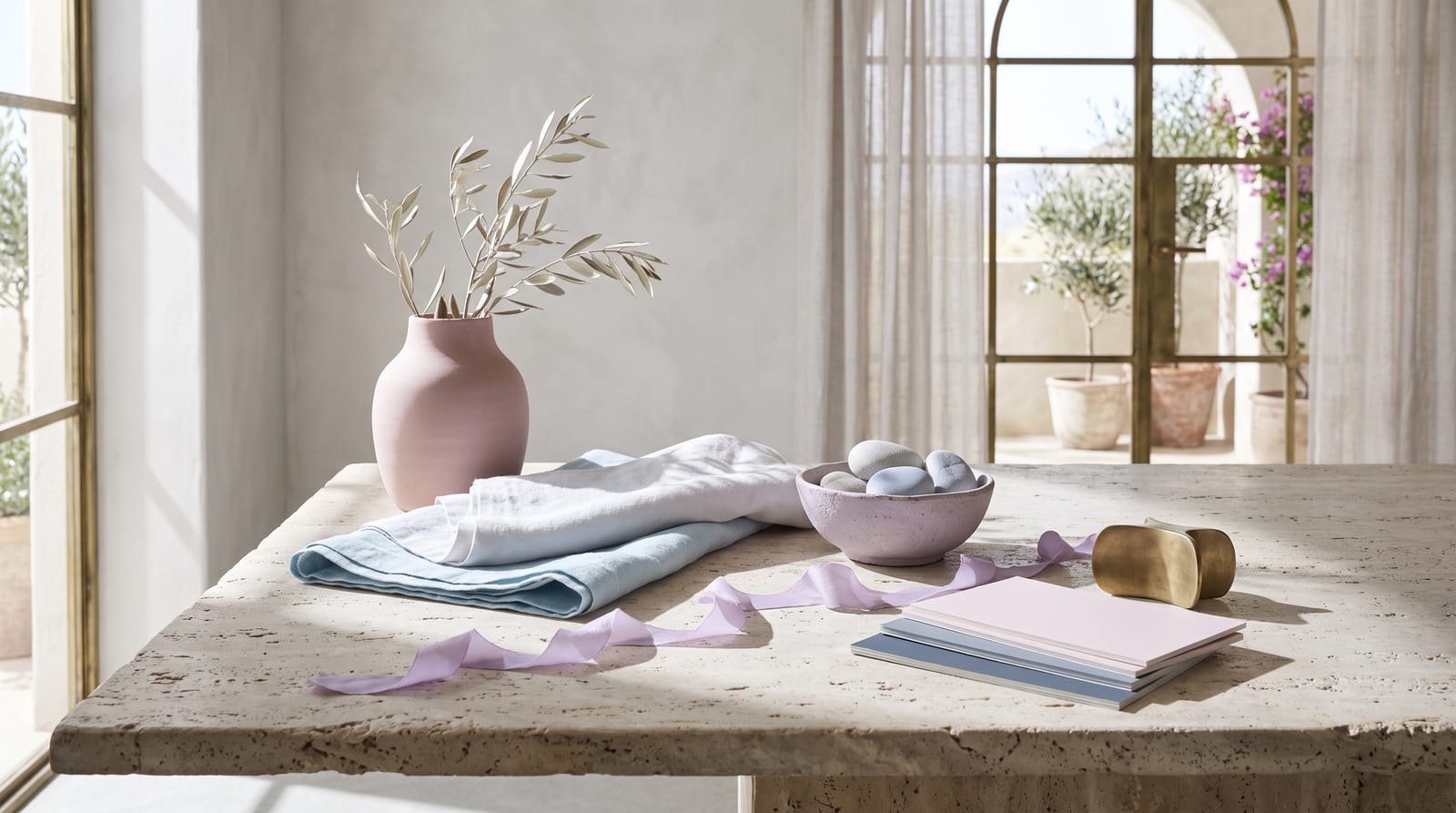
Light summer coloring is cool, light, and low in contrast. To see whether that's you, take the features one by one.
Hair. Light summers almost always have light hair with a cool, ashy cast. Think light ash blonde, dishwater blonde, or light ash brown, with no warm gold or red running through it. The hair doesn't go platinum-icy the way a bright winter's can, and it doesn't carry the honey warmth of a spring. If your natural color has been called "mousey" or "ashy" your whole life, that's the light summer signature, not a flaw.
Eyes. Light, cool, and slightly hazed is the pattern. Gray, soft blue, cool green, and grayed blue-green all fit. Up close the iris often shows a soft, crackled-looking texture rather than a sharp clear ring, and the color reads gentle even in bright light.
Skin. A light summer's skin is cool or neutral-cool, fair to medium, usually with a pink or soft beige cast rather than a golden one. "Cool but delicate" is the phrase most professional analysts reach for. You likely burn before you tan, and you look better in silver jewelry than gold.
Contrast level. Very low. Hold a photo of yourself next to a high-contrast outfit, stark black beside stark white, and the outfit will read louder than your whole face. Light summer contrast is soft across all three features. Nothing about the coloring pops; it blends.
Hitting three of the four makes light summer the likely answer. Warmer misses point toward light spring; deeper or brighter ones toward cool (true) summer. The comparison section below works through each of these.
Light summer across different skin tones
Fair, European faces dominate the seasonal-color literature, and the hair, eye, and skin descriptions above reflect that. The season isn't actually that narrow. What sets it is a cool-leaning undertone, low saturation, and light value with very low contrast. The first two of those have nothing to do with how light or dark skin is. The third one, value, is the genuine constraint. Light summer asks for an overall light, gentle coloring, and deep skin reads light in value far less often than fair skin does. So the season skews lighter than the others, but it's not fair-only.
The common mis-sort runs cool-to-winter: a cool, medium-depth complexion gets handed a "winter" label on sight. In color analysis, "dark" describes high-contrast features, dark eyes and hair set against much lighter skin, not the skin's own depth, and cool, soft, blended coloring belongs here even at medium depth. Whatever the background, the same signature shows: features that blur into each other instead of striking against one another, with skin, hair, and eyes reading as one quiet, cool harmony.
What it looks like in practice varies by background. A neutral-cool South Asian or Latina light summer tends to land at the lighter, rosier end of medium depth, with soft ash-brown hair and cool gray-green or soft brown eyes. East Asian light summer reads as cool porcelain to light neutral with low contrast and a slightly pink cast. On Black skin a true light summer is genuinely rare, because the value usually runs deeper than the season allows. The cool, low-contrast complexions that do qualify sit toward the lighter end. Across all of them the silver-beats-gold test holds, and so does the pastel-beats-jewel-tone one.
This matters more here than on any other season page: the deeper the skin, the thinner the record gets, and light summer is the least documented of all the summers at depth. The named color-analysis communities almost never type a person of color as light summer with any agreement. A few suggestions float around. Alicia Keys and Song Hye Kyo turn up on The Aligned Lover's list, but they don't converge across sources, so treat them as ideas, not anchors. That's a gap in who gets analyzed, plus the real value constraint of the season, not proof that cool low-contrast coloring belongs to one group. The drape test settles it at any depth. Hold a powder blue or soft gray against your face, then an icy white or a saturated jewel tone. One of them lets your skin breathe; the other swallows it.

The light summer color palette
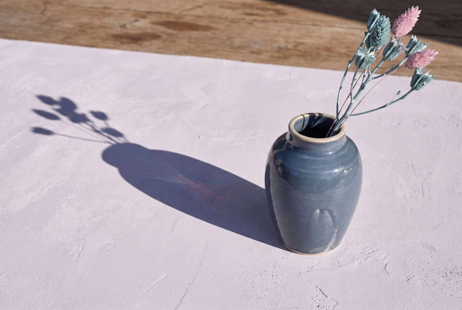
All 24 hex codes sit below, organized by role, in the cool, light zone: saturation roughly under 40%, value high (roughly 70-89% lightness for the main band, with the deeper grounds dropping to around 50%), hue leaning cool. To place those numbers, 70% lightness is a powder blue, 89% is an oyster just off white, and the 50% grounds are the slate of an overcast sky.
How to read this palette
Three roles make the grid wearable, and naming the role a color plays makes the shopping faster.
Anchors (the foundation, roughly eight colors). Soft oyster, powder gray-blue, dove gray, pewter, rosy gray. You'll reach for these more than anything else: roughly 60% of the wardrobe, the quiet base the accents sit on.
Accents (the personality, roughly 12 colors). Powder blue, periwinkle, cornflower, soft lavender, lilac, light rose, cool dusty pink, soft mint, cool teal, sky blue. Accents are where a light summer wardrobe gets interesting without breaking the gentle register. One clear accent per outfit is the thing light summer is actually told to include, so the palette doesn't go flat.
Grounds (the depth layer, roughly four colors). Slate blue, cadet blue-gray, cool pewter gray, muted plum-gray. These replace black and navy. They're the shoe, the coat, the trouser that creates depth, and the key word is medium. A light summer ground sits around 50% lightness, not 10%. It anchors the look without spiking the contrast the whole season is built to avoid.
Put together a head-to-toe outfit from anchors and one accent only, and judge it honestly. If it feels complete with no hard dark and no stark white, you're working inside the light summer band correctly. If the look feels like it needs black to "finish" it, you've wandered into a different season's rulebook.
Every hex here would lose against pure black placed beside it. The colors want each other's company, not a high-contrast referee. Pair a powder blue with a soft rose and the eye reads them as a set. Pair the same powder blue with jet black and the eye reads the black and forgets the blue.
Neutrals for light summer
Light summer's five everyday neutrals run cooler than autumn's beige-and-camel range and lighter than a winter's charcoal-and-black, which is the whole point.
: the "white" of this season. Reach for this before pure #FFFFFF, which reads too stark against gentle coloring.
: the foundation neutral. It takes any accent in the set.
: the softest neutral, a cool gray with a breath of pink in it. Works where beige would in a warmer wardrobe.
: the mid-tone neutral. A blazer, a trouser, a knit.
: the deepest neutral. This is the light summer answer to black. It grounds an outfit without turning the contrast up.
Those five and the 19 accents above cover the whole wardrobe.
Colors to avoid
Five colors break this palette on contact:
: too dark. The contrast overpowers low-contrast coloring and drains the face. Swap for slate blue #7E94AE.
: too warm. The golden undertone clashes with cool skin and turns it sallow. Swap for dove gray #BFC4C9.
: warm and saturated at once, the double clash. Swap for cool teal #8FC5C2.
: too warm and too bright for this gentle register. Swap for soft lavender #B6A9D0.
: cool enough in hue, but far too saturated. It overwhelms the whole face before any other color gets a word in. Swap for light rose #E3BFC8.
Dark, warm, or louder than roughly 60% saturation: those are the three ways to break this season. Black breaks it on depth, camel and gold break it on warmth, and fuchsia breaks it on pure loudness even though the hue is technically cool. None of them is a bad color. It's this coloring they fight, nobody else's. The fuchsia that flattens a light summer will look stunning on a bright winter.
Celebrity examples
A short list of names lands as light summer across the color-analysis communities that publish typed celebrity lists: theconceptwardrobe, four seasons studio, truth-is-beauty, and Spicemarket Colour. Every anchor below appears on three or four of those lists independently, which is the standard this section holds to.
Cate Blanchett. Her name shows up on essentially every list. Fair, cool, slightly pink skin, light blue eyes, and the kind of low contrast that lets soft, cool color read as radiance instead of effort make her the season's reference face. The truth-is-beauty writeup puts it bluntly, betting she keeps a light summer swatch book. Her best looks are pale pinks, cool blues, and soft pastels; her worst are anything too dark or too warm. When a stylist drops her into deep saturated color for an awards red carpet, the gown reads first and Cate reads second. Use her as the calibration point for light summer at a fair depth.
Reese Witherspoon. Cool ash-blonde hair, clear light eyes, and fair cool skin make her the season's classic blonde. The silver-versus-gold test reads cleanly on her: in cool, light summer color her skin looks clear and her eyes lift, and in warm gold tones the same face goes slightly murky. She's the example to study if you're blonde and can't tell whether you belong in spring or summer. The answer is in whether warmth helps or hurts, and on Reese, warmth hurts.
Margot Robbie. She carries a touch more brightness than most light summers, which is why the named lists keep her here rather than in spring. Cool fair skin, light eyes, and blonde hair that goes ashy at its best hold her on the summer side. She's the proof that light summer is allowed one clearer note. The season tells you to include at least one brighter color, and Margot in a clean powder blue or cool rose is what that instruction looks like in practice. Push the same styling warm or dark and the effect collapses.
January Jones and Naomi Watts. Two more that recur across the lists, both at the cooler, blonder end of the season. January Jones is most often typed light summer, though some analysts, truth-is-beauty among them, read her as the warm sister, light spring. Naomi Watts lands cleanly in light summer, soft and cool rather than bright or deep. Neither carries the heavy contrast that would push them into winter, which is the exact distinction this season turns on.
A few names sit on some lists but not others, and the disagreements cluster in one place: the light summer to light spring border. Gwyneth Paltrow gets typed as both, with at least one analyst going back and forth before settling on summer. Billie Eilish and Dakota Fanning are sometimes pulled toward light spring as well. The split is almost always about warmth, not depth. A light, low-contrast person who can carry a hint of warmth gets read as spring, and one who can't gets read as summer. Treat those names as edge cases rather than anchors.
Those anchors skew fair, which is a limit in how the color-analysis world documents its examples and, for this season specifically, a limit of the season's own light-value requirement. Light summer at deeper skin is barely recorded, more so than any other summer. You don't need a match on the list. You need the four readings: cool undertone, low saturation, light value, and contrast that blends rather than strikes.
Makeup and wardrobe recommendations
The makeup drawer follows the palette's settings: cool undertones, soft saturation, light depth.
Foundation. Cool or neutral-cool undertone. Avoid anything labeled "warm," "golden," or "honey." In MAC's system the NW range, which pulls pink, tends to suit cool light summer skin, while the golden NC range fights it. The general move across brands is to choose the cooler, pinker option whenever a shade comes in a warm/cool pair, and to test it in daylight rather than warm store lighting.
Lip. Soft rose, cool pink, dusty mauve, soft berry, muted plum-pink. The sweet spot is "cool and soft," not bright and not warm. A sheer cool berry such as Clinique Black Honey reads gentle enough to fit, and most "your lips but better" shades work as long as they lean cool. Avoid true coral, brick, and orange-red; they pull warm against the skin and drag the color off the face.
Eye. Soft taupe, cool slate, pewter, soft lavender, muted rose, and gentle gray-blue. Shimmers should be silver or cool pearl, not gold. A cool-rosy neutral palette like Urban Decay Naked3 sits in the right register. Avoid warm bronzes, coppers, and anything in the orange-toned register; they fight the cool undertone every time.
Jewelry. Silver, white gold, platinum, and cool-toned rose metal. The rule is temperature matching, and light summer runs cool, so cool metals land. Yellow gold pulls warmth into the face and quietly fights the cool undertone. If you want a warmer-looking metal, a muted rose gold is the closest you can get without breaking it.
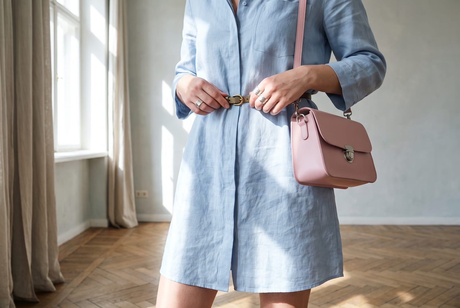
Wardrobe basics (everyday). Dove-gray knit, powder-blue shirt, soft-oyster trouser, slate-blue coat, cool rosy-gray blazer. All of them sit inside the palette, with black, stark white, and neon left out entirely. Retailers with a soft, cool seasonal palette tend to carry pieces that sit naturally in this band, especially in their spring drops where pastels run cool.
Wardrobe accents (statement pieces). A periwinkle scarf, a soft-lavender blouse, a light-rose knit, a cool-mint cardigan, a sky-blue dress. These bring color without spiking saturation, and one clear accent is what keeps a light summer wardrobe from going washed out.
Prints and patterns. Tonal pastel florals, low-contrast cool stripes, soft watercolor prints, fine cool checks. Scale should be small to medium with low internal contrast. Avoid bold graphic prints with stark black-and-white contrast; the contrast overrides light summer coloring before the color can do anything.
For a wardrobe built on these principles, generate a palette in the Light Summer direction and use the hex output as your shopping filter.
Hair color for light summer
If you color your hair, carry the season's settings into the chair: stay cool, keep it light, and don't stray far from your natural depth. The whole season runs on low contrast, so hair a few shades off your skin in a cool direction reads as harmony. Hair pushed warm, gold, or jet black reads as a fight.
The directions that work are cool and soft: ash blonde, cool beige blonde, mushroom brown, and light ash brown. Colorists speak in levels, from 1 at black to 10 at the lightest blonde, and light summer lives in roughly the 6-to-9 band. Light ash and beige blondes sit at levels 8 to 9, cool light browns at 6 to 7. Say it to your stylist in their language: "a level 8 cool beige blonde, no gold," or "a level 6 or 7 ash brown, kept cool."
Make "no gold" the sentence they remember. Ash, beige, and mushroom are the tones to name; warmth and brass are the ones to veto, because a single warm gloss can turn a good cool color brassy on light summer skin. Unlike a warm season, light summer should keep the purple toning shampoo in rotation; it holds the cool the season depends on.
Each of these breaks one of the two rules the palette runs on. Jet black, blue-black, and very dark brown break the light, low-contrast rule, too deep for coloring this gentle. Warm gold, honey, copper, and auburn break the cool rule and leave the skin looking tired. Platinum that goes truly icy-white can also break the contrast rule by being brighter than the face, so cool-but-soft beats cool-and-stark.
For highlights, keep them low-contrast and cool: fine ashy or beige balayage no more than two or three levels off the base. Chunky high-contrast streaks undo the blended look the season runs on. Light summer also gets a gift the warm seasons don't. Arriving gray reads as a cool silver blend that often suits a light summer beautifully, where it would wash out an autumn. Cool gray is on-palette here.
Comparison with adjacent seasons
Four neighbors get confused with light summer most often. A single dial separates each pair.
Light summer vs cool summer (the depth dial). Both are cool and both are summer, so the tiebreaker is value. Cool summer (the true summer at the center of the family) runs deeper and a touch more saturated than light summer. If your coloring can carry a medium-depth cool blue or a soft burgundy without being weighed down, you're likely cool summer. If those same colors feel heavy and a powder-blue feels right, you're light summer. Hold a deep cool teal against your face, then a powder blue. Whichever one your face wins against, rather than disappears under, names your season.
Light summer vs soft summer (the saturation dial). Both are cool and light-ish, so the dial here is mutedness. Soft summer is grayer and more blended, its colors dusted down toward neutral. Light summer keeps a little more clarity and is told to include at least one brighter note. If your best colors are hazy and muted, you're soft summer; if a clean powder blue lifts you rather than overwhelming you, you're light summer. The two share a lot of wardrobe, which is exactly why people mix them up.
Light summer vs light spring (the warmth dial). This is the most common light summer mis-type by a wide margin. Both seasons are light and low-contrast, so the only thing separating them is undertone. Light spring is warm: its pastels are peachy, its blues lean green-warm, its neutrals are ivory and cream. Light summer is cool: its pastels are powder and rose, its blues lean true-cool, its neutrals are gray. The cleanest decider is the metal test. Light summer faces brighten under silver; light spring faces brighten under gold. If you're warm and light but your color reads muted rather than clear, the fork is actually toward soft autumn instead, the warm-muted mirror of this season.
Light summer vs the summers that don't exist (the season-name trap). People reach for "bright summer" or "deep summer" to describe a cool person who can carry more saturation or more depth, but the standard 12-season system has only three summers: light, true (cool), and soft. There's no bright summer, because brightness past a point lands you in a winter, not a summer. There's no deep summer either. A cool, deep, blended coloring is a cool winter or a soft season, not a "deep summer." If you're cool and you keep circling those made-up labels, the real question is whether your depth and contrast belong in summer at all. The full 12-season chart, with every neighbor mapped, lives on the seasonal color analysis hub.
Frequently asked questions
How do I know if I'm a light summer? Check three anchors: your hair should be light with a cool, ashy cast, your eyes should be light gray, blue, or cool green, and your skin should be cool or neutral-cool and low in contrast. If three of three match and stark black looks heavy on you, you're almost certainly light summer. If two match and the rest skew warmer, compare yourself against light spring instead.
Can light summer wear black?
Not well. Pure black #000000 is too dark for low-contrast coloring and creates a contrast the face can't match, so the black wins and you recede. Use slate blue #7E94AE or a cool medium gray as the functional substitute. Black is fine in small doses, a shoe or a bag, but not as the main garment near your face.
Can light summer wear white?
Soft white, yes; stark optic white, not really. Pure #FFFFFF is bright and hard enough to flatten gentle coloring, the same way black overwhelms it from the other direction. Reach for soft oyster #E6E2E6 or a cool off-white instead. It gives you the clean, light look without the harsh edge.
What's the difference between light summer and light spring? Temperature. Both are light and low-contrast, but light spring is warm (peach, ivory, warm-leaning pastels) while light summer is cool (powder, rose, gray-based neutrals). The fastest decider is the metal test: light summer skin brightens under silver, light spring skin brightens under gold. Get that answer and the palette follows from it.
Is light summer warm or cool? Cool. The "light" in the name describes value, not temperature. Light summer's undertone is cool (blue and gray leaning), just lighter and softer than a true summer or a winter. Cool is the secondary trait; light is the primary one.
Is there a "bright summer" or "deep summer"? No. The standard 12-season system splits summer into light, true (cool), and soft. There's no bright summer, because high brightness pushes you into the winter family, and no deep summer, because deep cool coloring reads as a winter or a soft season. If you've been calling yourself a "deep summer," you're most likely a cool winter or a soft summer instead.
Can light summer have deep skin? Rarely. Light summer is set by undertone, saturation, and value, and the value requirement is the catch: the season asks for overall light coloring, and deep skin reads light in value far less often. Cool, low-contrast, medium-depth complexions can absolutely be light summer, but the truly deep end usually belongs to a cool winter or a soft season. The mis-type to avoid is the opposite one, reading every cool complexion as winter on contrast alone.
What's the best metal jewelry for light summer? Silver, white gold, and platinum. The rule is undertone matching: light summer runs cool, so cool metals land. Yellow gold pulls warmth into the face and reads slightly off even when the wearer can't articulate why. If you want a warmer look, a muted rose gold is the closest you can get without breaking the cool undertone.
Can men have light summer coloring? Yes. The system sorts coloring, and gender plays no part in it. Men with light ash hair, cool light eyes, and cool low-contrast skin fit the light summer profile the same way women do, and the dial settings are identical. In menswear it reads as soft grays, powder and slate blues, cool light knits, and ash-toned tailoring, with stark black-and-white shirting and warm earth tones being the things to skip.
Disclosure: BrandColors makes the color-palette generator linked in this guide. The seasonal typings and palettes above are drawn from the external color-analysis sources named throughout (theconceptwardrobe, truth-is-beauty, Spicemarket Colour, and others), not from our product. Last updated July 24, 2026.
Related palettes: Soft Summer · Cool Summer · Soft Autumn · Seasonal color analysis hub