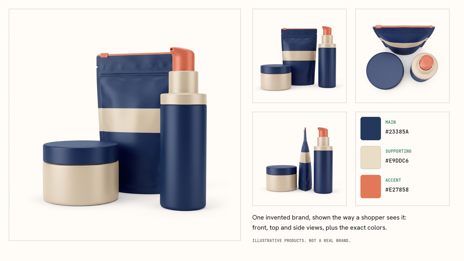
Three. One main color, one supporting color and one accent. Add black or white for text and backgrounds, and you're done.
That's the working answer for a founder running a consumer brand with a small team and no design department. It isn't a law. There's no universal right number, and anyone who sells you one is selling a myth. But three is a useful working number, and it's one you can actually manage.

What real brands do
We keep a database of more than 5,000 real brands and the colors on their sites. Each brand is recorded with a primary color, a secondary color and an accent, plus a light and a dark neutral.
About 31% of the brands you can browse in the BrandColors Explorer have no accent at all. That's 1,555 of 5,062, counted 29 September 2026. They run on two colors. The rest have all three.
Two limits on that number. The database records three brand colors per brand, so it can't show a brand using four. And it counts what a brand's site shows, not what its brand guide says. Read it as "what founders ship," not "what designers recommend."
Three real brands
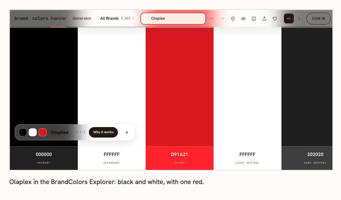
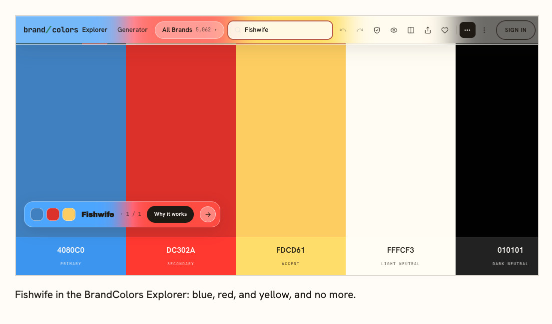
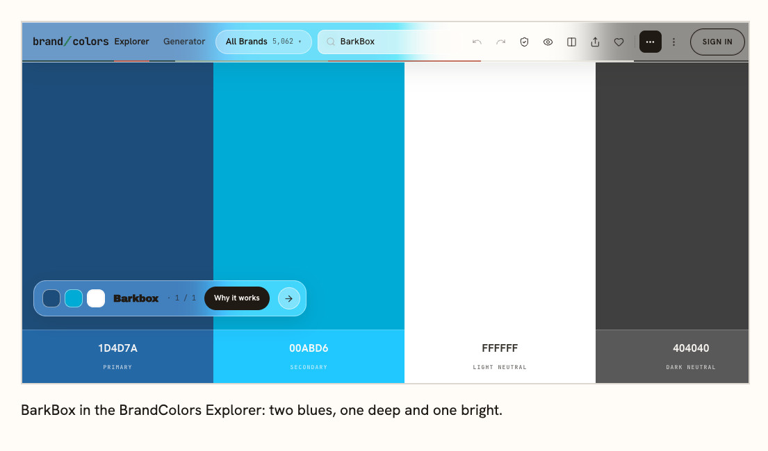
The swatches are the colors our database records for each brand. Live sites drift a little, so treat the hex codes as close, not exact.
Olaplex (hair care) runs on black and white, with red as its one accent. The red shows up rarely, so it's the color you notice.
Fishwife (tinned fish) shows the three-color case: blue, red and yellow. It's a bolder mix, and it's still three.
BarkBox (pet subscription) is built on two blues, a deep navy and a bright one. Promotions add other colors now and then, but the blues carry the look.
Why three works
The easiest way to manage three colors is to give each one a job.
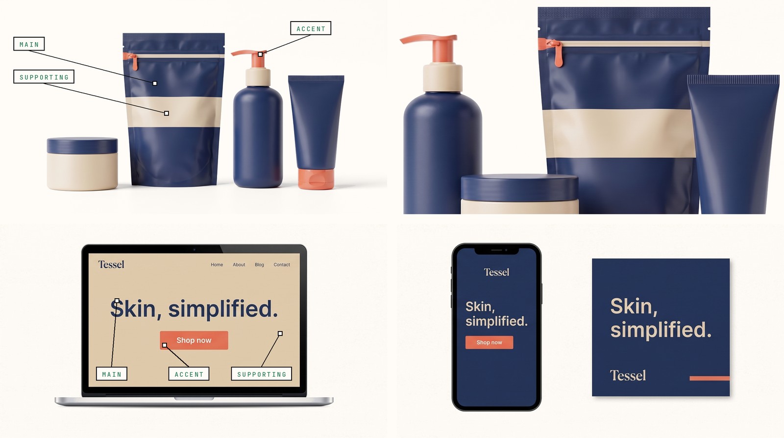
The main color is the one you want people to associate with you. You'll usually see it where the brand shows up most: the logo, the packaging, the key parts of the site. Ask a customer to describe you by color and this is the one they should name.
Your supporting color has a quieter job. It might sit behind text, fill a card or give the main color room to breathe. It's often a softer or darker cousin of the main one.
The accent is the color you use sparingly. On a site, that might be the button you want clicked. On a pack, it might be the flavor name or one small detail you want noticed. Put it on everything and it stops being an accent.
Text and backgrounds run on neutrals (near-black, near-white and a gray or two), and those don't count toward your three.
When one color is enough
A single strong color plus black and white is a real choice. Some brands with a memorable look use exactly that. If your product photography carries color already (food, flowers, clothes), a quiet palette lets the product be the loud part.
When to go past three
Add a color when you have a job for it, not when the palette feels thin. Two reasons:
- Product lines that need to be told apart. Three flavors, three scents, three sizes. Give each line its own color, and keep your main color on the logo so they still read as one brand.
- Charts and app screens. Software needs status colors (green, amber, red). Keep them separate from your brand palette, and don't count them toward your three.
Past five colors, it gets hard to give each one a job, and the palette starts to feel like a mood board. If you can't say what each color is for in a sentence, cut it.
Where founders get this wrong
Most founders we hear from didn't pick their colors on purpose. They came with a Canva template, a Shopify theme or a freelancer's taste. The result isn't usually too many colors. It's colors with no jobs: two blues that almost match, an accent used on everything, a main color nobody would recognize without the logo.
The fix is deciding which color is main, which is supporting and which is the accent, then using each one where it belongs. You rarely need a new palette for that.
What the research says (and doesn't)
No study we've found tests how many colors a brand should have, so nobody can honestly give you a proven number.
What research does support is smaller. A 2013 study in PLOS ONE (Kimura and colleagues) showed food and drink logos to 14 and then 17 university students in Japan. People's memory of a logo's color showed up only for brands they knew well, not for brands they barely knew. It's a small study, and it doesn't say how many colors are right.
The useful part for a founder is simpler. Color becomes familiar through repetition, and a smaller palette makes that easier to do consistently.
We're also cautious about rules like "blue builds trust" or "red creates urgency." Context matters too much to build a palette on claims like that.
How to pick yours
- Start with your category, not a color wheel. Look at the brands your customer sees next to you and note which colors keep showing up.
- Decide whether to sit inside that pattern or move away from it. Neither is wrong. It's a choice, so make it on purpose.
- Choose the color that should lead your brand. If customers already know you by a color from your logo or packaging, start there unless you have a hard reason to leave it.
- Give the other colors jobs. One supports. One gets used sparingly.
- Try the palette where it has to work: on the pack, on the site and next to your product photos. Then write down what each color is for, one sentence each.
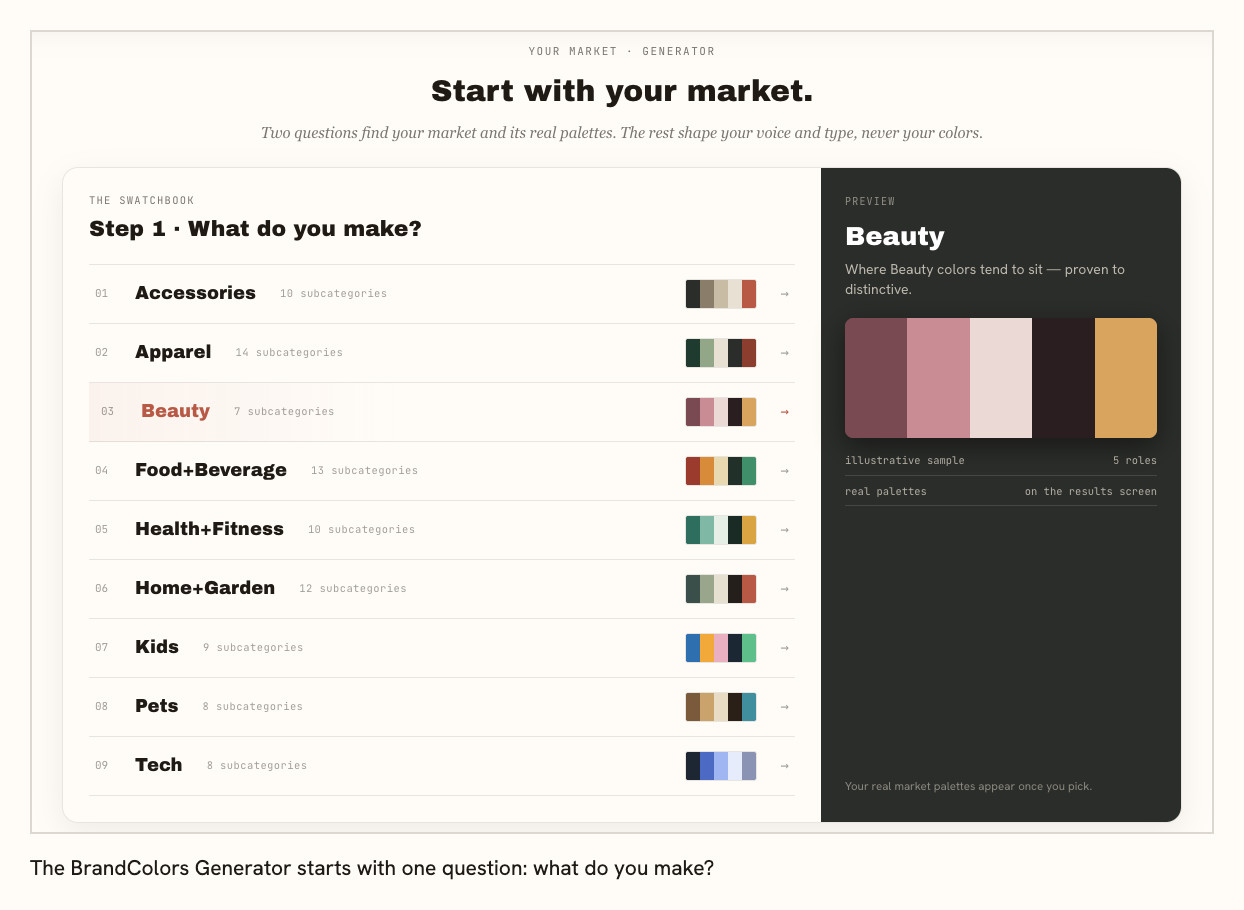
The BrandColors Explorer shows you the palettes real brands in your category use, so step 1 takes minutes instead of an afternoon. The Generator builds a three-color palette checked against them.
FAQ
How many colors should a logo have? Usually fewer than the brand itself. A logo has to survive at tiny sizes, in one color and on both light and dark backgrounds. Don't force all three brand colors into it just because you have them.
How many colors should a website use? Start with the same palette. Don't invent a second set of colors because you're building a site. Your neutrals can do most of the page work. Save the brand colors for the places you want noticed.
Is one color enough for a brand? Yes, if it's distinctive and you use it everywhere. Add black and white for text and backgrounds.
Do neutrals count as brand colors? Usually not. Black, white and grays support the palette. If a neutral is what people remember you by, treat it as your main color.