To choose brand colors, start with your category. Look at the colors the brands next to yours use, and decide whether to sit inside that pattern or move away from it. Then pick one main color and give every other color a job. That's the whole method.
There's no formula that hands you the right color, and anyone selling one is selling a myth. If your colors came from a template, a theme, or a freelancer's taste, here is how to choose brand colors on purpose, even with no design department.
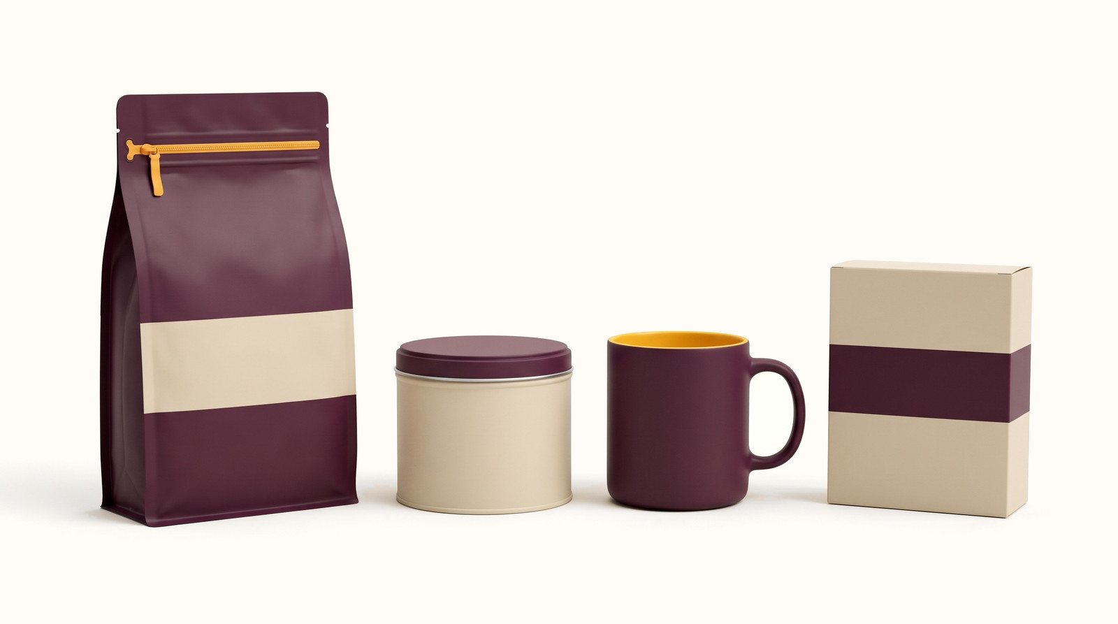
How to choose brand colors: the short version
- Look at the brands your customer sees next to you, and write down the colors that keep showing up.
- Decide whether you'll sit inside that pattern or move away from it, and be able to say why.
- Pick the main color first. It's the one people should name when they describe you.
- Give every other color one job, such as backgrounds or the one button you want clicked.
- Put the palette on a pack, a site, and a phone before you commit to it. Three swatches on a white page prove nothing yet. The real test is whether the palette still works on the things you'll actually sell.
Start with the brands next to you
Your customer never sees your colors alone. They see them next to two or three other brands in a search result or a feed. So the first job is to know what those brands look like.
We keep a database of more than 5,000 real brands and the colors on their sites. A brand's lead color is the main color our database records for it. Of the 5,062 brands you can browse in the BrandColors Explorer, 39.0% lead with black or near-black, which is 1,973 brands. Another 17.7% lead with blue, which is 894. Together that's more than half of everything we track. We counted each brand's lead color on September 29, 2026 and filed it with the same color-family rule the Explorer uses. Live sites change, so treat the counts as a snapshot.
Plenty of good brands live in black and blue. Neither color sets you apart on its own, though. If you choose one, choose it on purpose. The Explorer filters by category, and seeing your own category takes a few minutes.
Three brands, three choices
We can't know why these brands picked their colors. We can see the effect: each one uses color to solve a different problem. The swatches are the colors our database records for each brand. Treat the hex codes as close, not exact. Every one of these palettes is in the Explorer: search a brand's name and you get its recorded colors, with the hex code and role for each.
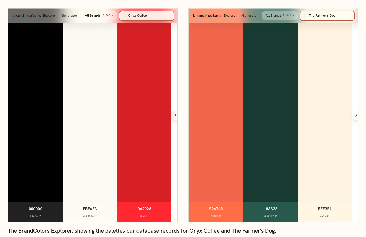
Onyx Coffee sits inside the pattern
Coffee's lead color is most often black or near-black, and Onyx goes with it. Its site runs on black and a warm off-white, with a red used in very small places. The category look is the base. The red is the part you remember.
Dieux sits inside, then hands the color to its products
Skincare also leads most often with black or near-black. On its site, Dieux runs on black and a pale gray-blue. Each product wears its own color instead: white, green, mint, and navy tubes on the home page. The brand stays quiet so the products can be told apart.
The Farmer's Dog moves away
Blue is the most common lead color among the pet food brands we track. Chewy, Petco, and Blue Buffalo all lead with it in our database. The Farmer's Dog's site uses coral and a deep green on a warm cream. In a row of blue logos, the coral one is easy to find.
Sit inside the pattern or move away
Sitting inside a category's pattern tells the customer you belong in it, so they work less to place you. Moving away tells them you're different, and asks them to notice.
The risk you face decides which to use. If you're new and every competitor looks alike, not being noticed is the bigger risk, so move away. If you sell to a careful buyer who wants the category's rules followed, not being trusted is the bigger risk, so sit inside. You can also do what Dieux does: sit inside with the brand and stand out through the product. Make the call before you pick a color, or your category will make it for you.
Pick the main color first
The main color is the one you want people to name when they describe you. Choose it before anything else, because every other color gets chosen in relation to it.
If customers already know you by a color from your logo or your packaging, start there unless you have a hard reason to leave. A color people recognize took time to build, and a switch spends it.
If you're starting fresh, pick two or three candidates and test each one the same way. Put your product photo next to two competitors' in a single image. If you can find yours in a second, it's a candidate. If it disappears or clashes, move on.
Give the other colors a job
Once the main color is set, the rest follow from it. The supporting color sits behind text, fills cards, and gives the main color room. The accent gets one job, usually the thing you most want clicked or noticed.
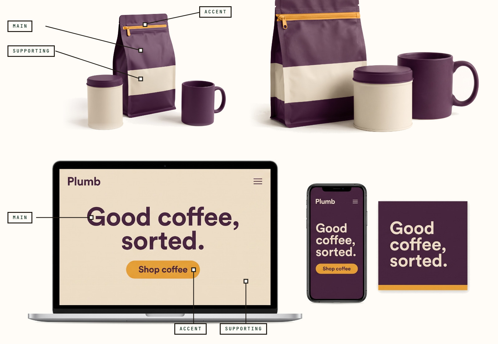
Take Plumb, an invented coffee brand we made so you can see the three jobs without borrowing a real company's look. Plum leads on the bag, the mug, and the ad. Oat carries the page behind the headline and the band on the pack. Saffron appears on the zipper pull, the mug lining, and the Shop button. It's almost nowhere else. We cover why three is a useful number in How many colors should a brand have? It also says when to go past three.
Test your brand color palette on real things
A palette that looks good as three squares can fail on a pack or a phone. Put it where it has to work. That means the front of a pack, your home page on a phone, and a social ad next to your product photos.
Check text first. The web accessibility standard, WCAG 2.1, sets a floor. Normal-size text needs a contrast ratio of at least 4.5:1, and large text needs 3:1 (W3C). We ran Plumb through that math. Plum (#4A2545) text on oat (#EADFCB) is 9.7:1, and plum text on saffron (#E8A33D) is 5.9:1, so both pass. Saffron text on oat is 1.6:1, which fails. That's why saffron works as the fill of a button and stays off the text. Any light accent needs the same check.
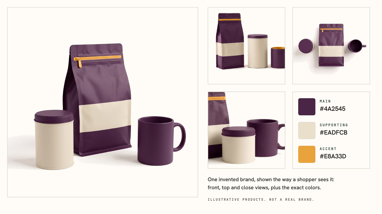
Then shrink it. Look at your pack at thumbnail size, the way it appears in a search result or a cart. If you can still tell which color leads, it'll hold up.
We make the Explorer and the Generator, so we're not neutral about them. The Explorer shows the palettes real brands in your category use. The Generator builds a three-color palette checked against them.
What one study says, and what nobody has tested
No study we've found tests which colors a brand should pick, so nobody can honestly give you a proven answer.
One study is useful for this decision. Song, Xu, and Jiang ran four experiments on how colorful a logo is. They used US adults, Hong Kong undergraduates, and made-up brands. Each experiment had 125 to 402 people (Psychology & Marketing, 2022; we read the author manuscript). A more colorful logo made people think the brand sold more variety. That lifted opinion of a store described as a general one. With 402 adults, a colorful logo scored 6.89 out of 9 and a one-color logo scored 6.18. For a store described as a specialist, the logo made no difference: 6.25 and 6.35.
If you sell a wide range, a colorful palette can read as variety. If you sell one focused thing, extra colors didn't help in this study. The limits are real: invented brands, candy, and a made-up electronics store, and no test of any particular color. Nothing here supports rules like "blue builds trust."
Four mistakes when choosing brand colors
A word like "trustworthy" or "fresh" doesn't point to one color. Choosing from a mood word usually lands on the category default. Look at what the brands you admire in your own category did instead.
A color that looks great alone can fail on the pack. That's why the test above belongs before the decision.
Copying the category leader's exact color reads as a knockoff. Launch a pet food brand in Chewy's blue (#1c49c2 in our database) and you'll look like a copy of Chewy. If you want to belong to a family of colors, take the family. Then change the hue, the balance, or the accent.
Leaving the exact colors unwritten is the quiet one. Plumb's main color is #4A2545. Call it "a nice plum" instead. It turns into three different plums across the pack, the site, and the ads. Write down the hex codes and hand them to everyone who makes anything for you.
FAQ
How do I choose brand colors for my business? Start with your category: note which colors the brands next to you use. Decide whether to sit inside that pattern or move away. Then pick one main color and give each other color one job. Test the palette on a pack, a site, and a phone.
What if customers already know my current colors? Keep them unless you have a hard reason to leave. Recognition builds through repetition, so a switch spends something you've already earned. If you do change, keep one anchor, such as the main color or the logo shape. Move the rest.
Should my brand colors match my competitors'? Only if you want to look like them. Sitting inside a category's pattern is a fair choice, and copying one brand's exact colors isn't. Stay in the same family if you want to belong. Then change the hue, the balance, or the accent so people can tell you apart.
Does color psychology help me choose brand colors? Less than most guides claim. The research we found is about fit and context. One example is whether a colorful logo matches a broad range of products. None of it says a color carries a fixed meaning for every buyer, like "blue means trust."
How do I know if my brand colors are working? Show a few customers your pack next to two competitors' for one second, then ask which one they remember. If they name yours and mention its main color, it's working. If they can't, your colors probably have no jobs yet.