Cool summer is the season people keep handing to winter by mistake. The logic sounds right: cool undertone, blue-based, no warmth in sight, so it must be a winter. But temperature and brightness are two separate readings, and cool summer only turns one of them up. Winter runs cool at full volume. Cool summer runs exactly as cool with the volume pulled down: saturation kept soft, value (the light-to-dark scale a color sits on) resting in the middle. Same cool. Different volume.
The cool summer color palette follows that setting. It's built on a blue-based undertone with no yellow in it. Value stays medium, rarely going very light or very dark, and the saturation is soft and dusky, never tipping into winter's snap. Slate blue instead of royal blue. Cool rose instead of fuchsia. Then mauve, dusty navy, gray-green, plum, and cool teal, all with the brightness turned down. Cool summer is also called true summer, the original summer of the four-season system, and the two names point at the same coloring.
This guide covers who cool summer fits, the 24 hex codes that map the palette, the colors to avoid, and the celebrities typed cool summer by the communities that publish lists. Maybe you've been told you're a winter, but jet black and icy brights keep flattening you, and the "dramatic" makeup palette a consultant sold you sits untouched in a drawer. The reading to re-check is brightness, not temperature. Cool was never the problem.
Who cool summer fits
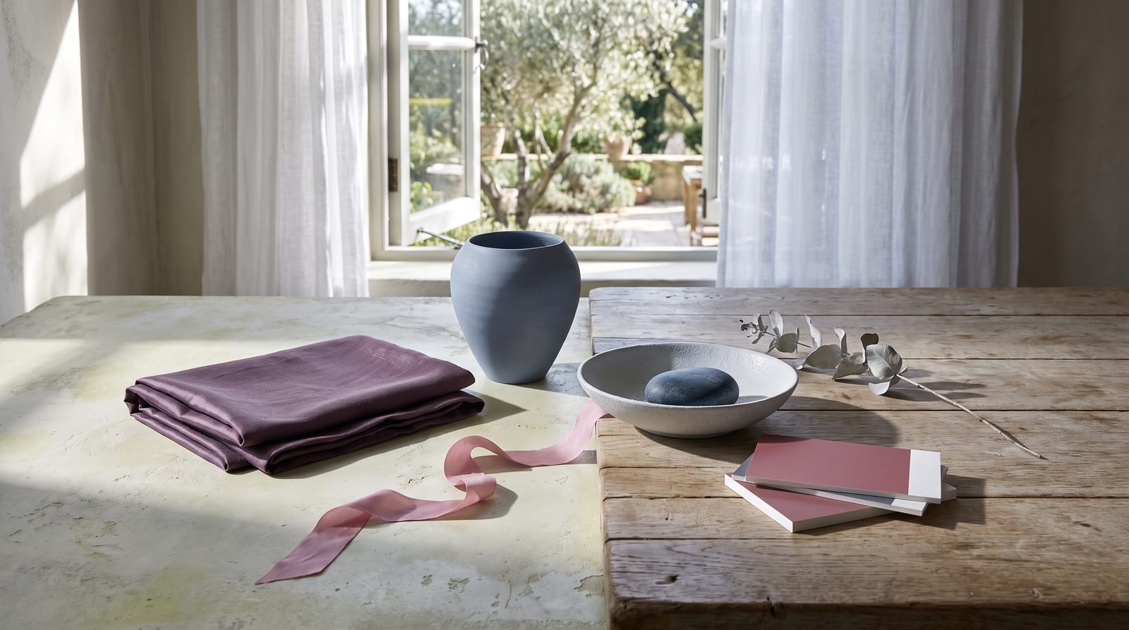
Cool summer coloring is cool, medium in value, and soft rather than sharp. Each of those words maps onto something you can check in a mirror: your hair, your eyes, your skin, and the contrast between them.
Hair. Cool summer hair is ashy and medium, with no warmth in it. Think cool light-to-medium brown, ash brown, or dark ash blonde. There's no golden glow, no auburn, no natural sun-streaks. If a stylist has ever called your hair "mousy" or "no real color to it," that flat, cool quality is the tell. The hair can run fairly dark, but it stays cool the whole way down.
Eyes. Soft blue, cool gray, gray-green, and gentle hazel are the common cool summer eyes. On deeper coloring they read as a softly grayed brown. Whatever the color, the eye looks hazy rather than clear up close, its saturation pulled back even in bright light. Cool summer eyes don't sparkle the way a winter's do.
Skin. A cool summer's skin carries a cool undertone, the tint sitting underneath the surface: blue, pink, or cool-beige rather than golden. The skin reads soft rather than vivid. Silver jewelry sits more comfortably against it than gold. You likely burn before you tan, and stark white at the collar tends to drain you a little.
Contrast level. Low to medium. Contrast is the distance between your darkest feature and your lightest one, and cool summer keeps that distance short. Hold a photo of yourself next to a true high-contrast look, stark black against stark white, and the outfit shouts while you stay quiet. The gap between your hair, skin, and eyes is gentle, not graphic.
Matching three or four of those puts cool summer squarely in reach. When you miss, the direction of the miss matters more than the count: brighter, higher-contrast misses point toward winter, warmer ones toward soft autumn. The comparison section below works through both forks.
Cool summer across different skin tones
The hair, eye, and skin descriptions above lean toward lighter, European coloring, because that's who most of the seasonal-color writing was built around. The season itself is wider than that. Three readings set it: a cool, blue-based undertone, soft rather than bright saturation, and medium value with low contrast. None of the three says anything about how light or dark the skin is. Cool summer exists at every depth.
The trap is reading deep cool skin as automatically a winter. In color analysis, "winter" means high brightness and high contrast, not deep skin. Plenty of people of color get filed under cool winter on the strength of a cool undertone alone, when their real coloring is cool and soft and blended. The giveaway holds across every background: your features melt together instead of snapping apart. Skin, hair, and eyes read as one cool, slightly grayed harmony, not a sharp dark-on-light contrast.
The specifics change from one background to the next. A cool summer with East Asian coloring often reads as cool neutral-beige, with soft, hazy dark eyes and cool-black hair that has no blue-bright shine to it. On Black and deeper skin, cool summer shows up as a cool, low-contrast, warmth-free softness. Soft cool roses, dusty blues, and slate light the face, while the icy, high-voltage brights you'd expect to suit a winter actually overpower it. Latina and Middle Eastern cool summers tend to land in cool-neutral medium complexions, with ash-toned brown hair and soft, cool eyes.
The record thins as skin deepens, and cool summer is written up even more narrowly than the warmer seasons. Most deeper-skinned people with cool, soft coloring get typed cool winter instead, because analysts read depth as brightness. That gap comes from who gets drafted onto the lists; the season itself skips nobody. A drape test settles it at any depth. Hold a soft slate or cool rose against your face, then an icy bright white or a saturated jewel tone. One pair lets your skin settle; the other takes the picture over. Silver suiting you better than gold confirms the cool undertone. Fairness never enters into it.

The cool summer color palette
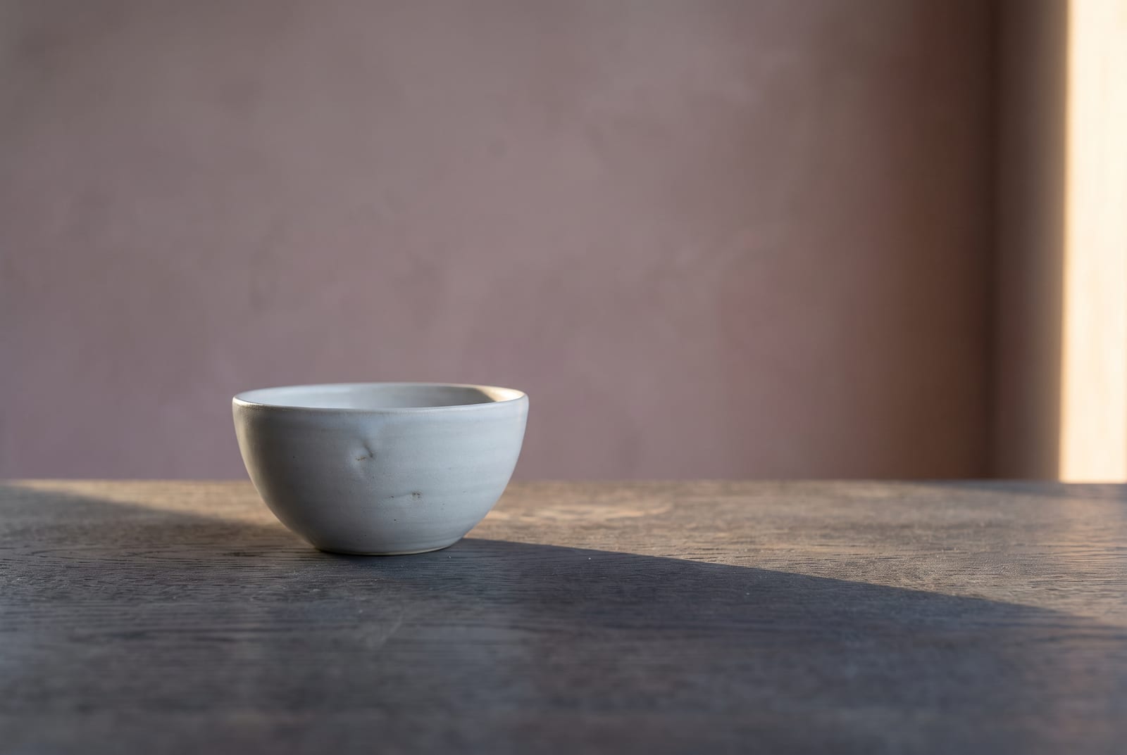
The palette runs to 24 hex codes, grouped by the job each color does in a wardrobe. Every one of them sits in the cool, soft zone: saturation roughly 20 to 45%, lightness roughly 45 to 75%, hue held firmly cool with no yellow. On fabric, those numbers have a feel. A 20% saturation is a gray with a hint of color in it; 45% is a clear-but-quiet slate blue. A 45% lightness lands in dusty-navy territory; 75% is the palest summer white that still reads cool. The bands sketch the season's territory rather than measure it, so read them as a map, not a spec sheet.
How to read this palette
Twenty-four swatches only become a wardrobe once you know how much of each to buy. The palette splits into three roles, and the role decides the quantity.
Anchors (the foundation, roughly eight colors). Slate blues, cool grays, blue-grays, pewter, soft summer whites. These are the colors you wear most days, and they earn about 60% of the wardrobe. Everything brighter gets judged against them.
Accents (the personality, roughly 12 colors). Cool rose, mauve, plum, cool teal, periwinkle, soft lavender, gray-green, cool berry. Accents are where a cool summer wardrobe gets interesting without breaking the soft, cool register. One accent piece per outfit usually does it. Two if the values are close.
Grounds (the depth layer, roughly four colors). The dusty navies, deep slates, and cool burgundies that sit underneath everything else. Grounds replace black in a cool summer wardrobe. They're the shoe, the bag, the structured coat that creates depth without slamming the contrast up to winter levels.
To check yourself, build a head-to-toe outfit from anchors alone. If it feels finished without a single accent or ground, you're working inside the band correctly. If the look needs a stark contrast to rescue it, you've wandered into winter's palette.
Every hex here would clash next to a saturated electric brightness. The colors want each other's company, not competition. Pair a slate blue with a cool rose and the eye reads them as related. Pair the same slate with a neon and the eye reads the neon and forgets the slate.
Neutrals for cool summer
Five neutrals carry the daily load of a cool summer wardrobe. They run cooler than autumn's camel-and-khaki range and softer than winter's pure black and stark white.
: the foundation. Pairs with every accent in the palette.
: the "white" of this season. Cool and quiet. Never reach for pure #FFFFFF when you can use this.
: the mid-tone neutral. Works as a blazer, a trouser, or a knit.
: the cool workhorse gray, slightly lighter. The most flexible third neutral in the set.
: the deepest neutral. Replaces black. Grounds everything without going stark.
Between these five and the 19 accents in the hex block above, the wardrobe is complete.
Colors to avoid
Five colors do real damage here, each failing in one of two directions: too warm, or too loud.
: too dark and too heavy. Black is a winter color; against medium-value summer coloring it overpowers the face. Swap dusty navy #2E3A4A.
: warm and saturated at once, the double clash. Pulls every drop of cool out of the skin. Swap cool teal #5F8A8B.
: warm yellow drains a cool complexion fast. Swap blue-gray #8E9CAA or pewter.
: earthy warmth fights the cool undertone. Swap deep slate #5B6A78.
: too warm and too bright. Cool summer reds live in the berry and raspberry zone, not the fire-engine one. Swap cool raspberry #A65C6E.
Warmth is one failure and volume is the other. Anything warm drains the cool undertone, and anything much past 50% saturation shouts over the soft register. None of these are ugly colors; they just argue with this particular coloring. A tomato red that flattens a cool summer will look electric on a warm spring.
Celebrity examples
A celebrity typing is only worth anchoring on when several sites land on the same name on their own. The lists this section draws from: theconceptwardrobe, Spicemarket Colour, Soul of Color, and The Aligned Lover.
Emily DiDonato. No name on this page has cleaner cross-community agreement. Spicemarket Colour, four seasons studio, Soul of Color, and The Aligned Lover all type her cool summer with no real dissent. Her coloring reads like the season's definition: cool-toned skin, ash-brown hair with no warmth, soft cool eyes. Put her in a saturated winter brightness and the look arrives a half-second before she does; in a cool rose, a soft blue, or a slate, she settles into the frame. Image consultants reach for her because nothing in her coloring fights the cool-but-soft brief. She's also a useful reference for the deeper end of cool summer, where the hair runs darker but never warms up.
Claire Foy. Her hair is the ashy, muted brown the season runs on, with no gold, no copper, and no shine that warms the face. Cool gray-blue eyes and cool, soft skin put her firmly in the subtype. The costume design on The Crown makes a useful study. Its cool blues, soft grays, and muted tones sit squarely inside the cool summer band, and they let her register before the clothes do. On the red carpets where she's been put in a high-voltage jewel tone, the gown reads first.
Kaya Scodelario. Three independent lists converge on her: four seasons studio names her a true summer outright, Spicemarket Colour carries her on its true summer celebrity list, and The Aligned Lover files her as a possible true summer. No competing typing surfaces anywhere; when sources weigh her against light summer and soft summer, they land on true every time. Her coloring fits the brief: a cool undertone with no warmth, soft-to-medium contrast that never snaps graphic, and skin that settles under silver rather than gold. These are editorial list assignments rather than personal drapings, though, and two of the three hedge to "possible," so read her as community consensus, not a confirmed draped result.
A few names pop up on some lists but not others. Kate Middleton gets cited constantly, but her season is genuinely disputed. Spicemarket Colour types her soft summer, others say cool summer or even cool winter, so treat her as a contested example rather than a reference. Emily Blunt is the most-argued of the rest. She's claimed across true summer, soft summer, and light summer, depending on which set of press photos the analyst is working from. That makes her a poor clean reference for any one of them. truth-is-beauty and others have gone back and forth on her for years. Marion Cotillard, Olivia Wilde, and Dakota Johnson surface on cool summer lists too. Each gets pulled toward an adjacent season by at least one analyst, usually over whether her coloring reads soft or clear. Read those as edge cases, not anchors. When a name is claimed cool summer on one site and winter on another, the disagreement is almost always about brightness, not undertone.
The anchors above skew light-skinned, which is a limit in how the color-analysis world documents its examples, not a limit of the season. Cool summer shows up at every depth, but the deeper-skinned references are genuinely sparse, and most get typed cool winter instead on contrast alone. The Aligned Lover's women-of-color edition types Constance Wu as a cool summer, though other analysts place her in winter, so call her summer most likely and cool for sure. Jessy Mendiola, a Filipina actress, lands cool summer on the same source. Cool summer is under-recorded for deeper skin, more so than the warmer seasons, and the lists thin out fast past the fair end. None of this depends on finding a famous face that looks like yours. It depends on three readings you can take in a mirror: cool undertone, soft rather than bright, medium contrast rather than stark.
Makeup and wardrobe recommendations
Nothing new happens at the makeup counter. Cool undertone, soft saturation, medium depth: the same three readings that built the palette decide the foundation and the lipstick.
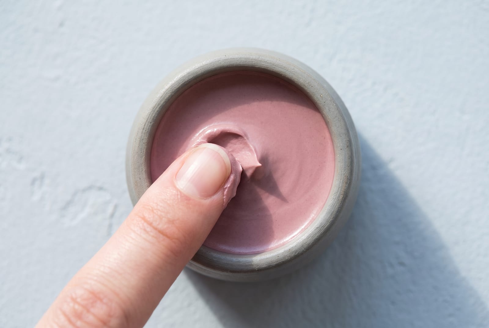
Foundation. Cool or cool-neutral undertone. Avoid anything labeled "warm," "golden," or "honey," which pull yellow against cool summer skin. Most major brands flag the cool options with "cool," "rosy," or "porcelain/neutral-cool" in their undertone naming. MAC's NW range tends to land in the band most cool summers sit inside, where the NC (warm) range does not. Match to the soft, cool side of your depth rather than the brightest match in the drawer.
Lip. Cool rose, soft mauve, cool berry, dusty pink, muted plum. The lip sweet spot for cool summer is "cool and soft." Avoid warm coral, orange-red, and brick. They sit too warm against the palette and pull the eye off the face. A blue-based pink reads natural; a warm nude reads sallow.
Eye. Cool taupe, slate, soft plum, dusty navy, muted gray-blue. Shimmers should be silver- or pewter-based, not gold. Avoid warm bronze, copper, and gold, which fight the cool undertone every time. Skip the heavy smoky-black look too; it spikes the contrast past where cool summer can carry it.
Jewelry. Silver, white gold, platinum, cool-toned steel. Metals should match the temperature of your coloring, and cool summer runs cool, so cool metals land. Yellow gold fights this palette and warms the skin in the wrong direction, no matter how on-trend it is. If you want a warmer metal, a cool-leaning rose gold is the furthest you should reach.
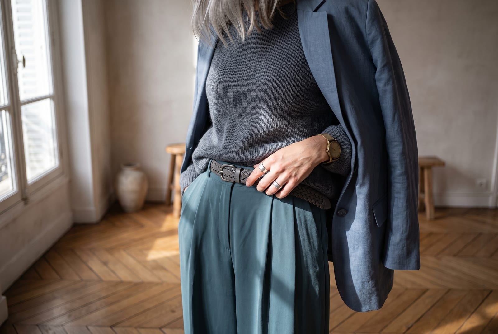
Wardrobe basics (everyday). Slate-blue coat, blue-gray trouser, soft-summer-white knit, deep-slate boot, cool-gray blazer. Every piece lives inside the palette, and black, stark white, and warm tan all stay out. Classic, cool-leaning labels with a soft color story tend to carry pieces that sit naturally inside this band.
Wardrobe accents (statement pieces). Cool rose silk blouse, periwinkle scarf, mauve knit, cool teal dress, plum wrap. These introduce color without spiking saturation or warming the undertone.
Prints and patterns. Cool tone-on-tone stripes, soft watercolor florals, low-contrast cool checks, blue-gray marl. Keep the scale small-to-medium and the internal contrast low. Avoid stark black-and-white graphics, which override cool summer coloring, and warm earth-tone prints, which fight the undertone. A cool, hazy print belongs here; a sharp, high-contrast one does not.
A cool summer wardrobe is easiest to shop when you carry the hex codes with you and treat anything warm or stark as a hard pass. The soft cool band is narrow, but inside it almost everything works together.
For a wardrobe built on these principles, generate a palette in the cool summer direction and use the hex output as your shopping filter.
Hair color for cool summer
If you color your hair, hold the same line the palette holds: cool, ashy, medium, and close to your natural depth. The season runs on low contrast and zero warmth. Hair a few shades off your skin in a cool direction reads as harmony; hair pushed warm, bleached icy-pale, or dyed jet black reads as a fight.
The directions that work are cool and ashy: ash brown, cool light brown, mushroom and greige, cool taupe, and ash blonde that stays mushroom rather than golden. Colorists talk in levels, 1 for black up to 10 for the palest blonde, and cool summer lives around 5 to 8. Medium ash and cool browns sit at levels 5 to 7, cool ash blondes at 7 to 8. Ask for "a level 6 or 7 cool ash brown, no gold," or "a level 7 or 8 ash blonde, no warmth and no brass," and the instruction survives the salon translation.
"No warmth" is the part to insist on. Say ash, cool, mushroom, or greige, and say out loud that no gold, copper, or honey gets pulled through. A warm toner is what turns a good cool color brassy on cool summer skin. The purple and blue brass-correcting shampoos, the enemy of every warm season, are on your side here.
Each direction that fails breaks one of two rules. Golden, honey, caramel, copper, and auburn break the cool rule and leave the skin looking sallow. Platinum, icy white-blonde, and jet or blue-black break the medium-value rule, landing too light or too dark for coloring this gentle. Fire-engine copper breaks both at once.
For highlights, keep them cool and low-contrast: fine ash or mushroom balayage, no more than two or three levels off your base, no warm gold pulled through. Chunky warm highlights and heavy contrast undo the blended look the season depends on. Gray, when it arrives, is good news for this coloring, because a cool, soft silver sits naturally inside the palette. A cool ash gloss keeps it from yellowing; a warm honey blend is the one thing to skip.
Comparison with adjacent seasons
Four adjacent subtypes get confused with cool summer most often, plus one that doesn't actually exist. Each one comes down to a single dial.
Cool summer vs. soft summer (the saturation dial). Both seasons are cool, so the tiebreaker is how muted the coloring is. Soft summer is the most blended, grayed, neutral-leaning summer; cool summer is a touch clearer and reads more decisively cool. Soft summer's palette leans into smoky, dusty, almost-neutral versions of every color, where cool summer's holds a bit more of the blue. To test it, hold a soft slate-blue against your face, then a hazier gray-blue. If the clearer cool color settles your skin and the grayed one looks like nothing, you're cool summer. If the grayed one harmonizes and the clearer one feels slightly loud, you're soft summer.
Cool summer vs. light summer (the value dial). Both are cool and soft, so the tiebreaker is lightness. Light summer sits lighter and a hair brighter, with pastel-leaning colors and lower overall depth. Cool summer sits in the medium range and reads more saturated by comparison. If your natural coloring is delicate and pale all the way through, you're light summer. If there's a medium weight to your hair and eyes and the pastels wash you out, you're cool summer. A second marker: light summer can carry a soft warm-neutral, where cool summer wants the temperature held firmly cool.
Cool summer vs. cool winter (the brightness dial). This is the fork that sends the most people wrong, because both are genuinely cool. Cool winter is bright and high-contrast; cool summer is soft and low-contrast. If you can wear an icy bright pink, a true black, and a saturated cobalt without being overpowered, you're cool winter. If those same colors feel like they're wearing you, and a dusty cool rose or a soft slate feels right, you're cool summer. The common mis-type runs in one direction only: a cool summer dressed in winter brights looks tired and slightly harsh by mid-afternoon, because the colors are louder than the coloring.
Cool summer vs. soft autumn (the warmth dial). Both seasons are muted, which is exactly why they get confused, so the tiebreaker is undertone. Soft autumn's palette carries warm-shifted camels and olive-sages; cool summer's carries cool-shifted slates and dusty roses. Hold a camel next to a slate-gray and whichever lights your face identifies your season. The metal test is cleaner still. Cool summer faces brighten under silver, soft autumn faces under gold, and once the metal answers, the palette decision follows from it.
Cool summer vs. dark summer (the season that isn't). This one trips people up because it sounds plausible, but the standard 12-season system gives summer exactly three subtypes: light, true (cool), and soft. There is no dark or deep summer. "Deep" is a winter and autumn trait, so the deep seasons are deep winter and deep autumn. Cool summer is already the most saturated and often the deepest-feeling of the summers, which is why people who run cool and medium-dark reach for "dark summer" to name themselves. The term shows up on a few auto-generated palette pages, but no two define it the same way, so there's nothing solid to anchor to. If you're cool and genuinely deep, the real fork is cool summer vs. cool winter, decided on brightness, not a fictional fourth summer.
The full 12-season comparison chart lives on the seasonal color analysis hub.
Frequently asked questions
How do I know if I'm a cool summer? Check three anchors: your hair should be ashy and medium with no warmth, your eyes should be soft blue, gray, or gray-green, and your skin should have a cool undertone that looks best in silver. If three of three match and your overall look is soft rather than bright, you're almost certainly cool summer. If everything is cool but also bright and high-contrast, you're likely a winter instead.
Is cool summer the same as true summer? Yes. They are two names for one season. "True summer" is the original four-season and 12-season name; "cool summer" is the more common label in 16-season frameworks. Both describe the same cool, soft, medium-value coloring, so a palette built for one works for the other.
Can cool summer wear black?
Not well. Pure black #000000 is a winter color, too dark and heavy against cool summer's medium-value, low-contrast coloring. Use dusty navy #2E3A4A or deep slate #5B6A78 as a functional substitute. Black works in small accents (a shoe, a bag), but as a main garment it overpowers the face.
What's the difference between cool summer and soft summer? Saturation. Both seasons are cool and soft, but soft summer is the most muted, grayed, neutral-leaning summer, while cool summer holds a touch more clarity and reads more decisively cool. A soft summer in cool summer colors can look slightly loud; a cool summer in soft summer colors can look slightly washed out.
Can cool summer have dark skin? Yes. Cool summer is set by undertone, softness, and contrast, not by how light or dark the skin is. The common mistake is reading deep cool skin as a winter automatically, but "winter" in color analysis means high brightness and high contrast, not depth. Plenty of people with medium and deep skin are cool summers whose features blend softly rather than snap.
What's the best metal jewelry for cool summer? Silver, white gold, platinum, and cool-toned steel. The rule is undertone-matching: cool summer coloring runs cool, so cool metals land. Yellow gold warms the skin in the wrong direction and reads as "off" even when the wearer can't say why. If you want something warmer, a cool-leaning rose gold is as far as the palette stretches.
Can men have cool summer coloring? Yes. Seasons sort coloring, and gender plays no part in the sorting. Men with cool ash-brown hair, soft blue or gray eyes, and cool, soft skin fit the cool summer profile the same way women do. Analysts type men into the season regularly (Matt Bomer is a frequently cited example). The menswear translation is straightforward: slate-blue and soft-navy tailoring, cool-gray knits, soft-white shirts, and silver-toned hardware, with pure-black suiting and stark-white-against-black saved for the winters.
Disclosure: BrandColors makes the color-palette generator linked in this guide. The seasonal typings and palettes above are drawn from the external color-analysis sources named throughout (theconceptwardrobe, truth-is-beauty, Spicemarket Colour, and others), not from our product. Last updated July 24, 2026.
Related palettes: Soft Summer · Light Summer · Soft Autumn · Seasonal color analysis hub