Cool winter is the only one of the 12 seasons that gets to keep both pure white and true black at full strength. Those are the two colors already hanging in almost everyone's closet. Every other season has to warm its white or soften its black to wear them. Cool winter wears both straight, with no adjustment. That's the tell that runs through the whole cool winter color palette. It's the coolest coloring there is. It also turns the contrast dial all the way up.
The cross-family sister season is cool summer, which runs exactly as cold with the volume pulled down to a soft, dusty medium. Cool winter takes the same cold and turns the volume all the way up. That one difference, brightness, sends more people wrong on this season than anything else.
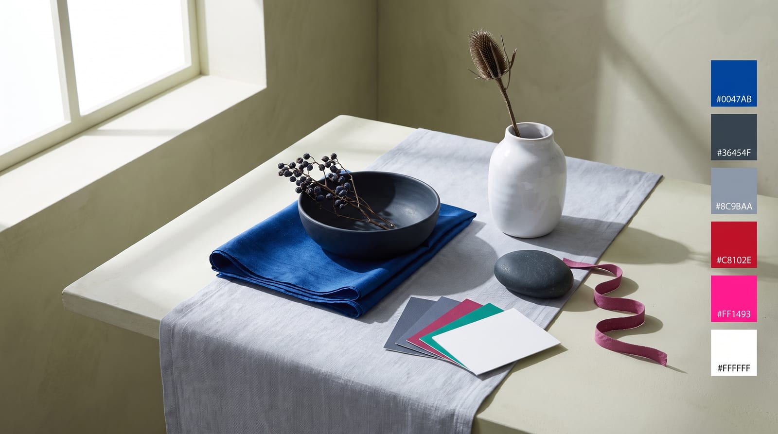
A cool winter, or true winter, color palette is cool, saturated, and high-contrast: pure white, true black, true blue, emerald, fuchsia, and cool cherry red. It's the most purely cool of the 12 seasons. It sits between two other winters. Deep winter drops the icy pastels for darker jewel tones. Bright winter allows a hair of warmth. Cool winter allows neither. No warmth anywhere, and the full range from icy pastel to near-black in the same wardrobe.
This guide covers who cool winter fits, the 24 hex codes that map the palette, and the colors to avoid. It also covers six people who land as cool winter across the color-analysis communities that publish typed lists. Maybe you've been told you're a winter but can't tell which one. Maybe you keep reaching for black and white while everyone insists those colors are too harsh for you. This is the season where they're not. They're yours.
Who cool winter fits
Cool winter coloring is cool, clear, and high-contrast. Your hair, eyes, and skin will each vote on whether that's you.
Hair. Cool winter hair is dark and cool, with no warmth running through it. Cool dark brown, cool espresso, blue-black, or a true black with an almost-blue sheen. There's no gold, no auburn, no honey. Even the rare lighter cool winter keeps that cool, ashy-dark quality rather than warming up. If your hair looks near-black in most light, that's a start. When it picks up a cool tone rather than a warm one in the sun, that's the winter tell.
Eyes. Cool winter eyes are clear and cool, and they hold a sharp line against the white of the eye. Icy blue, cool gray-blue, clear green, cool dark brown, and near-black all fit. The giveaway is clarity: the color looks bright and defined up close, not hazy. Where a cool summer's eyes look softly grayed, a cool winter's snap.
Skin. A cool winter's skin has a cool undertone: blue, pink, cool-neutral, or cool-olive. It can run anywhere from very fair to deep. What stays constant is the contrast between the skin and the dark hair and clear eyes. Silver jewelry sits more naturally against it than gold, and true white at the collar looks crisp rather than draining.
Contrast level. High. Hold a photo of yourself next to a stark black-and-white outfit. Unlike almost every other season, the outfit doesn't overpower you. It matches you. That built-in contrast, dark hair or clear features against the skin, is the clearest cool winter marker. It's what separates winter from every softer season.
Score yourself three of the four and cool winter is likely. Cool-but-soft, low-contrast coloring points to cool summer instead; darker-all-through coloring with no icy brights suiting it points to deep winter; even brighter coloring with a trace of warmth points to bright winter. The comparison section below works through each fork.
Cool winter across different skin tones
The hair, eye, and skin notes above lean toward lighter, European coloring. That's who most of the seasonal-color writing was built around. The season is wider than that. A cool, blue-based undertone with no yellow, high saturation, and high contrast are what define it, and not one of those is about how light or dark the skin is. Cool winter exists at every depth.
The trap runs the opposite way from the summers. Deep, cool skin often gets read straight into winter. That's right on temperature, but it says nothing about which winter. What crosses every background is the pairing that defines the season: a cool undertone and high contrast, with features that snap apart rather than blend.
How it presents varies by background. On East Asian cool winter coloring, it reads as cool black hair with a blue sheen, cool porcelain-to-neutral skin, and clear dark eyes, with a graphic contrast between them. On South Asian coloring, it's cool deep-brown or black hair, cool-olive or cool-brown skin with no gold in it, and clear dark eyes, which is Jameela Jamil's coloring. On Black and deeper skin, cool winter shows as a cool deep tone with a blue or plum undertone, black hair, and a bright, high contrast between skin, eyes, and a clear white smile. True jewel tones and icy brights light the face, while warm earth tones dull it. On Middle Eastern coloring it tends to land in cool deep-olive or cool-neutral skin with cool-dark hair and clear dark eyes.
The deeper the skin, the thinner the record gets, and the very deepest-skinned cool winter references are genuinely sparse. Most get typed on skin depth alone, rather than drafted onto the cool-winter lists. The few names that do surface tend to be split between true, deep, and bright winter. The gap sits in who gets analyzed, not in who the season fits. At every depth, the drape test is the reading to trust. Hold a true jewel tone or an icy white against your face, then a muted or warm earth tone. Watch which one sharpens your features and which one dulls them. Silver sitting better against your skin than gold seals the cool undertone. None of that is a statement about skin depth.
The cool winter color palette
The full palette below runs 24 hex codes, organized by role. Every color sits in the cool zone with no yellow in it. Saturation runs high, roughly 55% to 95% and up on the brights. Value spans the extremes, from near-white icy pastels to near-black darks, held together by high contrast.
How to read this palette
Three roles turn the grid into a wardrobe, and knowing which one a color plays makes the shopping faster.
Anchors (the spine, roughly six colors). Pure white, true black, cool navy, charcoal, and the cool grays. This is the part no other season has. Your neutrals run the full contrast range, so a black-and-white outfit is already complete before any color goes in. Anchors carry roughly 60% of a cool winter wardrobe.
Brights (the statement, the jewel tones and cool brights). True blue, cobalt, sapphire, emerald, amethyst, fuchsia, cool cherry red, cool berry. These are cool winter's loud colors. The season can carry them at full saturation where softer seasons can't. One saturated bright against the neutral spine is usually the whole outfit. Two jewel tones together works too, because the coloring is bright enough to hold both.
Icy pastels (the light end). Icy blue, icy pink, icy lilac, icy aqua. Cool winter's soft option, and the one most cool winters forget they own. These aren't warm or dusty pastels. They're cold, clear, near-white tints that keep the season's clarity. They're the reason cool winter isn't only about drama.
Two color-world markers sit right inside this palette, if you want proof it isn't niche. Pantone's Classic Blue (2020) is a true blue that lands squarely in cool winter's blues. Viva Magenta (2023) sits close to its cool cherry and fuchsia. A useful test for the whole palette: build an outfit from pure white, true black, and one jewel tone. If it reads powerful rather than costume-y, you're working inside the cool winter band correctly. If you find yourself reaching for a warm or dusty color to soften it, you've wandered toward a different season.
Neutrals for cool winter
The neutrals are where cool winter breaks from every other season. Most palettes have to fake their darkest and lightest neutrals. They warm the white or soften the black so it doesn't overpower the coloring. Cool winter doesn't. Pure white and true black are native here. They sit at the two ends of a neutral range that keeps its full contrast.
: the real thing, not a softened cream. Cool winter is one of the only seasons whose true neutral is an optic white. Pantone's 2026 Color of the Year, Cloud Dancer, a clean structural white, sits right in this slot. Cool winter's iciest whites just lean a touch bluer.
: the palest cool gray, near-white with a blue breath in it. A softer alternative to optic white that still reads cold and clean.
: the mid-tone steel gray. Cool and clear, never warm-taupe. Good as a trouser, a knit, or a blazer.
: the deep cool gray-blue that stands in for a slightly softer black when true black feels like too much.
: the deep blue neutral. On cool winter, navy behaves like a second black, grounding an outfit without any warmth.
: the anchor. True black is a cool winter color in a way it isn't for any softer season, matching the coloring's contrast instead of flattening it.
These six neutrals, plus the saturated colors and icy pastels in the block above, cover a whole wardrobe without a single warm piece.
Colors to avoid
Cool winter is the one season that fails colors from two opposite directions at once. Warm colors drain the cool undertone. Muted colors blur the high contrast. That double weakness is exactly why the season gets a reputation for being hard to wear. The rule fixes it: cold and clear, nothing else.
Five colors lose to this palette every time:
: warm yellow drains the cool undertone fast. Swap true blue #0047AB.
: warm and earthy, the opposite of everything cool winter is. Swap cool cherry red #C8102E.
: warm and muted at once, the double fail. Swap cool navy #13294B.
: muted and soft; even though it isn't very warm, the dustiness blurs cool winter's contrast. Swap emerald #009B77.
: cool, but muted, which is the giveaway that mutedness alone fails this season. Swap fuchsia #FF1493.
Anything warm pulls against the cool undertone, and anything below roughly 50% saturation goes quiet against coloring this bright. There's nothing wrong with any of these colors. A dusty rose that disappears on a cool winter looks lovely on a cool summer. A camel that drains you flatters a warm autumn. They just fight this specific coloring.
Celebrity examples
Six names show up as cool winter, also called true winter, across the color-analysis communities that publish typed celebrity lists: theconceptwardrobe, Spicemarket Colour, four seasons studio, and The Aligned Lover. Each of them lands on several of those lists independently, which is what a name needs to appear here.
Liv Tyler. No name here has cleaner agreement: theconceptwardrobe, Spicemarket Colour, four seasons studio, and The Aligned Lover all type her true winter with no dissent. Porcelain skin, cool near-black hair, and clear blue eyes carry the season's whole signature. Put her in a warm camel and the color pulls the life out of her face. Put her in a true blue, an icy pink, or plain black and white, and she reads powerful and settled. She's the lead anchor for cool winter at a fair depth. She's the reference image consultants reach for when they want to show what cool and high-contrast looks like with nothing muddying it.
Jennifer Connelly. Cool near-black hair, clear blue-green eyes, and fair cool skin give her the high natural contrast that defines the season. Spicemarket Colour, four seasons studio, and The Aligned Lover all land her in true winter with no competing typing. She wears the palette's hardest colors, true black, sapphire, cool cherry red, without any of them overpowering her. That's the whole point of winter contrast: the coloring is loud enough to keep up. On a rare warm-beige red-carpet look, the dress reads first and she reads second.
Janelle Monáe. She's the strongest deeper-skin cool winter anchor with clean convergence, typed true winter by Spicemarket Colour and The Aligned Lover. A cool undertone, black hair, and a graphic contrast between skin, eyes, and a bright white smile give her exactly the contrast winter runs on. Her long signature run of black-and-white styling is her season worn on purpose. Drop her into a warm mustard or a muted earth tone and the clarity goes flat. Keep it cool and high-contrast and she snaps into focus.
Jameela Jamil. She extends the season into South Asian coloring at cool-winter contrast: cool dark hair, clear dark eyes, and cool-toned skin with no gold in it. Spicemarket Colour and The Aligned Lover both list her as true winter. She's a useful reference for a specific reader. That reader has deep, cool coloring and keeps getting told to wear warm, rich tones that leave her looking tired. The palette that actually lights her up is the cold, clear one: true blue, emerald, cool pink, and crisp white.
Amal Clooney. Widely typed true or cool winter, carried on both the Spicemarket Colour and The Aligned Lover lists. Her coloring is cool and Middle Eastern: cool-dark hair, clear dark eyes, cool-neutral skin. A few analysts push her toward deep winter on depth, so read her as a strong cool-winter reference rather than an undisputed one. Her most-photographed looks lean into the palette's clean end: crisp white, cool navy, and true red. The cool clarity is what keeps them looking sharp rather than heavy.
Ian Somerhalder. Dark hair, bright blue eyes, cool skin, and the high contrast that reads as striking long before anyone can name why make him the season's clearest male reference. Spicemarket Colour and four seasons studio both type him true winter. He's the answer for the reader searching for a men's reference. He's proof that this palette isn't a women's-wardrobe idea. A cool winter man in a true-navy suit, a crisp white shirt, and a cool-toned tie is working the exact same dials as everything else on this page.
A few names show up on some lists but not others, usually for a reason you can check. Lucy Liu gets called cool winter on plenty of style blogs. But four seasons studio types her deep (dark) winter, so she belongs on the deep winter page, not this one. Marion Cotillard and Katy Perry both carry real winter sources, but each gets pulled across a border. Cotillard surfaces on cool summer lists too. Katy Perry is often read as a true winter reaching for bright winter, and her hair dye changes too often to trust as a natural reference. Constance Wu lands true winter on one list. But our own cool summer guide already types her cool summer, so we won't claim her twice. When a name is contested, the disagreement is almost always about brightness or depth, not undertone.
The anchors above skew light-to-medium. That's a limit in how the color-analysis world documents its examples, not a limit of the season. The very deepest-skinned cool winter references are genuinely sparse. Names like Zoe Saldana, Chanel Iman, and Michael B. Jordan get cited. But each is either single-sourced or split between true, deep, and bright winter, so none is a clean anchor yet. That's a documentation gap, not proof the season skips a group. Cool winter is set by undertone, brightness, and contrast. Not one of those is about how light or dark the skin is. The tell at any depth is the same: a cool undertone, no warmth anywhere, and features that snap apart instead of blending. It's the exact inverse of cool summer's soft, melted look.
A name on a list is somewhere to start. What settles it is the drape against your own face.
Makeup and wardrobe recommendations
Makeup follows the palette's settings: cool undertones, high saturation, high contrast. Where the softer seasons ask you to turn things down, cool winter asks you to keep them turned up, and cold.
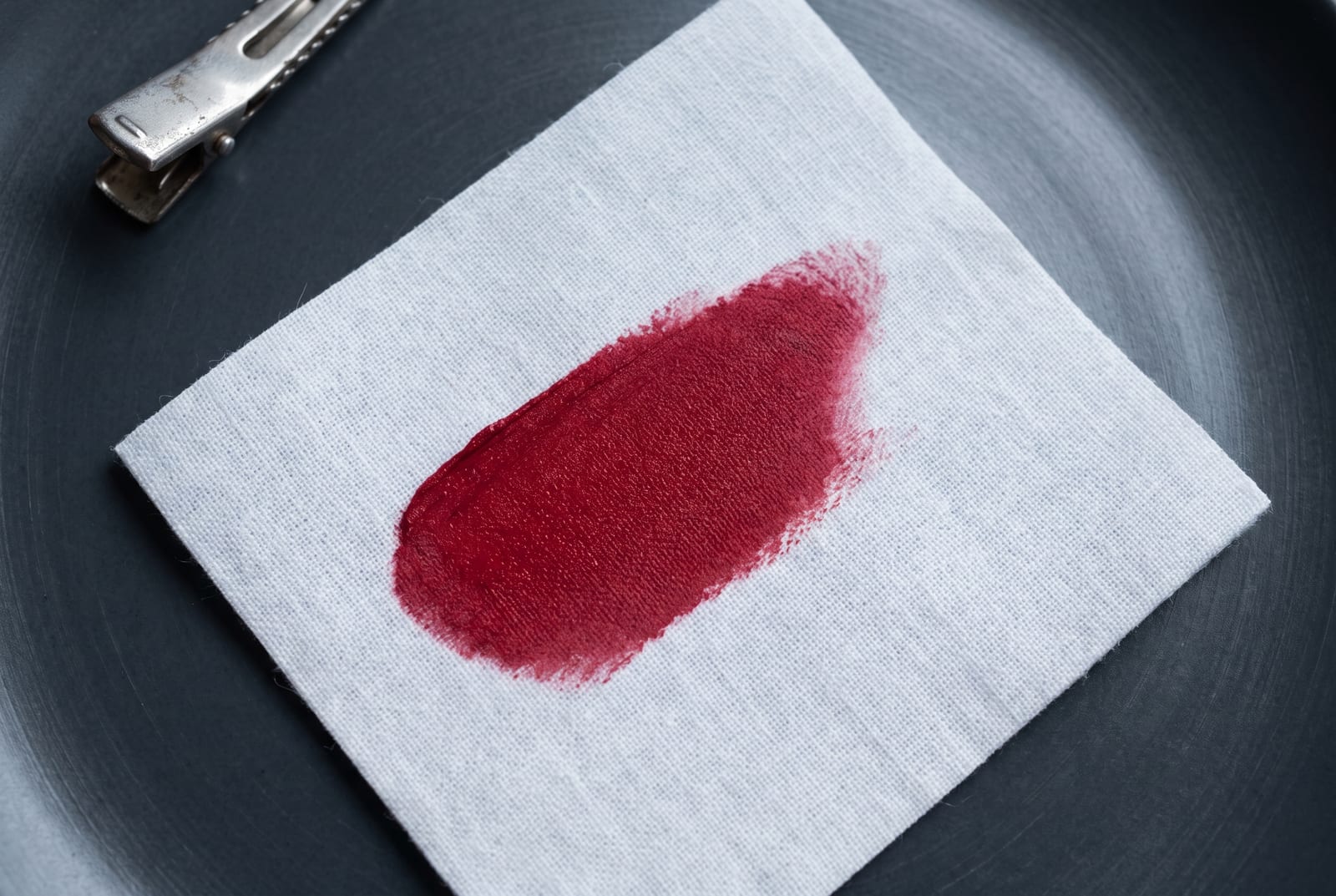
Foundation. Cool or cool-neutral undertone. Skip the bottles marked "warm," "golden," or "honey"; they pull yellow against cool winter skin. Match to the cool side of your depth. Because cool winter contrast is high, a foundation that's even slightly too warm or too light shows up fast. Match it in daylight rather than store light.
Lip. This is where cool winter gets to be loud. True red with a blue base, cool cherry, fuchsia, cool berry, and clear cool plum all belong here. The season carries a bold lip better than almost any other. A soft, muted nude does the opposite of what it does on a summer, it flattens the face. If you want a quieter day lip, reach for a clear cool pink, not a dusty one.
Eye. Cool and clear: charcoal, true gray, cool taupe, sapphire, cool plum, and a crisp icy highlight. Cool winter is one of the few seasons that can carry a true smoky eye and a graphic black liner without being overwhelmed. The contrast is already native. Skip warm bronze, copper, and gold, which fight the cool undertone every time.
Jewelry. Silver, white gold, platinum, and cool-toned steel. The rule is temperature-matching: cool winter runs cool, so cool metals land. Yellow gold warms the skin in the wrong direction, no matter how on-trend it is. Where a softer season wants delicate metal, cool winter can also carry a bold, high-shine silver piece. The contrast supports it.
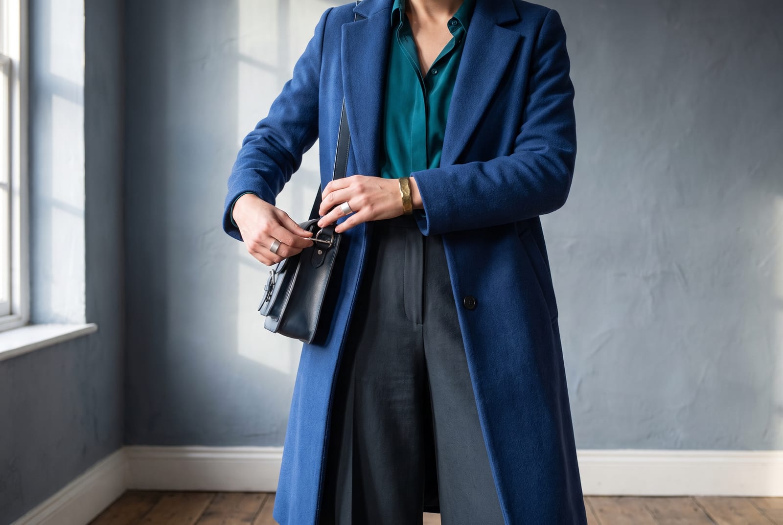
Wardrobe basics (everyday). True black trouser, crisp white shirt, cool navy coat, charcoal knit, black leather boot. Every one of those sits inside the palette. Unlike almost every other season, black and white are the foundation here, not colors to avoid, and warm tan, camel, and olive never make the list.
Wardrobe accents (statement pieces). Cobalt or sapphire knit, fuchsia dress, emerald coat, cool-cherry-red blazer, amethyst scarf. Cool winter accents work best as a single block of saturated color against the neutral spine. One loud, cold color at a time.
Denim. Denim is a quiet win for cool winter. A crisp, cool-toned indigo or a true blue-black wash sits perfectly inside the palette, where a warm, orange-cast stonewash fights it. A stark white jean works too. Skip the faded, warm-sand and muted-gray washes. They blur the contrast the same way a dusty color does.
Prints and patterns. High-contrast graphics belong here: black-and-white stripe or check, a bold cool-toned floral on a dark ground, color-blocked jewel tones. Cool winter is the one season that can carry a stark black-and-white print without it overpowering the face. The contrast matches. Avoid muted, low-contrast, warm-toned prints. They go flat.
For a wardrobe built on these colors, build a cool winter palette and use the hex output as your shopping filter.
Hair color for cool winter
If you color your hair, the season's brief is short: stay cool, keep the contrast high, and don't drift into the warm middle. The season's natural hair is dark and cool. Most cool winters are choosing between deepening what they have or going to the opposite extreme. Both ends can work, because high contrast is native here.
The directions that work sit at the two ends of the value range, not the middle. On the dark end: blue-black, cool espresso, cool dark brown, and true black, all with no warmth pulled through. On the light end, cool winter is one of the few seasons that can actually carry an icy platinum or a cool silver-white. The high contrast against cool skin holds up where it would wash out a softer season. What doesn't work is the warm middle. Golden brown, honey, caramel, auburn, and warm copper all fight the cool undertone.
Hold the line on "no warmth." Ask for cool, ash, or blue-based tones. Say out loud that you don't want gold, honey, or copper. A warm toner is what turns a good cool color brassy on cool winter skin. The purple and blue toning shampoos are your friends here. They hold the cool the season depends on.
Every color on this list fails one of two tests. Golden, honey, caramel, and auburn break the cool rule and leave the skin looking sallow. A warm-mousey mid-brown breaks it more quietly, by drifting into the muddy middle the season can't wear. For highlights, keep them cool and high-contrast if you want them at all. Cool winter carries a sharp contrast better than a blended balayage, which tends to soften the very definition the season runs on. Incoming gray is good news here: a cool silver-white can look striking on cool winter. Hold it clear with a cool-toned gloss so it never yellows.
Cool winter for men
Coloring, not gender, is what the seasonal system reads, and cool winter shows up in men exactly the way it does in women: dark cool hair, clear cool eyes, cool skin, and high natural contrast. Ian Somerhalder is the textbook reference: dark hair and bright blue eyes against cool skin. It's the kind of face that reads as striking before anyone can say why. The why is contrast.
The menswear version is nicely simple. The two hardest colors in most men's closets, true black and crisp white, are the two cool winter wears best. A true black suit with a white shirt isn't too harsh on this coloring. It's the home base. From there, the color comes from tailoring and knitwear in the palette's cold, saturated range: a cool navy or cobalt suit, a sapphire or emerald knit, a true-red or cool-berry tie, all against white or black. Hardware and accessories run cool, silver watches, gunmetal, and steel, not warm brass or gold.
The colors to skip are the warm-neutral staples menswear defaults to. Camel coats, khaki chinos, olive field jackets, warm brown leather, and tan suede all fight cool winter skin the same way they'd flatter an autumn. Swap warm brown shoes and belts for black, swap khaki for charcoal or cool navy, and swap any golden-brown knit for a cool gray or a jewel tone. The market for men's color analysis is thinner than the women's side. But the dials are identical, and the payoff is the same: a wardrobe that reads sharp instead of tired.
Building a cool winter capsule wardrobe
Cool winter is one of the easiest seasons to build a capsule around. Its neutrals do more work than any other palette's. Most seasons have to invent a substitute for black and white. Cool winter just uses black and white. That gives you a spine almost no other season has: pure white, true black, cool navy, and charcoal. Any two of them already make a finished outfit before a single color goes in.
Build the base first. A true black trouser or suit, a crisp white shirt, a cool navy coat, and a charcoal knit cover most of a working wardrobe. They read sharp rather than heavy on cool winter coloring, the way they wouldn't on a softer season. These are the pieces to buy well and wear constantly.
Then add color as impact, not filler. Cool winter looks best in blocks of one saturated color against the neutral spine, not in busy mixes. A cobalt or sapphire knit over black trousers. A fuchsia or cool-cherry-red dress on its own. An emerald coat over a white shirt. The rule is one loud, cold color at a time, carried by the neutrals.
For combinations that hold up, start with the boldest. Pair true black with pure white for maximum contrast, then break it with a single jewel tone. Black, white, and cobalt is a complete outfit. Pair cool navy with icy blue for a softer high-contrast look. Pair charcoal with fuchsia or amethyst when you want color without going full black-and-white. Cool winter can also do the thing few seasons can: wear two saturated jewel tones together, like sapphire with emerald. The coloring is bright enough to carry both. What it can't do is mute them. A cool winter capsule fails the moment a dusty or warmed-down version sneaks in.
Comparison with adjacent seasons
Three seasons get confused with cool winter most often, plus one that doesn't exist. Every comparison below turns on one dial.
Cool winter vs. deep winter (the value dial). Both are cool and high-contrast, so the tiebreaker is how much light the palette keeps. Cool winter holds the full range, icy pastels at one end and near-black at the other. Deep winter drops the icy end and lives in the dark jewel tones and deep neutrals. Its lightest colors are still fairly deep. If icy pink, icy blue, and pure white look clean and right on you, you're cool winter. If those same icy lights feel weak and you come alive in the darker, denser colors, you're deep winter. The most common mis-type is a cool winter avoiding their icy pastels, because they've been told winter means dramatic. But the icy end is theirs to use.
Cool winter vs. bright winter (the temperature dial). Both are bright, saturated, and high-contrast, so the tiebreaker is warmth. Cool winter is purely cool, no yellow anywhere. Bright winter is the brightest winter of all, but it allows a hair of warmth. That lets it carry a clear warm-leaning color that would look slightly off on a cool winter. If a true, cool blue-red suits you better than a warm-leaning true red, and gold never quite works, you're cool winter. If you can carry a bright warm accent and gold doesn't fight you, look at bright winter. This fork is subtle, because both seasons are cold-leaning and loud. It comes down to whether any warmth at all reads on your skin.
Cool winter vs. cool summer (the brightness dial). This is the cross-family fork, and it sends the most people wrong. Both seasons are genuinely, equally cool. The difference is volume. Cool winter is saturated and high-contrast. Cool summer is soft and low-contrast. If you can wear icy bright pink, true black, and saturated cobalt without being overpowered, you're cool winter. If those same colors feel like they're wearing you, and a dusty cool rose or a soft slate feels right instead, you're cool summer. Same cool temperature, opposite volume. A cool summer in winter brights looks harsh by mid-afternoon. A cool winter in summer's soft dusty tones looks washed out and faded.
Which winter am I? The quick version: all three winters are cool and high-contrast. Bright winter is the brightest and allows a touch of warmth. Deep winter is the darkest and drops the icy pastels. Cool winter sits between them as the purely cool one. It keeps both the icy lights and the near-blacks. If gold ever truly works on you, you're probably not cool winter. If your best colors are dark and dense with no icy option, you lean deep. If the icy pastels and the jewel tones both look clean and cold, you're home.
Cool winter vs. light winter (the season that isn't). This one comes up because it sounds like it should exist. It doesn't. The 12-season system gives winter three subtypes: bright (clear), true (cool), and dark (deep). There's no light winter. "Light" is a spring and summer trait, so the light seasons are light spring and light summer. Cool winter already keeps the palette's lightest icy pastels. That's probably why people who run cool and clear reach for "light winter" to name themselves. If you're cool and genuinely light and soft, the real fork is cool winter vs. light summer. It's decided on brightness and contrast, not a fictional fourth winter.
The full 12-season comparison chart lives on the seasonal color analysis hub.
Frequently asked questions
Is cool winter the same as true winter? Yes. They're two names for one season. "True winter" is the original four-season and 12-season name; "cool winter" is the more common label in 16-season frameworks. Both describe the same cool, saturated, high-contrast coloring, so a palette built for one works for the other.
What colors look best on a cool winter? Cool, saturated, high-contrast ones: pure white, true black, true blue, cobalt, sapphire, emerald, fuchsia, cool cherry red, amethyst, and icy pastels. The rule is cold and clear, never warm and never dusty. Cool winter is the rare season that wears pure black and pure white at full strength.
Can cool winter wear black?
Yes, and better than any other season. True black #000000 is native to cool winter; it matches the season's high natural contrast instead of overpowering it. Where black overwhelms a softer season, it reads powerful and clean on cool winter. It's a foundation color here, not just an accent.
Do cool winters look better in silver or gold? Silver. Cool winter runs cool, so silver, white gold, and platinum sit naturally against the skin, while yellow gold warms it in the wrong direction and reads as off. The silver-versus-gold test is the fastest self-check: if silver flatters and gold drains, your undertone is cool.
What colors should a cool winter avoid? Anything warm and anything muted. Warm colors, orange, gold, camel, olive, warm brown, and tomato red, drain the cool undertone. Muted or dusty colors, sage, dusty rose, and anything grayed-down, blur the high contrast the season needs. Cool winter is the rare season that fails colors from both directions.
What's the difference between cool winter and deep winter? Value. Both are cool and high-contrast, but cool winter keeps the full range from icy pastel to near-black, while deep winter drops the icy lights and lives in the dark jewel tones. If icy pink and pure white look clean on you, you're cool winter; if only the deeper colors work, you're deep winter.
What's the difference between cool winter and bright winter? Warmth. Both are bright and high-contrast, but cool winter is purely cool with no yellow anywhere, while bright winter allows a hair of warmth. If gold never works and a cool blue-red beats a warm red, you're cool winter. If you can carry a warm-leaning bright accent, look at bright winter.
Can cool winter have dark skin? Yes. Cool winter is set by undertone, brightness, and contrast, not by how light or dark the skin is. Deep, cool skin with black hair and high contrast is cool winter coloring. The common mistake is reading deep skin as a different season on depth alone, when the real markers are a cool undertone and clear, snapping contrast.
Disclosure: BrandColors makes the color-palette generator linked in this guide. The seasonal typings and palettes above are drawn from the external color-analysis sources named throughout (theconceptwardrobe, Spicemarket Colour, four seasons studio, and The Aligned Lover), not from our product. Last updated July 24, 2026.
Related palettes: Deep Winter · Bright Winter · Cool Summer · Seasonal color analysis hub