Every other season asks you to soften something. Bright winter asks you to turn it up.
It sits at the coldest, brightest corner of the color wheel: icy pastels and jewel-bright saturation set against stark black and white, with no warmth and no dust anywhere in it. The bright winter color palette is the coolest, brightest, highest-contrast set in the whole 12-season system. Icy blue, electric cobalt, hot fuchsia, true red, emerald, and a black-and-white so clean it looks lit. It shares bright spring's intensity but stays cool and blue-based, never warm. Some analysts call it clear winter, which is the same season under a different naming system.
Bright winter isn't too much. Most bright winters have just been dressed too quiet. That correction matters, because bright winter is the season people resist. The colors feel loud next to what most of us were taught to wear. So a lot of bright winters spend years in beige and dusty mauve and safe greige, quietly washed out, wondering why "tasteful" neutrals leave them looking tired. If muted colors drain you and soft pastels seem to erase your face, you may have been reading your own palette wrong the entire time.
This guide covers who bright winter fits, the 24 hex codes that define the palette, the colors to avoid, and the people typed bright winter across the communities that publish lists. It also separates the season from its three winter siblings and its warm twin, bright spring.
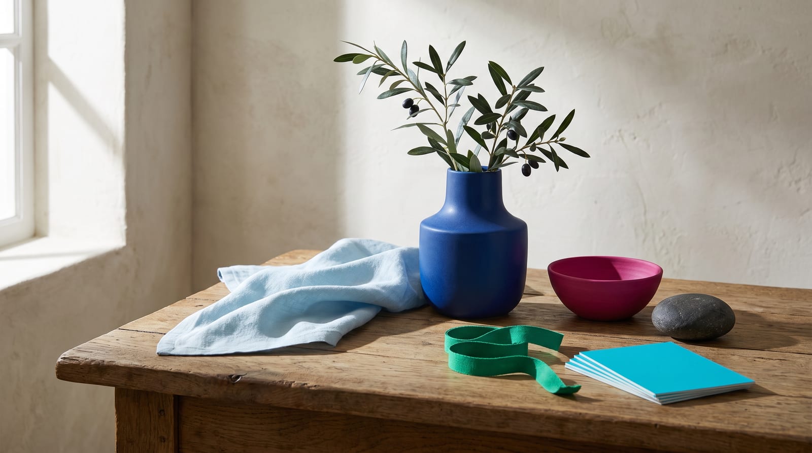
Who bright winter fits
Bright winter coloring is cool, saturated, and high in contrast. Those three words earn their meaning at the mirror, one feature at a time: hair, eyes, skin, and the gap between them.
Hair. Bright winters almost always have deep, cool-toned hair. Dark brown, espresso, blue-black, or true black, and in rarer cases a stark cool blonde with no gold in it. The hair reads cold, not warm. If your hair has ever been called "so dark it's almost blue" in the right light, that's the bright-winter signal. Warm, honeyed, or golden-brown hair points somewhere else.
Eyes. Bright and clear. Vivid blue, cool green, glassy grey, or a dark brown that reads almost jewel-like against the white of the eye. The giveaway is saturation. A bright winter's eye color looks turned up rather than muted, and it holds that intensity even in flat light. Where a soft season's eyes melt into the face, a bright winter's eyes pop against it.
Skin. Cool or neutral undertone (the tint beneath the surface, which stays put whatever the light does). Bright winter exists from porcelain to deep, but the undertone reads blue, pink, or clean olive rather than golden. "Cool and clear" is the descriptor most analysts reach for. You most likely look better in silver than in gold, and stark white lifts your face instead of draining it.
Contrast level. High, and it outranks every other marker. Hold a photo of yourself against a stark black-and-white outfit. If the outfit does not overpower you, you carry high contrast. Dark hair against light or cool skin, bright eyes against dark lashes, the whole face built on a gap between light and dark. That gap is the season.
When three or four of those line up, bright winter is the likely answer. Features that are just as cool but softer and less electric point to cool winter instead; darker and deeper ones point to deep winter. On paper the difference from the pure cool center of the season is one extra click of saturation, and on the face it's obvious. Most bright winters get told they're a true winter first, then discover their coloring can carry even more brightness than that. The comparison section below sorts out all three.
Bright winter across different skin tones
The published record skews toward lighter, European coloring, and the hair, eye, and skin descriptions above inherit that lean. The season itself is not that narrow. What sets it is a cool or neutral undertone, very high saturation, and a wide light-to-dark gap between features. None of those measures how light or dark your skin is. Bright winter exists at every depth.
The trap runs the opposite way here than it does for the soft seasons. Deep skin gets read as automatically "deep winter" or "warm autumn" on depth alone, when plenty of deep-skinned people carry the cool undertone and the electric contrast that define bright winter. In color analysis, "bright" means the coloring can hold maximum saturation without being overwhelmed. "High contrast" means the gap between features is wide. Neither is a statement about skin depth. A deep, cool complexion with jet-black hair and bright dark eyes is one of the clearest bright-winter profiles there is.
What that looks like shifts by background. On cool-toned Black and deep skin, bright winter shows up as very dark hair and eyes against skin with a blue, plum, or clean-neutral undertone. Icy brights and true jewel tones light the face while warm earth tones deaden it. East Asian bright winters often read as cool-neutral skin with blue-black hair and dark, glassy eyes, the contrast doing the work rather than the depth. South Asian and Latina bright winters tend to land in medium-to-deep cool or neutral complexions, where a fuchsia or a cobalt snaps the face into focus and a camel or an olive drags it down. Middle Eastern bright winters often carry that same deep-cool contrast with near-black hair.
The deeper the skin, the thinner and less agreed-upon the record gets, and this is the most contested call in the whole system. The line between bright winter, true winter, and deep winter for very deep skin is the single least-settled judgment in color analysis. Lupita Nyong'o is the clearest example. She lands in all three depending on which analyst you read, and no community has real consensus. Deeper-skinned bright winters are real and named across the sources. Idris Elba, Laura Harrier, Michael B. Jordan, Will Smith, and Danai Gurira all appear on bright-winter lists. But the exact bright-versus-deep boundary at that depth is genuinely unsettled, and anyone who tells you it's obvious is overselling. At any depth, the drape test gives the answer. Hold a saturated icy blue or a true red against your face, then a muted camel or a warm olive, and watch which one clears your skin and which one muddies it. Silver beating gold is the cool-undertone check. Skin depth doesn't enter into it.

The bright winter color palette
All 24 hex codes are below, organized by role, and every one is click-to-copy, so you can lift a swatch straight into a shopping filter or a design file. Every color is either cool and blue-based or a warm-family hue that reads clean-cool. None of them is earthy or golden. Saturation stays in the top band, so the brights look almost electric. Value runs the full range on purpose, because the gap defines the palette as much as any single swatch. The lightest icy tints sit at roughly 85% lightness and up, a white with a whisper of color in it. The darkest saturated darks sit at roughly 15 to 25%, a navy or pine that still reads as color. The set breaks into four working groups: five stark neutrals, five icy pastels, seven hot brights, and seven deep jewels.
How to read this palette
The four groups are what turn the grid into a wardrobe, because the group a color belongs to tells you what to do with it.
Stark neutrals (the frame, five colors). True black, optic white, charcoal, cool grey, and silver. These replace the beige-and-cream neutrals most people default to. In a bright winter wardrobe they're the stage the color performs on, and black and white are load-bearing.
Icy pastels (the lights, five colors). Icy blue, icy pink, icy lilac, icy mint, and icy aqua. These are the season's soft option, and they only work because they stay cold. An icy pink is a pastel with all the warmth drained out, which is why it reads crisp rather than sweet. Use them where another season would use a cream or a blush.
Hot brights (the statement, seven colors). Hot fuchsia, electric cobalt, true red, bright turquoise, bright emerald, bright violet, and a cool lemon-lime. This is where bright winter lives. One of these against black or white is the entire look. Two of them together, played at full volume, is the move no other season can pull off cleanly.
Deep jewels (the depth, seven colors). Sapphire, ruby, deep pine, royal purple, magenta, navy, and cerise. These are the saturated darks that add weight without going muddy. They're what you reach for when you want depth and still want the color to read as a color, not a brown.
The one rule that ties it together is contrast. Set a very light value against a very dark one, an icy tint or optic white against a jewel or black. If the pairing looks deliberate and lit, you're inside the season. If you find yourself building a soft, tonal, low-contrast outfit and it looks flat on you, you've drifted toward a different palette. Every hex here would look wrong next to a muddy camel or a warm gold. These colors want a clean cold field around them, not a warm one competing for the same light.
Neutrals for bright winter
This is the section that surprises people. Bright winter neutrals are stark, not softened. Where a warm season leans on cream and taupe, bright winter leans on the hardest, cleanest neutrals on the wheel, and they still do the daily work every wardrobe asks of its neutrals.
: the anchor. Bright winter is one of the only seasons where pure black works with the face instead of against it. Wear it with intent.
: the "white" of this season. Use the pure, cold white, never a cream or an ivory. This is the color that lifts your skin.
: the softer black. A near-black that still reads crisp when full black feels like too much for the occasion.
: the mid neutral. A blue-shifted grey, never a warm greige. It carries the brights without competing with them.
: the light neutral and the season's metal in one. Silver stands in for the warm beige other palettes rely on, and it's the reason silver jewelry always beats gold here.
Five stark neutrals and 19 accents build the whole wardrobe. Nothing warm is required, and nothing warm helps.
Colors to avoid
Five colors undo this palette, each failing on temperature, on saturation, or on both at once.
: muddies cool skin on contact and drags the whole face down. Swap in charcoal #2E2E2E for a neutral that still reads crisp.
: fights the cool undertone and turns the skin sallow. Swap in silver #C0C4CC or a cool platinum.
: too greyed and too soft, and it erases a face that was built to carry maximum saturation. Swap in hot fuchsia #E5007E.
: warm and earthy, the exact opposite corner of the wheel from where bright winter lives. Swap in true red #E30016.
: warm and muted at the same time, a double clash that does the most damage of the five. Swap in bright emerald #009E60.
The failures mirror the warm seasons' rules. Anything with a warm undertone drains a bright winter, and anything dusty or muted flattens the contrast the coloring runs on. None of these are ugly colors. A muted olive that looks rich on a soft autumn just happens to fight this specific coloring, and the same dusty rose that drowns a bright winter will look settled and right on a soft summer.

Celebrity examples
Every name below is typed bright winter by at least two of the three communities that publish lists for the season: Four Seasons Studio, Soul of Color, and Spicemarket Colour. Two-source agreement is the floor; a single analyst's read doesn't qualify.
Megan Fox. No bright winter gets more agreement across the lists. Pale cool skin, near-black hair, and bright blue eyes give her the exact combination the season is built on: a cold undertone carrying maximum contrast. Her strongest looks sit in true red, cobalt, and stark black-and-white with a clean red lip. When she's been styled in warm bronzes or muted earth tones, the warmth flattens her and you notice the styling before you notice her. If you think you might be a bright winter and want to know what a clean one looks like, calibrate against her.
Krysten Ritter. Porcelain skin, jet-black hair, and dark eyes make her the clearest illustration of why high contrast reads as bright winter rather than any other season. On her, black loses its heaviness and white its starkness, because her own coloring already carries that gap. Watch what happens when she wears a saturated jewel tone against her skin: the color and the face both hold, neither one winning. That balance is the season working as intended.
Nicole Scherzinger. Native Hawaiian, Filipino, and Ukrainian heritage, and proof the season isn't a fair-skin story. Her neutral-cool, slightly olive-leaning skin with dark hair and bright dark eyes shows bright winter on a warmer-looking but still cool-based complexion. Fuchsia, emerald, and true red clear her face where a muted or golden shade would dull it. She's the example to study if your skin reads olive but your best colors keep turning out to be the cold, saturated ones.
Idris Elba. Deep skin, cool undertone, male, and a direct answer to the assumption that bright winter is a light-skin season. His very dark hair and eyes against a cool-based deep complexion carry the high contrast the season requires. He reads sharpest in optic white, true red, and cool jewel tones rather than the warm browns menswear tends to default to. He's one of the names that anchors the season at the deeper end of the skin-depth range.
Laura Harrier. Biracial, African-American and white, and the medium-deep female reference the season needs. Her coloring pairs a cool-neutral undertone with dark hair and bright eyes, and her best red-carpet looks lean into clear brights and stark contrast rather than soft or warm tones. Between her, Idris Elba, and Nicole Scherzinger, the bright-winter set is genuinely multi-ethnic in a way most published lists still aren't.
A few names get claimed on some lists but not others, and the disagreement is almost always about depth, not temperature. Katy Perry gets typed bright winter, true winter, and bright spring depending on the analyst. The deeper-skin cases are where the honest limit sits. The bright-versus-true-versus-deep call for very deep skin is the least-settled judgment in the whole system, and Lupita Nyong'o is the standing example, typed differently by nearly every community that lists her. Treat those as edge cases rather than anchors.
Whoever your closest match is, the dials matter more than the face: cool or neutral undertone, very high saturation, and high contrast between light and dark.
Makeup and wardrobe recommendations
Makeup follows the same three settings as the hex grid: cool undertone, high saturation, and enough contrast to match your own.
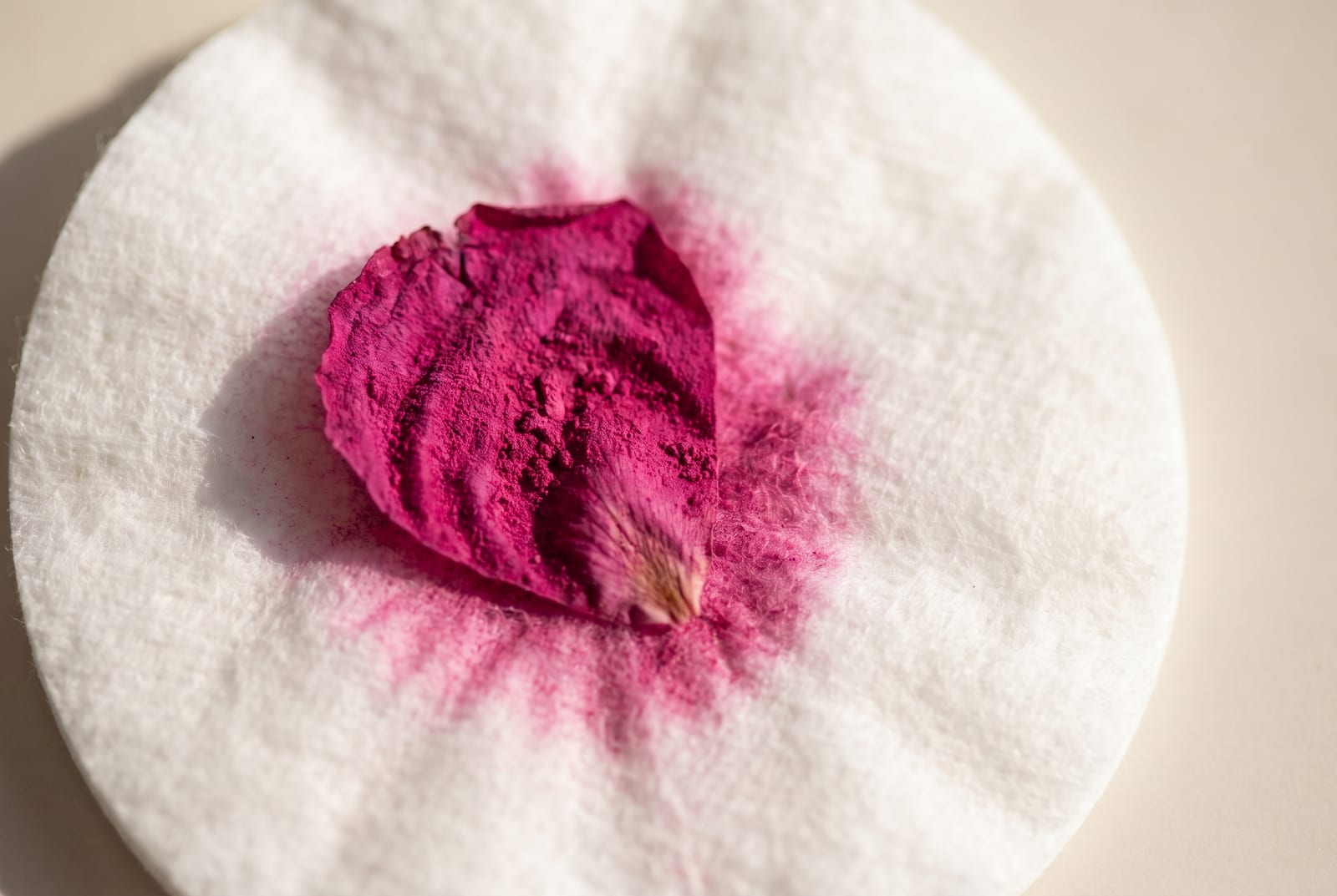
Foundation. Cool or neutral undertone. Anything labeled "warm," "golden," or "honey" pulls yellow against cold skin and doesn't belong here. Most brands mark the right shades as "cool," "neutral," or with a pink or rosy base. MAC's NW range and the cool-neutral shades in most lines land where a bright winter sits. A too-warm foundation is the fastest way to lose the clean coolness the whole season depends on.
Lip. This is where bright winter gets to play. A true blue-red is the signature, and a clean fuchsia is the second move. Both read as intentional rather than loud on this coloring, because the face can carry the saturation. A classic blue-red like a MAC Ruby Woo or a bright fuchsia both sit inside the palette. Avoid brick, terracotta, warm nude, and anything brown-based, which go muddy against cool skin.
Eye. Cool and clear. Charcoal, cool grey, icy silver, navy, and a true plum or cool emerald as color. Shimmers should be silver-based, not gold. A smoky charcoal reads sharp here rather than heavy. Avoid warm bronze, copper, and golden-brown shadow, which fight the undertone every time.
Blush. Cool pinks and clear berry rather than peach or coral. A cold pink lifts a bright winter's face the way a warm one lifts a soft autumn's. Peach and apricot go grey and lifeless on cool skin.
Jewelry. Silver, white gold, platinum, and cool-set diamonds. The rule is undertone-matching, and bright winter runs cold, so cold metals land. Yellow gold fights the coloring the same way warm brown does. If you want a warm-metal look, keep it to a cool, high-shine finish rather than an antique or brushed gold.
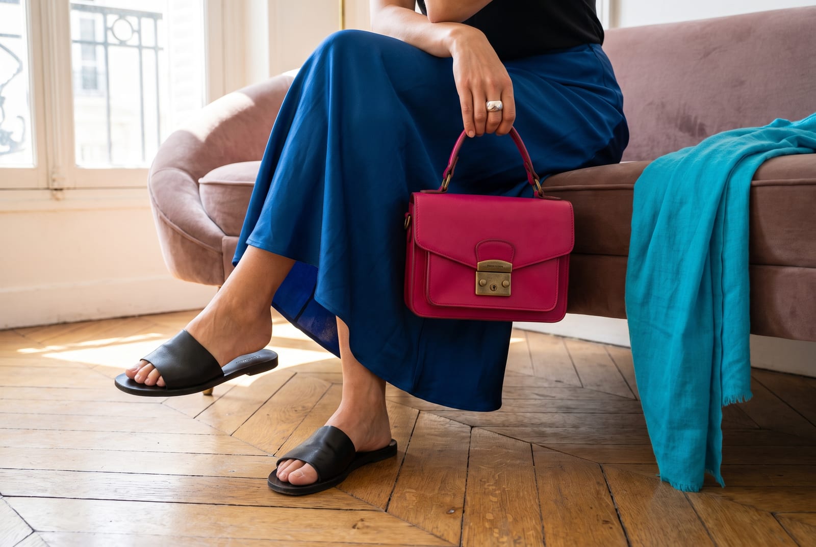
Wardrobe basics (everyday). Black tailored trousers, an optic-white shirt, a charcoal blazer, a bright-navy coat, and a silver-grey knit. Every piece is a stark neutral doing quiet work, and every one is a clean background for a single bright. None of it is beige, camel, cream, or warm brown. The neutrals here are the point, not the fallback.
Wardrobe accents (statement pieces). A cobalt knit, a true-red coat, a fuchsia blouse, an emerald dress, a bright-turquoise scarf. One saturated piece against the stark neutrals is a complete bright winter outfit. This is the season that can wear a single loud color head to shoulders and look composed rather than costumed.
Prints and patterns. High-contrast graphics: crisp black-and-white stripes, bold color-blocking, a clean geometric in two saturated brights. Scale can go large, and internal contrast should stay high. Avoid muted florals, warm paisleys, and low-contrast tonal prints, which the coloring simply overpowers. Where a soft season needs a print to stay quiet, a bright winter needs it to keep up.
For a wardrobe built on these colors, build a bright winter palette and use the hex output as your shopping filter.
Hair color for bright winter
Hair color keeps the same three settings: stay cool, keep the contrast high, add no warmth. The season runs on a wide gap between features and a cold undertone. Hair that's deep and cool holds the look; anything golden, honeyed, or ashy-warm breaks it.
The directions that work are cool and clear: true dark brown, cool espresso, blue-black, and jet black. Going lighter means staying cold, an icy platinum with no yellow in it rather than a golden or honey blonde. In colorist levels, which run from 1 at black to 10 at the lightest blonde, bright winter occupies the two ends and mostly avoids the warm middle. Deep cool browns and blacks sit at levels 1 to 4, and the rare cool blonde jumps to a level 9 or 10 platinum with a strong toner. Give your stylist one of two briefs: "a cool dark brown or true black with no warmth," or "an icy platinum, no gold, no beige."
Insist on the no-warmth half, because a warm gloss or a golden toner is what turns bright winter hair brassy and drops the contrast the season depends on. Ask for cool tones, and if you go platinum, keep a purple toner in rotation to kill any yellow. The colors to avoid each break one of two rules. Golden blonde, honey, caramel, and warm copper break the cool rule and leave the skin looking sallow. A muted, mousey mid-brown breaks the contrast rule, sitting too close to the skin to create the gap the face wants. For highlights, keep them cool and high-contrast rather than warm and blended. Grey suits this season when it comes: a cool silver or a sharp salt-and-pepper reads striking on a bright winter, where it would wash out a warm season.
Bright winter for men
The dials don't change for menswear. Men with deep cool-toned hair, dark brown to blue-black to true black, cool or neutral skin, and bright cool or glassy-dark eyes fit the profile. Idris Elba is the clearest male bright winter, and he anchors the season at its deeper end. A few other men surface on the community lists, like Michael B. Jordan and Will Smith. But those are deep-skin cases where the bright-versus-deep call is still unsettled. Treat them as edge references, not firm anchors.
The good news for men is that menswear does a lot of the work already, because it leans on the exact neutrals the season wants: black, optic white, charcoal, and true navy. The problem is that most men then default to muddy warm colors for everything else. Olive, khaki, tan, warm grey, and oatmeal are the precise tones that drain a bright winter. The fix is a swap, not a rebuild. Keep the black suit and the crisp white shirt, which are the bright-winter uniform, and replace the earthy layers with cool ones. Charcoal instead of taupe, true navy instead of brown, cool grey instead of oatmeal.
Then add exactly one saturated accent and let it carry the outfit. A cobalt sweater, a true-red tie, an emerald knit, a bright-white sneaker against black. The instinct to build a safe, tonal, low-contrast outfit is the thing to fight, because low contrast is what flattens this coloring. A bright winter man in a black suit, a white shirt, and a single cobalt or red accent looks sharper than the same man in a full head-to-toe warm-neutral palette, every time.
Comparison with adjacent seasons
Bright winter is a season people usually reach by elimination. They already know they're a winter, and they know they're not the deep or the muted kind. The real work is separating it from its two winter siblings and its warm twin across the family line, and every one of those comparisons comes down to one dial.
Bright winter vs. Cool Winter (the saturation dial). Cool winter, often called true winter, is the pure-cool center of the season: cold, clear, and deep, but not electric. Bright winter is cool winter with the saturation turned up one more click. Both are cold and high-contrast, so the tiebreaker is intensity. If the coldest, most saturated colors you own make your face snap into focus, you're bright winter. If those same electric brights feel slightly loud and a deep, cool, clear color settles better, you're a true cool winter. This is the most common mis-type, and it goes in one direction: bright winters get told they're true winters first, then find their coloring can carry even more brightness than that.
Bright winter vs. Deep Winter (the depth dial). Deep winter is the darkest corner of winter, where value carries the palette and the brights stay a little muted under all that depth. Bright winter trades some of that darkness for pure saturation and a wider light-to-dark gap. If your best colors are deep and rich, burgundy, pine, midnight, worn dark and close, you're deep winter. If your best colors are icy and electric, and a deep tone feels heavy rather than rich, you're bright winter. The two overlap on jewel tones, which is why they get confused. But the deep winter needs darkness and the bright winter needs brightness.
Bright winter vs. Bright Spring (the warmth dial). This is the cross-family twin, and the only dial between them is temperature. Both are the brightest, most saturated corner of their half of the wheel, so both can wear a loud color and look composed. Bright spring is warm and yellow-based; bright winter is cool and blue-based. The cleanest test is the best-red test, backed up across the community guides including truth-is-beauty. Hold a warm, coral-leaning red against your face, then a cool, blue-based true red. If the coral one glows and the blue-red goes hard, you're bright spring. If the blue-red clears your skin and the coral one makes you look flushed or sallow, you're bright winter.
Bright winter and clear winter (the season that isn't a second season). People find "clear winter" on some charts and assume it's a separate type from bright winter. It isn't. Clear winter is the name the sci-ART and PCA systems use for the exact same season this guide calls bright winter. Same palette, same dials, different naming tradition. If you've been comparing bright winter and clear winter trying to decide between them, you can stop. They're one season with two names, and either label points you at the same 24 colors.
The full 12-season comparison chart lives on the seasonal color analysis hub.
Frequently asked questions
How do you tell if you're a bright winter? Check three things. Your contrast is high, with dark hair and bright eyes against cool or light skin. Your undertone is cool or neutral, so silver flatters more than gold. And saturated, icy-cool colors make your face look clear while muted or warm shades drain it. If all three hold, you're almost certainly a bright winter.
Are bright winters rare? Yes. Bright winter needs an uncommon combination: a genuinely cool undertone, very high contrast between features, and coloring that can carry maximum saturation without being overwhelmed. Most people have one or two of those traits. Bright winters have all three at once.
Is bright winter silver or gold? Silver. Bright winter's cool undertone is flattered by silver, white gold, and platinum, and cool-set diamonds are the ideal stone. Yellow gold fights the coloring and turns the skin sallow. If you love a gold look, keep it to a cool, high-shine finish paired with a cold gemstone rather than a warm, antique tone.
Can bright winters wear navy?
Yes. Navy is one of bright winter's most useful darks, and it wears almost like a neutral. A true, cool navy like #002366 works head-to-toe or as a clean background for a bright. It behaves like a second black, a little softer but just as sharp. Avoid warm, greyed, or muddy navies.
What's the difference between bright winter and bright spring? Temperature, and only temperature. Both are the brightest, most saturated corner of their season, but bright spring is warm and yellow-based while bright winter is cool and blue-based. The test is the best red: bright spring glows in a warm, coral-leaning red, and bright winter glows in a cool, blue-based true red.
Can bright winters wear black? Yes, and bright winter is one of the few seasons where black genuinely flatters the face rather than draining it. The high contrast in your own coloring matches the drama of black, so it reads as sharp instead of heavy. Pair it with optic white or a single saturated bright for the cleanest bright-winter look there is.
What's the difference between bright winter and true winter? Saturation. True winter, also called cool winter, is the pure-cool center of the season: cold, clear, and deep, but not electric. Bright winter takes that same coolness and pushes the saturation to its brightest. If the most vivid cool colors clear your face, you're bright winter; if a deep, calm cool tone suits you better, you're true winter.
Can you be a bright winter with brown eyes? Yes. Bright winter eyes are often dark brown, as long as the brown reads cool and glassy, with a clear, almost jewel-like quality against the white of the eye rather than a soft, warm hazel. Idris Elba, Nicole Scherzinger, and Laura Harrier are all dark-eyed bright winters. The eye needs saturation and contrast, not a specific color.
Disclosure: BrandColors makes the color-palette generator linked in this guide. The seasonal typings and palettes above draw on the external color-analysis sources named throughout (Four Seasons Studio, Soul of Color, Spicemarket Colour, truth-is-beauty, and others), not from our product. Last updated July 24, 2026.
Related palettes: Cool Winter · Deep Winter · Bright Spring · Seasonal color analysis hub