Bright spring is spring turned all the way up: the warmest colors a person can wear and still look electric. It sits one step from winter's clarity, which is exactly why it gets mistaken for its cool sister, bright winter. The bright spring color palette is a band of high-chroma, warm-neutral hues that stay clear instead of dusty: coral, warm turquoise, golden yellow, true green, and hot warm pink. Also called clear spring, it's the brightest and most saturated of the three spring subtypes.
Across the color-analysis communities, the same mistake shows up again and again, and it's a temperature mistake rather than a brightness one. Both bright spring and bright winter run their brightness and contrast near maximum, so people sort themselves by how vivid their coloring is and stop there. Brightness is the thing the two seasons share. Warmth is the thing that separates them, and it's the tiebreaker most quizzes skip. That matters before you buy anything. A cool person in bright spring's coral and golden yellow reads sunburnt and slightly sallow, while a warm person in bright winter's icy fuchsia and blue-red goes grey at the edges. Same brightness. Opposite undertone.
This guide covers who bright spring fits, the 24 hex codes that define the palette, the neutrals and the colors to avoid, and the celebrities typed bright spring by the communities that publish lists. Maybe a quiz has bounced you between "warm" and "bright" and left you guessing, and you've already bought the electric-blue top three people swore was your color. If so, you're probably circling this subtype. The four dials below will say for sure.

Who bright spring fits
Bright spring coloring is warm, clear, and high in contrast. Hair, eyes, and skin each carry one of those signals, so take them in turn.
Hair. Bright springs run warm and clear across a wide range: bright golden blonde, warm honey, coppery or golden-red, and warm medium-to-dark brown with a visible gold or red thread. The shade matters less than the quality. It looks clean and lit-from-within rather than ashy or muted. It also usually sits a few shades away from the skin, so the head reads as its own bright note against the face. If your natural color has ever been called "shiny" or "warm" more than "mousy," that's the bright spring tell.
Eyes. This is the giveaway feature. Bright spring eyes are clear and jewel-like: clear blue, bright green, warm topaz hazel, or bright golden-brown, very often with a defined dark ring around the iris and visible spokes of color inside it. The eye looks lit up close, not soft. Where a soft season's eye color pulls back under bright light, a bright spring's holds its saturation and almost sparkles.
Skin. A bright spring's skin has a warm undertone (peachy, golden, or warm ivory through warm medium and brown) and reads clear rather than dusty. It can be fair or deep. Depth is not the season. Undertone and clarity are. You most likely tan warm, look lit by gold jewelry, and go a little tired under cool pink-based makeup.
Contrast level. High. Bright spring carries drama between the features: clear bright eyes and warm hair set against skin that's usually lighter or cleaner than both. Hold a photo of yourself next to a bright, clean outfit and the two match in energy instead of the outfit winning. If your face already supplies contrast and color, your clothes can carry the same intensity without burying you.
Match three of the four and bright spring is your working answer. Misses that skew cool point toward bright winter; misses that skew softer and lower in contrast point toward warm spring (also called true spring); and coloring that reads lighter and gentler all over belongs with light spring. The comparison section below walks each of these forks in detail.
Bright spring across different skin tones
Seasonal-color writing has a sampling problem: its bright spring examples are mostly lighter-skinned, so the checklist above inherits that skew. The season itself isn't that narrow. What defines it is a warm-leaning undertone, high chroma rather than muted coloring, and high contrast between clear features. None of those readings is about how light or dark your skin is. Bright spring exists at every depth.
The trap runs the opposite way here than it does for the muted seasons. Deep, clear, high-contrast coloring gets read as winter on sight, so a warm, bright person with rich skin often gets filed under bright winter or dark autumn on depth alone. Warmth plus clarity is the pair to check at every depth: gold flatters more than silver, and clean saturated color lights the face up while dusty or greyed color drains it. That holds whether the skin is fair or deep.
What it looks like shifts by background. On warm-medium and brown skin, bright spring shows up as a clear golden or bronze warmth. It comes alive next to coral, warm turquoise, and true green, and goes flat next to muddy earth tones. Latina and Southeast Asian bright springs often land in warm honey-to-caramel skin with bright warm-brown or topaz eyes. East Asian bright springs read as warm ivory with clear, high-contrast dark eyes that hold a warm ring rather than an icy one.
The deeper the skin, the thinner the record gets, and the very deepest bright springs are barely written up in seasonal color analysis at all. Deep-skinned people are typed bright winter or dark autumn far more often than bright spring, a skew that reflects who gets analyzed rather than who the season fits. Brightness, not skin depth, is what defines this palette. The drape test cuts through the thin record: put a clear coral or golden yellow under your chin, then swap in a dusty mauve or an icy blue-white. The brights waking your face up while the dusty pair mutes it is the bright spring signature, and gold beating silver seals the warm undertone. The reading works the same at every depth of skin.

The bright spring color palette
The palette's 24 hex codes are grouped by family. Most sit in the warm-bright zone: saturation roughly 70% and up, value in the medium-to-high range, hue leaning warm-neutral, so they carry clear, near-primary brights without tipping cool. On fabric, 70% saturation is already a coral that turns heads; the top of the band is nearly fluorescent. Five warm neutrals round out the set and give the brights a base to sit against. The numbers sketch the palette's shape rather than certify it, so let them orient you, nothing more.
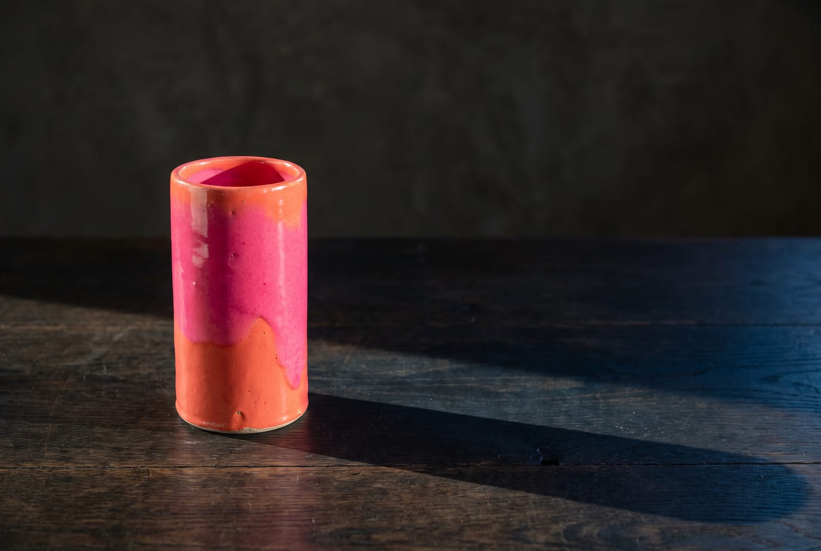
How to read this palette
Bright spring reads its grid differently from the muted seasons. Soft autumn is built on blending; bright spring is built on contrast and clarity. Seen as three jobs instead of one long list, the palette starts making shopping decisions for you.
The brights (the personality, most of the palette). Coral, tangerine, geranium red, hot warm pink, golden yellow, apple green, warm turquoise, clear violet. This is where a bright spring lives, and unlike almost every other season you can wear these full-strength, near the face, without toning them down. One clear bright is usually the loudest thing in the outfit, and it should be. Two clear brights together works when they're genuinely different hues, which is why a bright spring can pull off coral-with-turquoise or golden-yellow-with-fuchsia where a softer season can't.
The clean lights (the breathing room). Warm whites, warm ivory, the palest edge of the brights. These give the eye somewhere to rest and let the saturated colors read as deliberate rather than relentless. A bright spring outfit that's all-bright, top to toe, tips into costume. A clean light next to a coral is what turns it into an outfit.
The saturated darks and true neutrals (the contrast). Warm bright navy, clear violet at its deepest, and small doses of true black and true white. Bright spring borrows a trick from its bright winter sister: it can carry a hit of genuine black or white as contrast, where a warm or soft season can't. Use these for the shoe, the belt, the trouser, the structured layer that gives the brights something to push against.
Check any outfit for real contrast before you trust it. If everything sits at the same middle brightness, the look goes muddy and your coloring outshines your clothes. If there's a clear bright, a clean light, and a definite dark, you're wearing the palette the way it wants to be worn. Dusty and mid-tone are the two directions that kill it.
Neutrals for bright spring
Bright spring's neutrals are the ones people get wrong most, because the instinct is to reach for the safe greige and heather-grey that flatten this coloring on contact. The five that carry the everyday load stay warm and clear. They read as clean, not dusty.
: the everyday "white" of this season. Cleaner than cream, warmer than optic white, and a better base than pure #FFFFFF for most bright springs.
: the softer light neutral. Works as a knit, a shirt, or a trouser when a full white feels too stark.
: the mid neutral that doesn't go dead. Keep it warm and clear; the muddy, greyed version of this color is the one to avoid.
: the warm near-dark. Reads as a softened black, so it grounds an outfit without the coolness of true charcoal.
: the clear navy. Deep enough to anchor a bright, warm enough not to fight the palette. This is the bright spring version of the navy every wardrobe needs.
Add the 19 brights in the hex block and the count comes back to 24, everything a bright spring wardrobe needs to sit on.
Bright spring is also one of the few seasons that can wear true black and true white outright. Its contrast is high enough to hold them, in small, deliberate doses. A crisp white shirt or a black shoe reads as clean contrast rather than a clash. Just keep the warm neutrals above as the everyday base and let true black and white be the accent, not the field.
Colors to avoid
Five colors pull against everything this palette does:
: too greyed. The muted, chalky quality reads as a smudge against clear coloring. Swap for hot warm pink #FF4D8D.
: too cool and too muted at once. It drains the warmth and dulls the brightness in a single move. Swap for warm turquoise #1EC9BE.
: too heavy and muddy. Autumn's warmed-down browns weigh a bright spring down instead of lighting it up. Swap for tangerine #FF8C2B.
: too cold. This is a bright winter neutral, and its cool depth pulls the face grey. Swap for warm bright navy #2A3E7A.
: too flat. It has no chroma to keep up with the palette, so it reads as tired next to the brights. Swap for golden yellow #FFC61F.
What unites the five is dust, grey, or a cool base, and the fight is almost always about clarity rather than the hue itself. Hand the same dusty mauve to a soft summer and it turns considered, even lovely. The palette wants saturation and cleanliness, not restraint.
Celebrity examples
Bright spring's celebrity list is thinner and more contested than the muted seasons', partly because the category authority, theconceptwardrobe, names no celebrities in its guide at all. The names below hold up across the communities that do publish typed lists. Each lands on three or more independent rosters, a sturdier footing than any one analyst's read.
Emma Stone. The most widely cited bright spring, named across Four Seasons Studio, The Aligned Lover, and Spicemarket Colour. Warm-fair skin, coppery-red hair, and clear blue-green eyes give her the textbook warm-and-bright coloring, and she's at her best in clear coral, warm turquoise, and golden tones. The typing isn't unanimous. A minority of analysts read her as a light or muted spring, so treat her as the flagship reference rather than a settled verdict.
Jane Levy. She shows the coloring more plainly than anyone else on the list, typed bright spring by Four Seasons Studio, Spicemarket Colour, and ToneMatch. Coppery-red hair, clear blue-green eyes, and warm-fair skin carry real contrast between the features. If you want a single face to calibrate the warm-bright look against, hers is it.
Solange. She's named bright spring across The Aligned Lover, Spicemarket Colour, and ToneMatch. The Aligned Lover works her example directly: she radiates in bright orange, and powdery, muted peach mutes her glow. Her warm, clear, high-contrast coloring on rich skin is proof that bright spring is set by brightness and warmth, not by depth.
Kerry Washington. Spicemarket Colour, ToneMatch, and Soul of Color's spring list all type her bright spring, making her a second deeper-skin anchor. Her warm undertone and clear, high-contrast features light up in clean, saturated color and go flat under the dusty, greyed shades that flatter the muted seasons. She's a useful reference for how bright spring reads on warm brown skin.
Jamie Chung. She gives the list its Asian American reference, named bright spring by The Aligned Lover, Spicemarket Colour, and ToneMatch. The Aligned Lover notes she sparkles in coral-orange while heavy autumnal tones sit dull on her. Her warm ivory skin pairs with clear, high-contrast dark eyes that hold a warm ring rather than an icy one.
A few more names round out the range with real medium-depth coverage. Gina Rodriguez turns up as a bright spring across Spicemarket Colour, ToneMatch, and Soul of Color's spring list, and gives the set its Latina reference. Past that, bright spring skews light-to-medium in every published roster, and the deepest skin tones are barely documented in the field. That's a gap in who gets analyzed, not a rule about who can be one.
Two names worth flagging for what they teach rather than what they confirm. Zooey Deschanel gets read as a bright winter, the cool sister season. That's why she belongs in the comparison below, as the exact color of the confusion this page resolves, not on the roster. And Rachel Weisz turns up on a couple of bright spring lists, but her convergence sits at soft autumn, so we type her there for consistency. When a name splits across seasons like that, it's usually a temperature or clarity disagreement, and the person isn't a clean reference for either side.
Work from the 24 hex codes above. The names are only a shortcut to them, and a shortcut you can skip.
Makeup and wardrobe recommendations
Warm, clear, and saturated govern the makeup bag the same way they govern the palette. The failure mode is muddiness, not boldness. Most bright springs wear colors a half-step too dusty and blame the shade when the problem is the clarity. The skill is clean contrast: saturated color, clear lights, and a few real darks, combined so the outfit carries the same energy your coloring already does.
Foundation. Warm or warm-neutral undertone, and clear rather than heavy. Most brands label these "warm," "golden," or "honey." Steer away from anything tagged "cool," "rosy," or "neutral-cool," which pulls the skin grey against bright spring warmth. The goal is skin that looks lit, not matte and flattened.
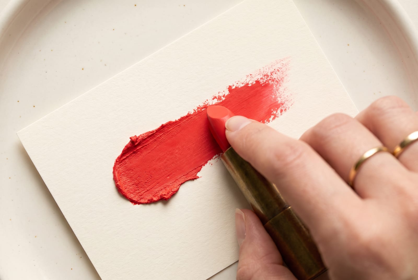
Lip. Clear coral, warm true red, and bright warm pink are the sweet spot. The famous clear-bright shades live here: a clean coral-red like MAC Lady Danger, a bright orange-red like NARS Heat Wave, a true warm coral. Skip anything described as "your-lips-but-better" muted mauve or brown-nude, which sits dusty against this coloring. Bright spring is one of the rare seasons that can wear a full, saturated lip in the daytime and look right.
Blush. Clear warm coral and peachy-pink, applied with a bit of energy. The blush should look like the flush after a brisk walk, not a soft powder wash. Muted rosy-brown blush is the one to avoid; it greys the whole face.
Eye. Warm and clear beats smoky and muted every time. Golden bronze, warm copper, clear teal or turquoise liner, and clean warm greens all work. A bright turquoise or emerald liner is a genuinely flattering bright spring move that most people never try. Cool taupes, grey smoke, and muted mauve shadow fight the warm-clear undertone and dull the eyes.
Jewelry. Bright warm gold is the natural match. But polished silver and white gold work here in a way they don't for the warmer seasons, because bright spring's clarity can carry a cool-clean metal as contrast. The rule is shine over patina: bright, polished, and clear beats antiqued or brushed. Dull, oxidized metals read as muddy.

Everyday basics. A soft-warm-white shirt, a warm-bright-navy trouser, a clear-coral knit, warm ivory, and a clean bright accent near the face. Every piece stays clear. The trap for a bright spring is a wardrobe full of "safe" greige and heather-grey. It drains the warmth and leaves you looking tired in clothes that would flatter a soft summer. Clean beats safe.
Statement pieces. This is where bright spring gets to do what almost no other season can: wear a clear, saturated color at full strength, right up near the face, without toning it down. A coral blazer, a golden-yellow dress, a warm-turquoise coat. One clear bright is usually the whole statement. Pair it with a clean light and a definite dark and let it carry the look.
Denim. Clean, bright, and clear washes work best: a crisp mid-blue, a bright white denim, or a saturated colored denim in the palette. The muddy, faded, grey-cast washes that read as "worn-in" go dull against bright spring and pull the warmth down. If a jean looks a little too clean and blue to be fashionable, it's probably right for you.
Prints and patterns. Bright spring is a rare season that genuinely suits busy, high-contrast, multicolor prints, because the coloring can keep up with them. Clear florals, saturated stripes, bold graphic prints where the colors are clean and the contrast is real. The prints to skip are the muddy, tonal, low-contrast ones, the faded earth-tone florals that look expensive on a soft autumn and washed-out on you.
Contrast rule. The single most useful bright spring styling habit is to check every outfit for a genuine dark-to-light spread. A bright plus a clean light plus a real dark reads as intentional. A collection of mid-tones with no clear light and no definite dark goes flat, no matter how warm the colors are. Build the contrast in on purpose.
A starter capsule looks like this: soft warm white shirt, warm ivory knit, warm-bright-navy trouser, bright white denim, clear-coral or golden-yellow statement layer, warm-turquoise accent, a black or bright-white piece for clean contrast, and bright gold hardware. Everything lives inside the palette, everything stays clear, and every piece pairs with every other.
For a wardrobe built on these colors, build a bright spring palette and use the hex output as your shopping filter.
Hair color for bright spring
If you color your hair, keep the season's three words in the chair with you: warm, clear, never ashy. The whole season runs on warmth and clarity. A warm, clean color that keeps its shine reads as harmony, while an ash toner, a flat dark box-dye, or a muddy "natural" brown reads as a fight.
The directions that work are warm and bright: golden and honey blondes, warm caramel, clear coppery and golden reds, and warm medium browns with a visible gold thread. Bright spring can go surprisingly light (a clean golden blonde) or stay in warm brown, as long as the color keeps a clear, warm tone. Colorists grade depth on levels running 1 (black) through 10 (lightest blonde), and most bright springs sit in the 5-to-9 band, with the color pulling warm and clean rather than smoky at every level.
Lead with "no ash." The words that get the right chair-side result are golden, honey, caramel, copper, and clear warm brown. Ash toner is the usual culprit when a warm color turns flat and grey on bright spring skin, and purple or blue brass-correcting shampoos do the same job in slow motion. The brass they're built to fight sits right next to the warmth this season runs on, so go easy on both.
The colors to avoid each fail one of two tests. Ashy blonde, cool espresso, and flat "neutral" brown break the warmth rule and leave the skin looking tired. Muddy, dusty, or heavily lowlighted color breaks the clarity rule, because bright spring wants its hair to read as one clean bright note, not a blended, low-contrast wash. Jet-black is usually too heavy and too cool, even though the high contrast can tempt you toward it. A clear warm dark brown does the same job without the coldness.
Bright spring for men
The same dials type men. A man with warm, clear, high-contrast coloring (warm golden or coppery hair, clear bright eyes, warm skin that reads clean rather than dusty) sits in the exact same palette. The dial settings are identical, and this is a real search that thin men's-style resources usually leave unanswered.
The menswear translation is straightforward. Clean white and soft-warm-white shirts, warm-bright-navy tailoring, clear-blue and warm-green polos and knits, and coral or warm-red as the accent that most men skip and shouldn't. Bright spring is one of the few palettes where a man can wear a genuinely saturated shirt, a clear teal or a strong coral, and look sharp rather than costumey. The coloring supports the color.
What to avoid is the standard menswear drift into drab: muddy olive, greyed navy, heather-grey marl, and washed, faded denim. Those are the exact tones that flatten bright spring, and they make up most of the "safe" men's basics wall. Keep the whites clean, the navies clear, the denim bright, and add one saturated warm color near the face. A crisp white shirt against warm-bright-navy with a clear-coral detail carries the high contrast this coloring wants.
Comparison with adjacent seasons
Three seasons get confused with bright spring most often, and each fork below hangs on one dial.
Bright spring vs. bright winter (the temperature dial). This is the big one, and it's the whole reason bright spring is hard to type. The two seasons share almost everything: high brightness, high saturation, and high contrast. They differ on undertone alone. Bright spring is warm, so its brights are coral, golden yellow, apple green, and warm turquoise. Bright winter is cool, so its brights are fuchsia, icy blue, blue-red, and true green with a cold edge. Zooey Deschanel is the clean bright winter reference: same clear, high-contrast intensity as a bright spring, but her coloring wants the cool version of every bright. The test is direct. Hold a clear coral against your face, then a cool fuchsia. If coral lights you and fuchsia hardens you, you're bright spring. If it's the reverse, you're bright winter.
Bright spring vs. warm spring (the brightness and contrast dial). Warm spring, also called true spring, shares the warmth but not the intensity. It sits softer, more golden, and lower in contrast: apricot instead of coral, buttery yellow instead of golden yellow, warm peach instead of hot pink. Its palette is sun-warmed where bright spring's is clear and near-primary. The giveaway is what you can carry near the face. A bright spring can wear a clean, almost-primary color and a hit of true black or white without being overwhelmed. A warm spring in the same clear brights and hard darks looks slightly overpowered. The practical test: hold a clear coral like #FF5A47 against your face, then a soft apricot. If the coral energizes you, you're bright spring. If the coral feels louder than you do and the apricot feels settled, you're warm spring.
Bright spring vs. light spring (the depth and chroma dial). Light spring is the palest, most delicate spring: warm and clear like bright spring, but lighter and lower in chroma, and gentler in contrast. Where bright spring wears a saturated coral, light spring wears a warm, light peach-coral. If your coloring is warm and fresh but soft and light overall, with low contrast between your features, light spring is the closer fit. Bright spring keeps the high contrast and the full saturation that light spring softens.
The full 12-season comparison chart lives on the seasonal color analysis hub.
Frequently asked questions
How do you know if you're a bright spring? Check three anchors: warm, clear hair (golden, coppery, or warm brown with shine), bright jewel-like eyes, and a warm undertone that looks best in gold. If your coloring is also high-contrast and comes alive in clear, saturated color rather than dusty tones, you're almost certainly bright spring.
Can bright spring wear black? Yes, in small doses, which sets bright spring apart from most seasons. Its high contrast can carry a hit of true black as a shoe, a bag, or a clean accent. Just keep it under about half the outfit and pair it with a clear bright near the face, so the black reads as sharp contrast rather than a weight.
What are the worst colors for a bright spring? Anything dusty, muted, or cool-based. Dusty mauve, greyed slate blue, muddy earth-tone browns, cool blue-black, and flat beige all drain the warmth or dull the brightness this coloring runs on. The problem is almost always clarity, not the hue. The clean, saturated version of the same color usually works.
What's the difference between bright spring and bright winter? Undertone. Both are bright, high-contrast, and highly saturated, so people confuse them constantly, but bright spring is warm (coral, golden yellow, apple green) while bright winter is cool (fuchsia, icy blue, blue-red). Warmth is the whole tiebreaker. Gold flattering you more than silver puts you on the spring side.
Is bright spring warm or cool? Warm. The undertone leans warm-neutral, and that warmth is the whole thing separating bright spring from bright winter. Both run bright and high-contrast, but bright spring's brights are coral, golden yellow, and warm turquoise, where bright winter's are fuchsia and icy blue. Only the temperature splits them.
Should a bright spring wear silver or gold jewelry? Gold is the natural match, bright and warm against warm coloring. But bright spring is one of the few seasons that can also wear polished silver and white gold, because its clarity carries a cool-clean metal as contrast. The rule is shine over patina: bright and polished beats antiqued.
Can bright spring have deep skin? Yes. Bright spring is set by warm undertone, high chroma, and high contrast, not by how light or dark the skin is. Deep, warm, clear coloring often gets mistyped as bright winter or dark autumn on depth alone. Gold flattering more than silver is the tell that holds at any depth.
What hair color is best for a bright spring? Warm and clear: golden or honey blonde, warm caramel, clear coppery or golden red, and warm medium brown with a gold thread. Keep it shiny and warm-toned, and say "no ash" to your colorist. Ashy, muddy, or flat cool colors turn bright spring skin tired and grey.
Can men be bright spring? Yes. The seasonal system describes coloring, not gender. A man with warm golden or coppery hair, clear bright eyes, and warm clean skin sits in the same palette. In menswear that means clean whites, warm-bright navy, and one saturated warm color, a clear teal or a strong coral, near the face.
Disclosure: BrandColors makes the color-palette generator linked in this guide. The seasonal typings and palettes above draw on the external color-analysis sources named throughout (theconceptwardrobe, Four Seasons Studio, The Aligned Lover, Spicemarket Colour, and ToneMatch), not from our product. Last updated July 24, 2026.
Related palettes: Light Spring · Warm Spring · Bright Winter · Seasonal color analysis hub