Deep winter is the darkest, coolest, most saturated corner of the 12-season system. It's also the season people most often confuse with its warm sister, deep autumn. The deep winter color palette (also called dark winter) runs cool, dark, and clear: true black, charcoal, burgundy, pine and emerald green, sapphire, navy, and deep plum, lifted by icy white and icy pink for contrast. The confusing part is that darkness, the trait everybody notices first, is the one trait it shares with all its dark neighbors. What actually separates deep winter from deep autumn is warmth, and what separates it from the muted seasons is clarity.
Maybe a color analyst just typed you a deep winter and you felt a flicker of disappointment, like you got handed the "wear black forever" season. That read is backwards. Deep winter isn't the season of limits. It owns the loudest colors in the whole system: the true reds, the electric jewel tones, the icy brights that would flatten almost anyone else. Where a soft summer has to whisper and a soft autumn has to blend, a deep winter can put on emerald, sapphire, and a blue-red lip in the same outfit and still look like the calmest person in the room.
This guide covers who deep winter fits, the 24 hex codes, the colors to avoid, and the celebrities the color-analysis communities agree on. If you've been told you're a winter but can't tell whether you're the cool-dark one or the warm-dark one, one at-home test settles it. Start there.
Who deep winter fits
Deep winter coloring is cool, dark, and high in contrast. Three words aren't much to go on by themselves, so check them against your hair, eyes, and skin, the three anchors the 12-season system reads.
Hair. Deep winters almost always have dark hair: dark brown, cool espresso, or blue-black, with an ash or neutral base rather than a warm one. Hair is usually the deepest feature on the face. It isn't the golden-brown or auburn of a deep autumn, and it isn't the soft mousey brown of a summer. If your natural color reads as dark-and-cool, with a gray or blue undertone rather than a red or gold one, that's the deep winter tell.
Eyes. Dark and cool is the rule. Deep winter eyes run dark brown, cool hazel, deep gray-green, and what analysts sometimes call "black-brown," where the iris looks almost as dark as the pupil. The eye holds depth and a clear, cool edge at once. There's a steely clarity to it rather than the gold or amber thread a deep autumn eye carries.
Skin. A deep winter's skin has a cool or neutral undertone (the tint underneath the surface, the part a tan doesn't change): blue or blue-pink rather than golden. The skin itself can be porcelain-fair, olive, medium, or deep. The depth of the skin is not what makes the season. The undertone is. You tend to look better in silver jewelry than gold, and that holds whether your skin is light or dark.
Contrast level. High, and this is the marker that matters most. Contrast means the gap between your darkest feature and your lightest one, and deep winter runs that gap wide: dark hair and dark eyes against skin that reads a clear step lighter, or on deeper skin, a clear step cooler. Hold up a photo of yourself and the features carry their own drama. This is the opposite of soft summer, where everything melts together. If your face already supplies the contrast, your clothes get to match it instead of manufacturing it.
Three or four matches put you in deep winter territory. If only two match, the misses point the way instead: warmer, softer misses suggest deep autumn, while lighter, icier ones suggest true winter. Each fork gets its own section below.
Deep winter across different skin tones
The hair, eye, and skin descriptions above hold at every depth of skin. Deep winter is set by three dials: a cool-leaning undertone, dark value (how light or dark the coloring runs overall), and high contrast between the features. None of the three measures the skin itself. A porcelain deep winter and a deep-skinned deep winter run on identical settings.
The trap with this season is real, and it runs in a specific direction. Deeper-skinned people get sorted into deep winter on darkness alone, when their actual undertone is warm and they belong in deep autumn. Someone sees dark skin, dark hair, and dark eyes, files all that depth under "cool," and reaches for icy jewel tones that gray the person out. The darkness is obvious. The coolness is an assumption. The tell that crosses every ethnicity is the same one from the checklist above: silver lights the face and gold dims it, and cold clear colors make the skin glow while warm spiced tones drop a dull cast over it.
It presents differently depending on background. On porcelain and cool-fair skin, deep winter reads as the classic "Snow White" contrast: near-black hair, cool skin, and enough natural drama that stark black and optic white both work. On olive skin, it shows up as a cool, deep clarity where charcoal, pine, and true red come alive and warm earth tones turn the complexion sallow. On Black and deeper skin, deep winter shows up as a cool, high-contrast depth that comes alive in emerald, sapphire, magenta, and pure white, while muddy warm tones flatten the same face. truth-is-beauty makes the practical point: deeper-skinned deep winters still need contrast in a look. Head-to-toe black can quietly diminish the face, so the season wants black against something bright rather than black on its own. East Asian and Latina deep winters often carry cool-neutral or olive complexions with dark cool hair and dark eyes, sitting right on the line where the warm-versus-cool call decides everything.
Deeper-skin deep winter typings are thinly documented. Most darker-skinned faces get sorted into deep or dark autumn on the sanctioned community lists. And the deeper the skin, the more often an analyst reaches for "deep winter" on contrast alone. That single call is where the mis-sorting happens. A contrast read is standing in for a warmth read, and the two are different measurements. The one deeper-skin face who clears the bar cleanly is Viola Davis, below. The check that works at any depth is the drape test. Hold a cool blue-red or an icy white against your face, then a warm rust or a golden bronze; one pair makes the skin glow, the other drops a gray veil over it. Silver flattering you more than gold is the cool-undertone confirmation. Skin depth never enters the test.
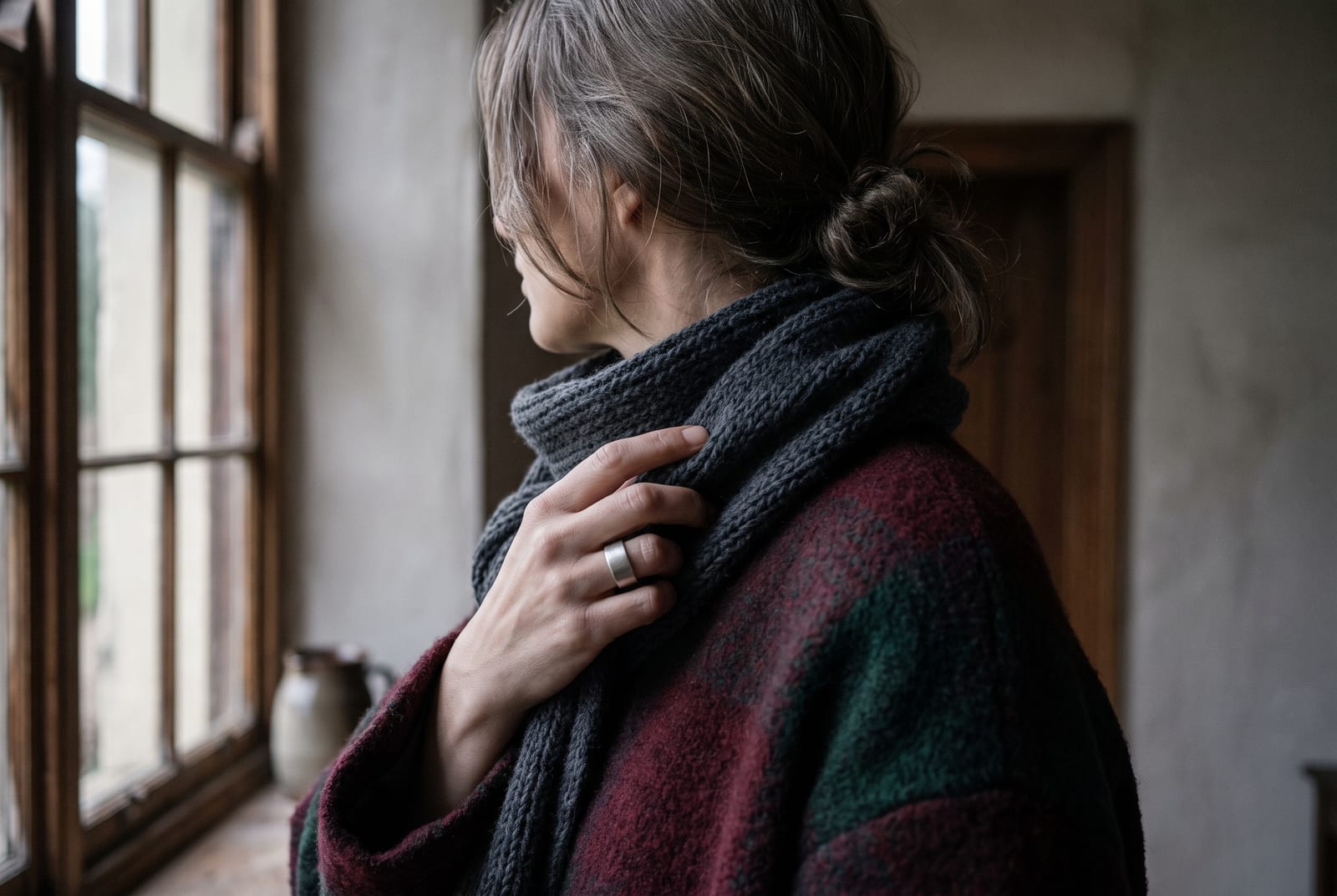
The deep winter color palette
The full palette is 24 hex codes, organized by the job each color does. Every color sits in the cool-deep zone: value runs low, roughly 12-45% lightness, saturation stays clear at roughly 50-85%, and the hue leans cool. Here's what those numbers feel like on a garment. A 12% lightness is a near-black that only reads as a color up close; 45% is a mid-depth jewel tone like sapphire. A 50% saturation is rich; 85% is electric. A few icy accents break high above that band on purpose, because deep winter is built on contrast, the dark and the bright living in one palette. The bands are a rough guide to the season's shape, not a measured standard, so treat them as direction, not a ruler.
How to read this palette
A hex grid tells you what the colors are. The roles tell you how much of each to buy, which is the decision that actually builds a wardrobe. Deep winter's palette breaks into three.
Anchors (the foundation, roughly six colors). True black, charcoal, deep navy, and the darkest pine and burgundy. These are the colors you wear most days, and deep winter is one of the only seasons that can build its base on true black without paying for it. Anchors should make up roughly 60% of a deep winter wardrobe. They're the dark ground everything bright sits against.
Accents (the personality, roughly 13 colors). Emerald, jade, pine, deep teal, sapphire, royal blue, true red, ruby, royal purple, deep violet, raspberry, magenta, and wine. This is where deep winter separates from every other dark season. The coloring carries so much natural contrast that a fully saturated jewel tone against the darks reads as composed, not loud. A true red that would shout on a soft summer looks deliberate here.
Brights (the contrast layer, roughly five colors). Icy white, icy blue, icy pink, icy lavender, and cool silver-gray. These are the high-value break that no warm or muted season can touch. A deep winter can put icy white next to jet black and the pairing reads as sharp rather than harsh, because the face already lives at that contrast level. Brights are the shirt under the black blazer, the piping, the single cold pastel that makes the whole outfit snap.
One way to check is to build an outfit that pairs one dark anchor with one bright: black and icy white, navy and icy pink, charcoal and emerald. If the pairing looks intentional rather than costume-like, you're reading the season right. If you need to soften the contrast to make it wearable, you may be a step toward one of the muted seasons.
The thing to watch is temperature and clarity, not darkness. Place any hex here next to a warm camel or a dusty muted rose. The cold jewel tones look sharp and clean; the warm neighbor looks tired. Pair the same emerald with a sapphire and a true red and the whole group reads as one cold, lit, high-contrast family.
Neutrals for deep winter
Most of a wardrobe is neutrals, so get these five right before anything else. Deep winter neutrals are cooler than autumn's brown-based range and darker and clearer than summer's soft grays. This is the season that gets to keep true black on the neutral list.
: the foundation, and one of the few seasons that wears it straight. Best worn against a bright rather than head-to-toe.
: the everyday mid-dark neutral. Softer than pure black, still unmistakably cool.
: the second black. A true cool navy rivals black on this coloring and reads a touch less severe.
: the mid-tone gray. Cool and clean, never warmed or greened. Works as a trouser, a coat, or a base for brights.
: the "white" of this season. Deep winter is one of the only seasons that can wear a true optic white, and this cool near-white does the sharp-contrast job that a creamy white can't.
These five neutrals, plus the 19 accents and brights in the hex block above, cover the whole wardrobe.
Colors to avoid
Five hex codes actively fight the deep winter palette, and they fail one of two ways: too warm, or too muted. Both drain a cool, clear coloring.
: warm and softened, it turns cool skin sallow and blurs the contrast the season runs on. Swap cool pewter #4C5563.
: an earthy warm orange-red that pulls against the blue-based palette and muddies on contact. Swap true red #C21031.
: light and warm at once, wrong on both dials for a dark, cool season. Swap icy white #E9EEF4.
: a warm muted green that goes dull and swampy next to clear jewel tones. Swap emerald #0C7C5B.
: greyed and soft, it's a summer color, and its mutedness reads as a smudge against deep winter's clarity. Swap deep raspberry #A21A5C.
The pattern holds across all five. Warm shades pull the coolness out of the skin; muted ones blur the clarity the season depends on. Deep winter needs both to look like itself. These aren't bad colors; the quarrel is with this coloring specifically. A dusty mauve that smudges a deep winter looks lovely on a soft summer, and a rust that muddies one looks warm and lit on a deep autumn.
Celebrity examples
The names below show up as deep winter on more than one independent list, which is the bar every name on this page has to clear. truth-is-beauty, four seasons studio, and The Aligned Lover's dark-winter guide converge on the anchors here, and theconceptwardrobe sets the season definition they're typing against.
Anne Hathaway. She appears on three separate community lists, more agreement than any other name here. Her dark brown hair, cool fair skin, and clear bright eyes are the textbook cool-dark contrast, and her best looks sit in true black, emerald, sapphire, and a blue-red lip. One honest edge: Soul of Color files her under true winter when her contrast reads especially icy, so some analysts push her one step cooler. That split is useful in itself. It shows the deep-winter-to-true-winter line turns on which trait the coloring leads with: depth or pure coolness.
Viola Davis. The one darker-skinned face that clears the two-source bar cleanly. Her cool bronze-deep skin, dark hair, and high feature contrast come alive in emerald, magenta, sapphire, and pure white. She's also the face of the season's honest rule from earlier: black works best on her against a bright, not on its own.
Lucy Liu. On her, the season reads through cool-neutral East Asian coloring instead of the pale-and-dark stereotype. Dark hair, deep brown eyes, and cool porcelain skin line up with the deep, cool, clear colors of the palette, and she's at her best in charcoal, true red, deep teal, and icy pink.
Salma Hayek. A lesson in reading undertone over first impression: her skin can look sun-warmed, but her coloring drapes cool. Dark hair, dark eyes, and a clarity that holds up in burgundy, sapphire, and deep plum, where warm earth tones would gray her. She's proof that a deep winter doesn't have to have obviously cool-looking skin, only a cool undertone underneath it.
Monica Bellucci. The same lesson at olive depth. Her complexion reads warm at a glance, but her dark hair, dark eyes, and high contrast drape as deep winter, coming alive in true red, deep wine, and cold jewel tones. If your skin looks warm in photos but cool, clear colors keep beating warm ones in the mirror, she's your calibration point.
Catherine Zeta-Jones. Near-black hair, cool fair skin, and dark eyes that carry the whole cool-dark signature. Her red-carpet best is exactly the season's home base, black, deep red, and emerald, and she comes without the edge cases the others carry.
The documentation gap from earlier shows up hardest in this list. Most darker-skinned faces get typed deep or dark autumn, the warm sister, and the few typed deep winter on darker skin, Naomi Campbell and Priyanka Chopra among them, appear on one sanctioned list each, so they don't clear the two-source bar. Viola Davis is the exception that does. When you see a darker-skinned face labeled deep winter on contrast alone, treat it with suspicion: contrast is standing in for warmth there, and those aren't the same measurement. The gold-versus-silver drape is the real test at every depth.
Makeup and wardrobe recommendations
Makeup and wardrobe run on the same three settings as everything above: cool undertone, deep value, and clear rather than muted color.
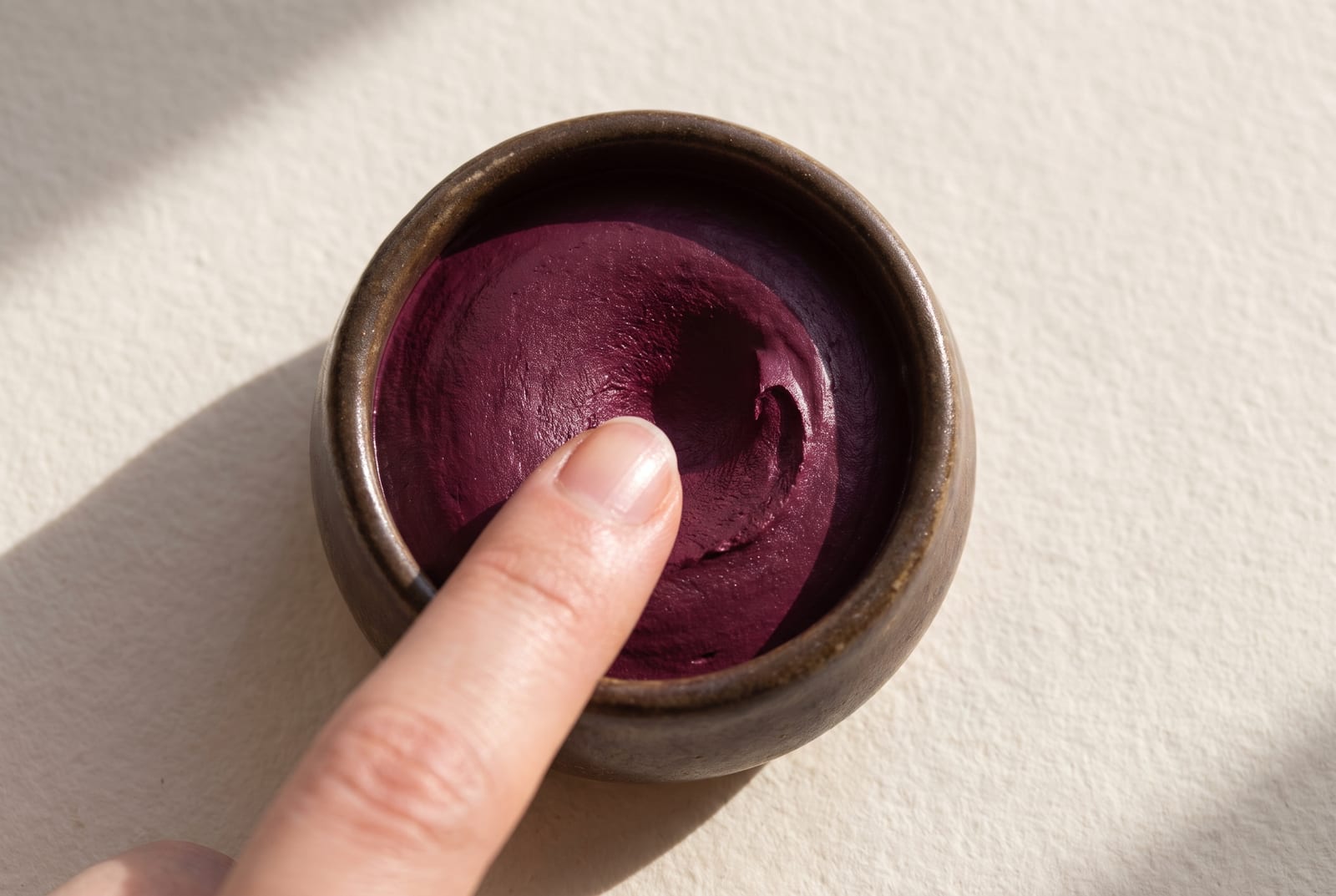
Foundation. Cool or cool-neutral undertone. Avoid anything labeled "warm," "golden," or "honey," which turns cool skin muddy. Most brands name the right shades "cool," "rosy," or "neutral," and MAC's NW range and the cooler NARS shades usually land where a deep winter sits. If a foundation looks slightly too pink in the bottle, that's often the right call for this coloring, not the wrong one.
Lip. True red, blue-red, deep berry, plum, wine, and cool fuchsia. The deep winter sweet spot is "cool and clear," and this is one of the only seasons that can wear a genuine blue-red without it looking costume-y. MAC Ruby Woo is a long-running deep winter blue-red, and a cool berry like Charlotte Tilbury's Glastonberry reads well too. Avoid warm coral, brick, and orange-red. They pull the palette warm and dull the face.
Eye. Charcoal, cool smoke, emerald, sapphire, deep plum, and true silver. Shimmers should read silver or cool, not gold or bronze. A cool-toned smoky palette in the gray-to-black family fits cleanly. A single cold jewel tone on the lid, emerald or sapphire, does more here than a whole warm palette would. Avoid warm browns, copper, and gold shimmer. They fight the cool undertone every time.
Jewelry. Silver, platinum, white gold, and cool-toned steel. Metals should match the temperature of your coloring, and deep winter runs cool, so a bright silver against black looks sharp and deliberate. Deep winter is the warmest of the three winters, so a deep or antiqued gold can work as an accent. But silver stays the everyday base. Gunmetal, hematite, onyx, and dark cool stones are all on-season.
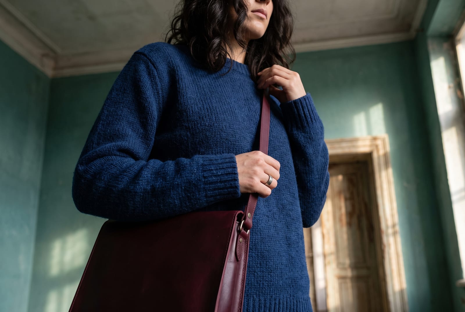
Wardrobe basics (everyday). Black tailoring, charcoal knit, deep-navy trouser, crisp icy-white shirt, and a cool-toned dark denim. Each piece sits inside the palette. Deep winter is the rare season where a true black suit with a stark white shirt is a flattering default rather than a draining one. The outfit finally matches the contrast the face already carries.
Wardrobe accents (statement pieces). Emerald coat, sapphire silk blouse, true-red dress, magenta knit, deep-plum scarf. These add color without leaving the cool-clear register. Because the coloring supplies its own contrast, a single saturated jewel tone against the darks does the work of a whole outfit.
Prints and patterns. High-contrast graphics, black-and-white, and jewel tones on a dark or black ground. Deep winter can carry bold scale and sharp internal contrast, the exact opposite of a soft season, because the face holds its own against it. Avoid warm, low-contrast, muddy prints, think faded earth-tone paisley. The muted warmth cancels the coloring out. A clean black-and-white houndstooth or a jewel-tone floral on black is far more the season's language.
For a wardrobe built on these colors, build a deep winter palette and use the hex output as your shopping filter.
Hair color for deep winter
Hair color follows the palette's own logic: stay dark, stay cool, keep the contrast high. The season is built on deep, cool value, so hair that holds its depth with a cool or neutral base reads as harmony. Hair that's bleached light, warmed to gold or copper, or dulled to a muddy mid-brown reads as a fight.
The directions that work are dark and cool: blue-black, cool dark espresso, true dark brown, and cool deep chestnut with no red in it. Colorists number hair depth on a 1-to-10 level scale, where 1 is black and 10 is the lightest blonde. Deep winter lives in roughly the 1-to-4 band: blue-black and cool black around levels 1 to 2, cool dark brown around 3 to 4. The plain-English version to hand your stylist: "a level 2 or 3 cool dark brown or black, ash or neutral base, no warmth."
That "no warmth" instruction matters most, and it runs the opposite direction from a deep autumn. Ask for ash, cool, or neutral tones. Say out loud that you don't want gold, copper, or red pulled through, because a warm toner is what turns a good cool color brassy on deep winter skin. Cool-toned toners and blue or purple brass-correcting products are your friends here, not your enemies.
The colors to avoid each break the dark rule or the cool rule. Platinum, honey blonde, and warm balayage go far too light for coloring this deep. Golden brown, copper, and warm auburn break the cool rule and leave the skin looking sallow. A muddy warm mid-brown misses on both at once. For highlights, keep them cool and high in contrast if you use them at all, though many deep winters look strongest in a single solid dark shade. And when the gray comes in, deep winter wears it better than almost anyone. A clean cool silver or a sharp salt-and-pepper reads as striking rather than washed out, where a warm season would look faded.
Deep winter for men
The seasonal-color system describes coloring, not gender, and deep winter is one of the most straightforward seasons to dress in menswear. Men with dark cool hair, dark eyes, and cool or neutral skin at any depth fit the profile the same way women do. The high-contrast wardrobe that drains warmer men is exactly where a deep winter man looks his best.
The core is high-contrast tailoring: a charcoal or black suit, a crisp white or icy-blue shirt, and a tie in true red, burgundy, deep emerald, or sapphire. Deep winter is one of the few seasons that can wear a genuine black suit with a stark white shirt and look sharper for it. The pairing finally matches the contrast the face already supplies. For casual, reach for cool-toned dark denim, charcoal and black knits, a true-red or emerald sweater, and a navy that stays cool rather than sliding warm. Silver-toned watches and steel accessories beat brass and gold. What to skip is the warm-earth menswear palette that dominates a lot of stores: camel coats, olive field jackets, rust knits, and warm khaki all pull against the coloring. A deep winter man in a camel overcoat looks tired; the same man in a black one with an icy-white scarf looks like himself.
Comparison with adjacent seasons
Deep winter gets confused with a handful of neighbors, and each mix-up turns on a single dial.
Deep winter vs. deep autumn (the warmth dial). Most deep winter mis-typing happens right here. Both seasons are dark and high-contrast, so darkness can't be the tiebreaker; warmth is. Deep winter runs cool: blue-black hair, icy contrast, cold jewel tones. Deep autumn runs warm: espresso, rust, deep gold, and bronze. Two people can have identically dark hair and eyes and sit in opposite seasons. Depth is the loud signal both share; warmth is the quiet one that decides it. The gold-versus-silver drape resolves it almost every time. If silver lights your face and gold dims it, you're on the winter side of the dark seasons. Gold lighting you up instead makes you a deep autumn, no matter how cool your dark hair looks.
Deep winter vs. cool winter (the depth dial). Cool winter, also called true winter, is the purest, iciest cool of the three winters, coolness leading over everything else. Deep winter leads with depth instead, and because it borders deep autumn it carries a fraction less iciness and a touch more darkness. Both are cool and both are clear, so the tiebreaker is which trait runs first. If your coloring reads as cold before it reads as dark, you're likely a cool winter. If it reads as dark before it reads as cold, you're likely a deep winter. Cool winter also does the mid and bright end of the palette more comfortably, where deep winter always wants the darkest version of a color.
Deep winter vs. bright winter (the brightness dial). Bright winter, sometimes called clear winter, is the winter that borders spring, so it leads with brightness and clarity. It's the season that can wear hot pink and clear turquoise. Deep winter leads with darkness. Both are cool and both are clear. A bright winter comes alive in the lightest, most vivid corner of the winter palette; a deep winter comes alive in the darkest. If the electric brights energize you and the near-blacks feel heavy, you're bright winter. If the near-blacks settle you and the lightest brights feel thin, you're deep winter.
There's no such thing as a warm winter. This one clears up a common mistake. People who are warm and dark sometimes go looking for a "warm winter" to explain why they're both deep and cozy in earth tones. It doesn't exist. Winter is cool by definition across every version of the 12-season system. If you're dark and warm, you're a deep autumn, not a warm deep winter. The word people are reaching for when they say "warm winter" is almost always deep autumn, the sister season above.
The full 12-season comparison lives on the seasonal color analysis hub.
Frequently asked questions
What is a deep winter (dark winter) color palette? A deep winter color palette is cool, dark, and clear: true black, charcoal, burgundy, pine and emerald green, sapphire, navy, and deep plum, lifted by icy white and icy pink for contrast. It's the darkest, coolest corner of the 12-season system, and it wears the most saturated colors of any season.
How do you tell if you're a deep winter? You're likely a deep winter if your hair is deep brown to blue-black, your eyes are dark and cool, and your features contrast sharply with your skin. The clincher is a drape test: a cool blue-red and an icy white glow on you, while a warm rust and golden bronze drop a gray veil.
Is deep winter warm or cool? Cool. The "deep" in the name describes value, not temperature. Every version of the 12-season system files winter as cool, and deep winter is the darkest cool season. Its undertone is blue-based, so it glows in icy whites and cold jewel tones and grays in warm gold or rust.
Can deep winters wear black? Yes, and it's one of the only seasons that can wear true black straight. Deep winter's dark, high-contrast coloring matches jet black instead of being drained by it. The one caveat: black works best against a bright, like an icy-white shirt, rather than head-to-toe, which can quietly flatten the face.
Can deep winters wear navy?
Yes. Navy is a deep winter core neutral, one of the few dark colors that rivals black on this coloring. It has to be a true cool navy, blue-based and clear like #16213F, not a warmed or greyed navy that slides toward slate. Worn head-to-toe, it works like black but reads a touch softer.
Should deep winters wear silver or gold? Silver. Platinum and white gold sit cleanest against deep winter's cool depth. Deep winter is the warmest of the three winters, so a deep or antiqued gold can work as an accent where it flattens the other winters. Silver stays the everyday home base and gives the crisp cool contrast the coloring wants.
What's the difference between deep winter and deep autumn? Warmth. Both are dark and high-contrast, so darkness can't separate them. Deep winter runs cool: blue-black, icy contrast, cold jewel tones. Deep autumn runs warm: espresso, rust, and bronze. The gold-versus-silver drape settles it every time. Silver and cold clarity win for deep winter; gold and warm depth win for deep autumn.
What's the difference between deep winter and cool winter? Depth versus coolness. Both are cool and clear, so the tiebreaker is which trait leads. Cool winter, also called true winter, leads with icy coolness. Deep winter leads with darkness and, because it borders deep autumn, carries a touch less iciness. If you read as dark before cold, you're deep winter.
Is there a warm winter season? No. Winter is cool by definition across every version of the 12-season system, so a "warm winter" doesn't exist. People who are both dark and warm are almost always deep autumn, winter's warm sister season. If you're deep and cozy in earth tones, deep autumn is the label you want.
Can deep winter have dark skin? Yes. Deep winter is set by undertone, value, and contrast, not by how light or dark your skin is. The common trap: deeper-skinned people get sorted here on darkness alone when their undertone is actually warm, which makes them deep autumn. Silver over gold is the cool-undertone tell at every depth.
Disclosure: BrandColors makes the color-palette generator linked in this guide. The seasonal typings and palettes above draw from the external color-analysis sources named throughout (theconceptwardrobe, truth-is-beauty, four seasons studio, The Aligned Lover, and Spicemarket Colour), not from our product. Last updated July 24, 2026.
Related palettes: Deep Autumn · Cool Winter · Bright Winter · Seasonal color analysis hub