Warm autumn is the season people get wrong in the other direction. With soft autumn, the mistake is reading "muted" as "cool." With warm autumn, the mistake is reading "autumn" as "muted" at all. The warm autumn color palette is the most saturated autumn there is, and turning its volume down is the single most common way to mis-style this coloring. Warm autumn runs warm at nearly full saturation. Soft autumn keeps most of the warmth and drops the saturation to a murmur. Deep autumn keeps the saturation but pulls the value (how far down the light-to-dark range a color sits) into shadow. All three share the family warmth; they part ways on volume and shadow.
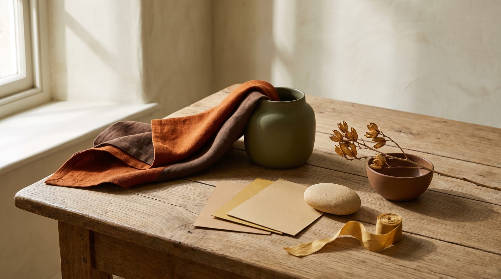
Warm autumn is also called true autumn, and the second name is the more honest one. It's the purest version of the season, the one every other autumn is measured against. The palette is golden and earthy at full strength: rust, cinnamon, mustard, olive, terracotta, golden brown, forest green, and pumpkin. These are warm colors with the saturation left in, not taken out. Where soft autumn is camel with dust on it, warm autumn is camel's louder cousin, the rust and the burnished gold that read as rich rather than restrained.
Warm autumns get mis-typed in two opposite directions. People with lighter coloring turn the saturation down, assuming autumn means quiet earth tones, and end up dressing a warm autumn like a soft autumn. People with deeper skin get the opposite treatment. They're sorted into deep or dark autumn on skin depth alone, when their real coloring is warm and saturated rather than dark and shadowed. Both errors come from the same place. Warm autumn is defined by warmth and saturation, not by how light or dark the person is.
What follows: the fit checklist, the 24 hex codes that define the palette, the colors to avoid, and the warm autumn celebrities the publishing communities agree on. Maybe you've been told you're a soft autumn, but you feel flat in dusty camels and only come alive in a true rust or a forest green. The muted-taupe capsule you built keeps washing you out. If so, you may have been under-saturating your wardrobe for years. Keep reading.
Who warm autumn fits
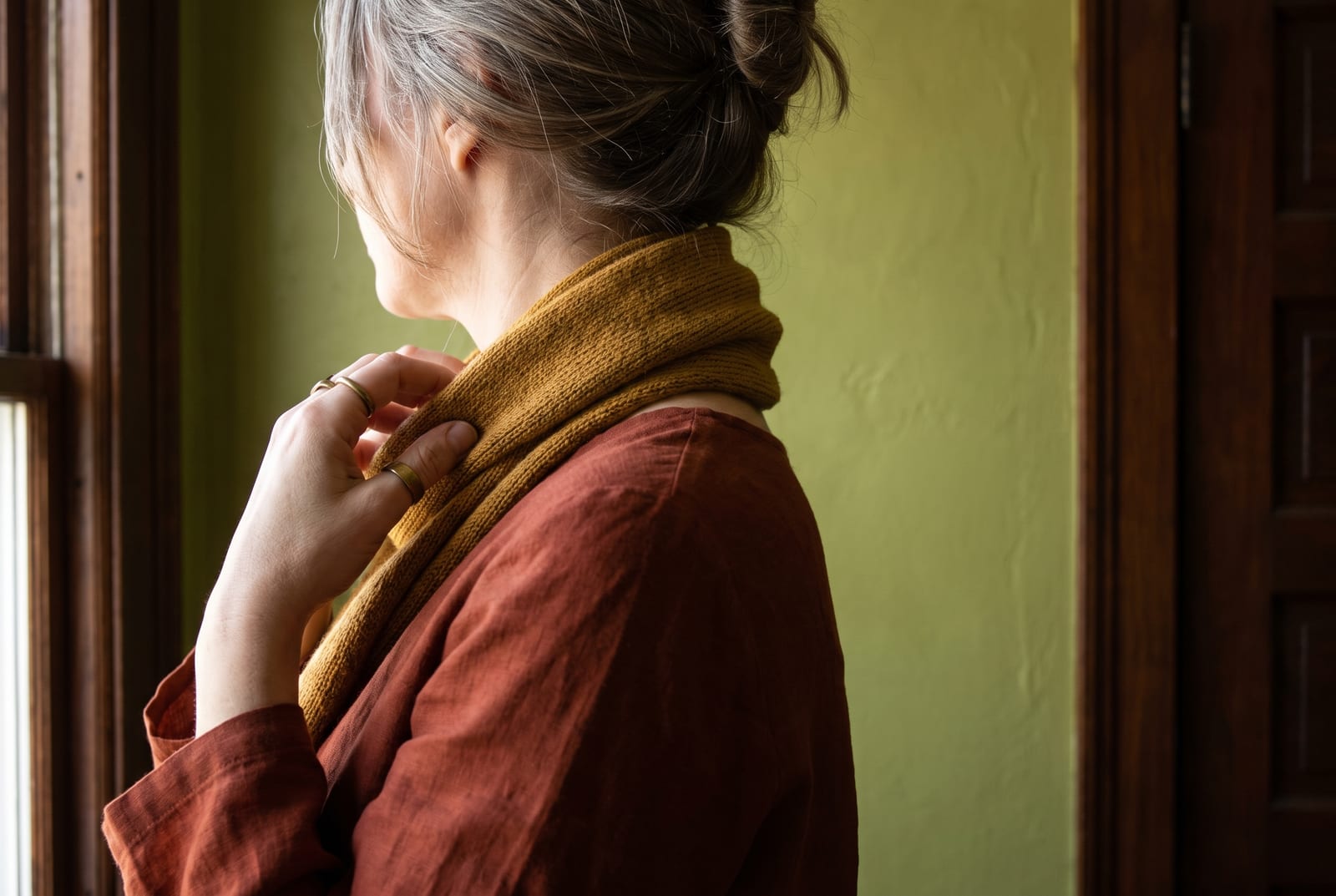
Warm autumn coloring is warm, saturated, and medium in value. The way to trust those three words is to test them against your hair, eyes, and skin, one anchor at a time.
Hair. Warm autumns almost always have hair with an obvious warm, golden, or red undertone: auburn, golden brown, chestnut, rich copper, or dark golden blonde. In the sun it pulls golden, caramel, bronze, or rusty highlights rather than ashy ones. This is the season most likely to have natural red in the hair, and the warmth is never subtle the way soft autumn's mousey base is.
Eyes. Warm green, olive, amber, golden hazel, topaz, and warm golden brown are the warm autumn eye colors. The giveaway is richness. The eye color reads saturated and warm up close, with gold or green flecks, not the grayed-down softness of a soft autumn or the cool darkness of a winter.
Skin. A warm autumn's skin has a clear golden or bronze undertone and gives off a glow when it's near warm colors. You likely tan to a golden or olive bronze. Gold jewelry sits against your skin like it belongs there, while silver looks slightly off.
Contrast level. Medium. Warm autumn's features are rich and unified by their shared warmth rather than split by stark light-against-dark. Hold a photo of yourself against a high-contrast black-and-white outfit and the outfit reads harder and colder than you do. A rust-and-olive pairing, by comparison, looks like it grew out of your own coloring.
Checking three of the four boxes makes warm autumn the working answer. Two matches with the rest skewing softer and grayer suggests soft autumn instead; two with the rest skewing darker and sharper suggests deep autumn. Both forks are worked out one by one below.
Warm autumn across different skin tones
The hair, eye, and skin descriptions above can read as if they only apply to fair, freckled, red-haired coloring, because the most famous warm autumn references look that way. The season is much wider than that. Three settings define it: a clearly warm undertone, saturated rather than muted coloring, and medium value with medium contrast. Not one of them reads skin depth. Warm autumn exists at every depth.
The trap here is the opposite of the one soft autumn falls into. Soft autumns get mis-read as cool; warm autumns with deeper skin get mis-read as deep. In color analysis, "deep" or "dark" describes high-contrast features and a low overall value, not the depth of the skin. A lot of people of color get filed under deep autumn or deep winter on skin tone alone, when nothing about their actual coloring is shadowed. The giveaway that crosses every background is the glow: warm, rich colors make the skin light up, and the warmth in skin, hair, and eyes reads as one golden harmony.
The particulars differ by background. Latina warm autumns are well represented and often land in golden or olive-bronze complexions, with rich brown hair and warm brown or hazel eyes. Black warm autumns show up as a glowing bronze warmth that comes alive in copper, marigold, rust, and warm reds. The cooler jewel tones you might expect to suit deeper skin instead sit flat against it. South Asian warm autumns are better documented than their soft autumn counterparts, with warm beige to deep golden-brown skin, near-black hair carrying warm or auburn light, and warm brown or hazel eyes. East Asian warm autumns read as golden-beige with an olive depth that warms rather than grays.
Warm autumn is one of the better-documented autumn subtypes across skin tones. Even so, deeper-skinned warm autumns still get routinely mis-sorted into deep or dark autumn, because an analyst sees the skin depth before testing the undertone. That's a pattern in the typing, not a limit of the season. The tiebreaker is fabric, not theory: rust and golden olive against the face, then a dusty camel, then an icy pastel. The saturated warm color winning over both is the warm autumn signature, and a gold chain doing more for your face than a silver one seals the undertone. Skin depth plays no part in any of it.
The warm autumn color palette
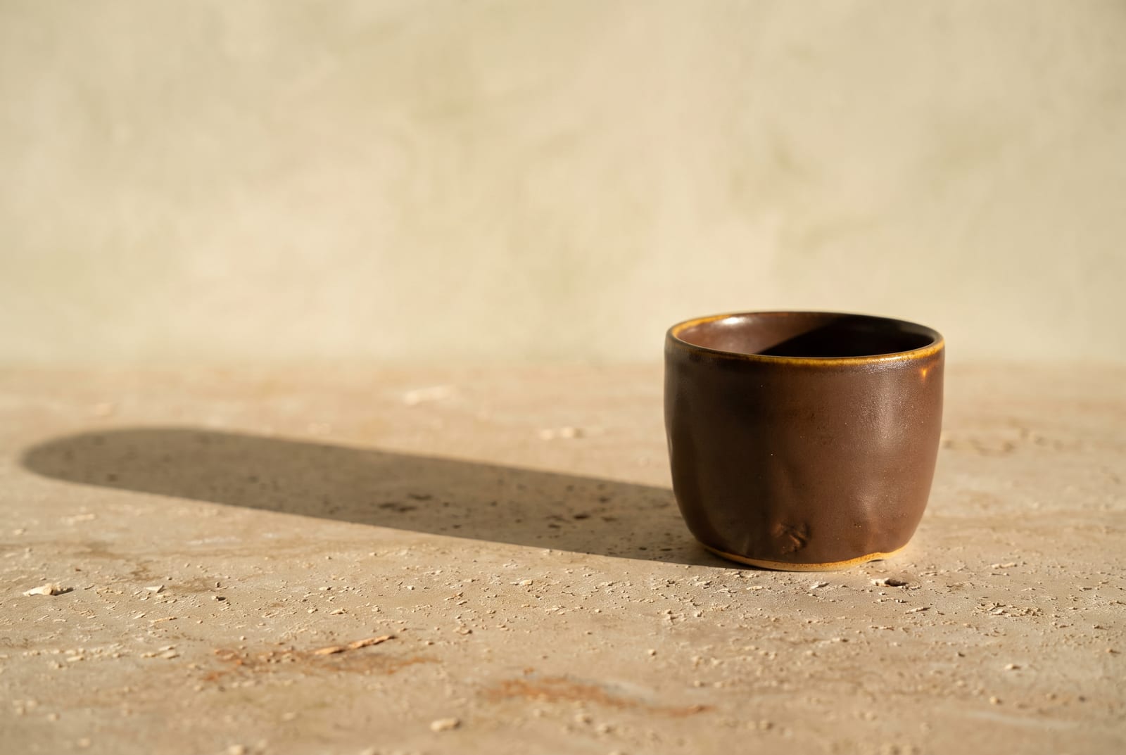
The full palette is 24 hex codes, sorted by the role each color plays. Everything sits in the warm-saturated zone: saturation roughly 55 to 80% in our framework, lightness roughly 40 to 65%, hue firmly warm. Numbers like those stay abstract until you put them on fabric. At 55% saturation a rust reads rich; at 80% it nearly glows. A 40% lightness is a deep coffee brown; 65% is camel in afternoon sun. The bands describe the season's center of gravity, and a real garment can drift a little outside them.
How to read this palette
Buying in the right proportions matters as much as buying the right colors, so the palette splits into three roles.
Anchors (the foundation, roughly eight colors). Golden browns, camels, warm tans, ochre, bronze, coffee brown, warm cream. Most of your week is built out of these. Plan on anchors filling about 60% of the closet, the layer the louder colors get worn against. They run warmer and a touch deeper than soft autumn's, with more honey in them.
Accents (the personality, roughly 12 colors). Rust, cinnamon, pumpkin, burnt orange, terracotta, brick red, mustard, amber gold, olive, moss, forest green, warm teal. Accents are where warm autumn earns its reputation, and unlike soft autumn, this season can take them at full saturation. A true rust or a marigold that would overwhelm a soft autumn reads as exactly right here.
Grounds (the depth layer, roughly four colors). The deepest warm browns, dark bronze-olive, and deep moss that sit underneath everything else. Grounds replace black in a warm autumn wardrobe. They're the boot, the belt, the structured outer layer that creates depth without going cold.
One test worth running: put together a head-to-toe outfit from the accents at full strength, a rust over an olive over a golden brown. Reading as rich and harmonious rather than loud means you're inside the warm autumn band. If that much saturation feels like it's wearing you, you may be a soft autumn who needs the muted versions instead.
Every hex here wants warmth around it, not coolness. Pair a rust with an olive and the eye reads them as kin. Pair the same rust with an icy blue and the blue turns the rust muddy while the rust turns the blue garish. The palette holds together because everything in it shares the same gold base.
Neutrals for warm autumn
Warm autumn's neutrals do the everyday work, and five cover it. They're richer and more golden than summer's gray-based set, warmer and more saturated than soft autumn's dusty taupes.
: the foundation. It holds up under every accent here.
: the "white" of this season. Never use pure #FFFFFF when you can use this gold-tinted cream.
: the mid-tone neutral. Works as a coat, a trouser, or a knit.
: the warm metallic neutral. Reads richer than a flat taupe and pairs with gold hardware.
: the deepest everyday neutral. Replaces black. Grounds everything without cooling it.
Those five, with the 19 accents in the hex block, cover everything the wardrobe needs.
Colors to avoid
The avoid list has five entries, each breaking one of the palette's two settings: warmth (too cool) or saturation (too dusty).
: too cool and too stark. It cools the warmth and creates contrast harder than this coloring carries. Swap for espresso #3E2B14.
: too cool and too bright. Drains the gold out of the skin. Swap for warm cream #E3C98F.
: cool-toned pink at high saturation. It clashes with the golden base and pulls the face gray. Swap for brick red #A52A2A or a warm coral.
: cool and pale, the opposite of warm and saturated on both dials at once. Swap for warm teal #1F6F5C.
: no warmth and no depth, so it flattens the glow warm autumn runs on. Swap for bronze #8A6E4B.
The failures run in two directions. A cool undertone fights the gold. Anything dusty, below roughly 40% saturation, goes muddy rather than rich, because this coloring carries enough saturation of its own to make a muted color look like a mistake. Good colors, all of them, and all wrong against this face. An icy blue that drowns a warm autumn will look stunning on a cool winter.
Celebrity examples
Three names appear as warm autumn, also called true autumn, on every color-analysis list that covers the season: theconceptwardrobe, four seasons studio, and truth-is-beauty all carry them. Agreement that wide is rare, and it counts for more than any single analyst's call.
Julianne Moore. Warm fair skin with golden freckles, copper-auburn hair, and warm green eyes make her about as clear a true autumn signature as exists. Her most flattering looks sit in rust, olive, golden brown, and forest green, and her red hair does half the styling work on its own. When she's been put in cool jewel tones or a stark black-and-white, the styling fights her, and you read the outfit before you read her. She anchors the fair, red-toned end of the season.
Julia Roberts. Deep warm brunette hair with auburn and chestnut light, warm hazel eyes flecked with gold and green, and golden skin put her at the season's medium depth. Her best looks lean into terracotta, warm reds, golden browns, and amber. True autumn is the dominant read, backed by a dedicated page on four seasons studio and a listing on Soul of Color. Only Spicemarket Colour places her at dark autumn, and it files that under guide-only, so treat the dark-autumn typing as a minority view rather than a coin-flip.
Beyoncé. She's the proof that this season is about warm saturation rather than lightness. Glowing golden-bronze skin, warm honey-brown hair, and warm brown eyes come alive in copper, bronze, rust, marigold, and warm reds. Warm or true autumn is best supported by four seasons studio and Soul of Color. A few unsanctioned lists push her toward deep autumn or deep winter instead, but that disagreement is about depth, not warmth. Everyone who types her agrees she's warm. If your own coloring runs deeper than the fair red-haired reference photos, calibrate on her.
A few more names hold up across more than one source and widen the picture past the red-haired stereotype. Latina warm autumns are especially well represented. Sofia Vergara is typed true autumn by four seasons studio and Soul of Color, with golden-olive skin, rich brown hair, and warm brown eyes. Jessica Alba leads true autumn across the same two sources, all warm peachy skin and caramel-brown hair, though Spicemarket Colour reads her as dark autumn. Jennifer Lopez shows up on Spicemarket Colour and Soul of Color, though her lists split between warm autumn and soft autumn, depending on how saturated the analyst reads her. On the lighter end, Shailene Woodley appears across four seasons studio and Soul of Color. Lily James lands true autumn there too, though some analysts read her as dark autumn (Spicemarket Colour lists her that way). Gwen Stefani gets typed warm autumn for her warm skin and naturally dark base, even though her platinum dye job hides it.
South Asian warm autumns are documented better here than in most seasons. Aishwarya Rai, Rani Mukerji, and Alia Bhatt all turn up on Spicemarket Colour's true autumn list. Aishwarya Rai is sometimes placed at deep autumn instead, which puts her on the warm-to-deep border rather than squarely in either. Nobody on any of these lists has your face. What a typed warm autumn shares with you is the settings underneath: warm undertone, saturated rather than muted, medium contrast rather than stark.
Makeup and wardrobe recommendations
Foundation, lip, eye, and metal all run on the settings the palette already set: warm undertone, saturated rather than dusty, medium depth.
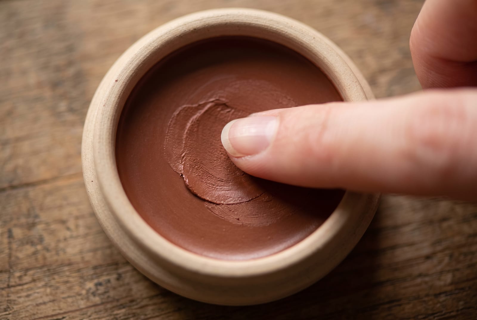
Foundation. Warm or warm-golden undertone. Avoid anything labeled "cool," "pink," or "rosy." Most major brands label the right shades "warm," "golden," or "honey." MAC's NC range typically lands in the warm-undertone band warm autumns sit inside, and NARS warm-leaning shades match well. The bronzey glow warm autumn skin gives off near warm color is the thing the foundation should keep, not flatten with a cool cast.
Lip. Brick, terracotta, rust, warm coral, copper, pumpkin, and a true warm red. This is where warm autumn separates from soft autumn. Warm autumn can wear a saturated warm red or a real terracotta without it overwhelming the face, where soft autumn needs the muted version. Avoid cool berries, blue-reds, and pure pinks, which sit cold against the gold.
Eye. Copper, bronze, rust, warm gold, olive, and forest green. Shimmers should be gold-based, not silver. Warm autumn eyes take a saturated copper or a deep olive that would read heavy on a softer season. Avoid cool grays, silver, icy blues, and the smoky-black register, which fight the warm-saturated undertone every time.
Jewelry. Gold, copper, bronze, and antique brass. Warm autumn runs the warmest of all the seasons, so warm metals are the whole point here. Sterling silver and platinum pull the warmth out and read cold against this coloring. If you want a lighter metal, choose a yellow-gold or a rich rose gold rather than true silver.
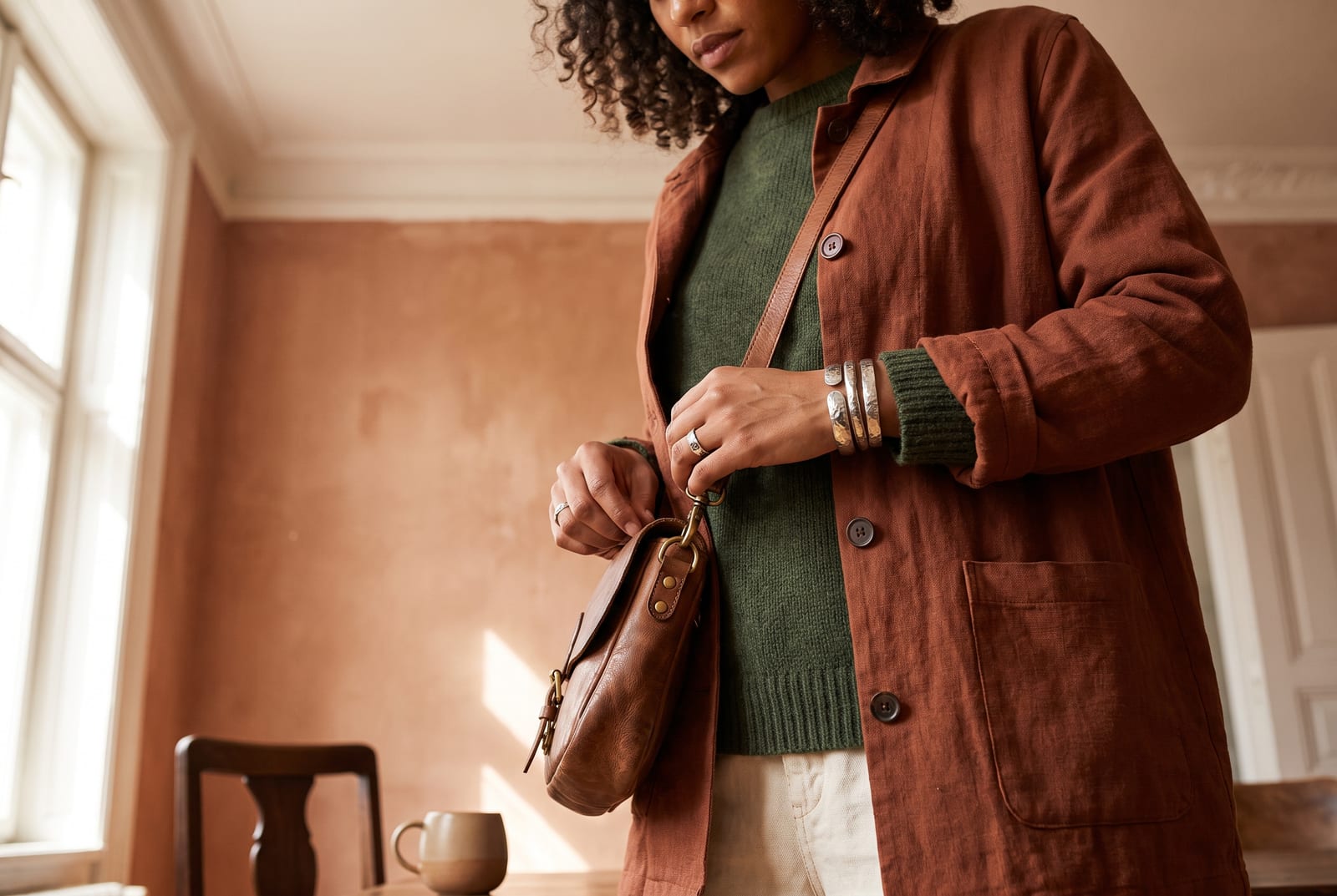
Wardrobe basics (everyday). Rust knit, golden-brown trouser, olive jacket, forest-green coat, camel layer, warm cream shirt. Every piece lives inside the palette at full saturation; nothing black, stark white, or cool-pastel makes the cut. Heritage and earth-tone-leaning retailers tend to carry pieces that sit naturally inside this band, especially in their autumn collections.
Wardrobe accents (statement pieces). A warm teal scarf, a tomato-red wrap, a pumpkin blouse, a marigold knit, a terracotta dress. Warm autumn is allowed to be the loudest of the autumns, so these can run brighter than a soft autumn would dare, as long as they stay warm.
Prints and patterns. Leopard and other warm animal prints, paisley, rich autumnal florals, and warm-toned plaid all belong to this season. Warm autumn is the rare palette where leopard reads as a neutral, because its tan-and-brown base is already inside the wardrobe. Avoid cool-toned prints and stark black-and-white graphics, which override the warmth.
For a wardrobe built on these principles, generate a palette in the Warm Autumn direction and use the hex output as your shopping filter.
Hair color for warm autumn
If you color your hair, the palette's settings still apply: stay warm, keep the saturation, and hold close to your natural depth. This is the one season that can carry a genuinely rich, saturated warm color, because the coloring already runs warm and saturated. A true copper or a deep auburn that would overwhelm a soft autumn sits right at home here.
The directions that work are warm and rich: auburn, copper, chestnut, golden and honey browns, caramel, and reds that stay warm rather than cool. Hair levels run from 1 at black to 10 at the palest blonde, and warm autumn lives in roughly the 4-to-8 band, deeper and richer than soft autumn's. Medium golden and chestnut browns sit at levels 4 to 6, warm coppers and honey blondes at 7 to 8. Tell your stylist "a level 5 or 6 warm brown with golden or copper undertones," or "a rich auburn, warm not cool."
"Warm not cool" is the half to insist on. Ask for golden, honey, caramel, copper, or auburn, and say out loud that no ash or cool tone goes in. An ash toner is what turns a good warm color flat and gray on warm autumn skin. Skip the purple and blue brass-correcting shampoos for the same reason: they strip out the exact warmth the season runs on.
Each color below trips one of two wires. Platinum, icy blonde, and cool ash break the warm rule and leave the skin looking sallow. Jet black and blue-black break it the other way, going too cool and too dark for a coloring that wants warmth and richness rather than hard contrast. Cool burgundy and cool espresso fail the same warm test. If a color reads cold in the mirror, it's wrong for this season no matter how on-trend it is.
For highlights, keep them warm: hand-painted balayage in golden, caramel, or copper tones, no more than a few levels off your base. Cool foils and ashy money-piece highlights undo the warm harmony the season depends on. Once gray arrives, warm golden or copper blending and gold-toned glosses hold up far better than a cool silver, which washes a warm autumn out completely.
Comparison with adjacent seasons
Four seasons get confused with warm autumn most often, and one dial decides each case.
Warm autumn vs. soft autumn (the saturation dial). Both seasons are warm, so the tiebreaker is saturation. Warm autumn runs roughly 55-80% saturated in our framework; soft autumn sits around 20-40%. If your natural coloring is rich and vivid rather than dusty and blended, you're warm autumn. Test it with two drapes: a saturated rust like #B7410E against your face, then a muted camel like #B8A282. The rust energizing your face says warm autumn. The rust feeling louder than you, and the camel feeling settled, says soft autumn.
Warm autumn vs. deep autumn (the depth dial). Both seasons are warm and saturated, so the difference is value. Deep autumn pulls the same warm colors down into darker, shadowed versions and carries higher contrast between features. If your coloring is rich but also genuinely dark, with near-black hair and deep eyes against your skin, you may be a deep autumn rather than a warm autumn. The most common version of this mis-type is a deeper-skinned warm autumn sorted into deep autumn on skin depth alone. Test it on saturation versus shadow: if a clear marigold or a true rust suits you better than a darkened oxblood, you're warm autumn.
Warm autumn vs. warm spring (the value and brightness dial). Both seasons are warm and saturated, which is why they get swapped. Warm spring is lighter, brighter, and clearer; warm autumn is deeper, earthier, and a touch more muted by comparison. If clear, fresh colors like coral and golden yellow suit you better than earthy rust and olive, you're a warm spring. If the earth tones make you glow and the bright clear colors feel slightly thin on you, you're a warm autumn. The hue family is shared; the depth and clarity decide it.
Warm autumn vs. soft summer (the temperature dial). This is the opposite-corner comparison, and it trips people up only because both can look "neutral" in the wrong light. Soft summer is cool and muted; warm autumn is warm and saturated. They share almost nothing, so the gold-versus-silver test settles it fast. Warm autumn faces brighten under gold and go flat under silver; soft summer faces do the reverse. If you're stuck between these two, you've probably been looking at a single in-between garment rather than your actual coloring.
Warm autumn vs. true autumn (the same season, two names). There's no real difference to resolve here. "Warm autumn" and "true autumn" are two names for the same season, the purest, most warm-and-saturated corner of autumn. Some systems prefer "true autumn" to mark it as the season's reference point; others use "warm autumn" to stress its warmth against the cooler-leaning autumns. If you've been typed as one, you've been typed as the other.
The full 12-season comparison chart lives on the seasonal color analysis hub.
Frequently asked questions
How do I know if I'm a warm autumn? Check three anchors: your hair should carry an obvious warm, golden, or red undertone, your eyes should be warm green, amber, or golden hazel, and your skin should glow gold near warm colors. If three of three match, you're almost certainly warm autumn. If two match and the rest skew dusty and grayed, you're likely soft autumn instead.
Is warm autumn the same as true autumn? Yes. Warm autumn and true autumn are two names for the same season: the purest, most warm-and-saturated version of autumn. Some analysts use "true autumn" to mark it as the reference point all the other autumns are measured against, and others use "warm autumn" to stress its warmth. The palette and the styling rules are identical.
Can warm autumn wear black?
Not well. Pure black #000000 cools the warmth and creates contrast harder than warm autumn coloring carries, which drains the glow. Use espresso #3E2B14 or a deep coffee brown as a functional substitute. You can wear black in small accents, a boot or a bag, without issue. The problem is black as a main-garment color near the face.
What's the difference between warm autumn and soft autumn? Saturation. Both seasons are warm; warm autumn runs saturated, in rust, cinnamon, and deep gold, while soft autumn runs muted, in camel, sage-olive, and dusty rose. A warm autumn dressed in soft autumn's dusty colors looks faded; a soft autumn dressed in warm autumn's saturated colors looks overwhelmed. The warmth matches; the volume doesn't.
Can warm autumn have dark skin? Yes. Warm autumn is set by undertone, saturation, and contrast, not by how light or dark your skin is. The common mistake is reading deep skin as a "deep" or "dark" season automatically, but those words describe high-contrast, low-value features, not skin depth. Plenty of people with medium and deep skin are warm autumns whose warmth comes alive in copper, rust, and marigold.
What's the best metal jewelry for warm autumn? Gold, copper, bronze, and antique brass. Warm autumn runs the warmest of all 12 seasons, so warm metals are the natural match. Sterling silver and platinum pull the warmth out of warm autumn skin and read cold. If you want a lighter metal, a yellow-gold or a rich rose gold gives you a brighter look without fighting your undertone.
Can warm autumn wear pink? Only warm pink. Cool, blue-based pinks and bright fuchsias clash with the golden undertone and pull the face gray. But a warm coral, a salmon, or a terracotta-pink sits inside the palette and reads as a soft warm accent. The test is the same as everywhere else: if the pink has gold or orange in it, it works; if it has blue in it, it doesn't.
Can men have warm autumn coloring? Yes. The 12-season system reads coloring, and coloring has no gender. Men with warm golden or red-toned hair, warm green or amber eyes, and golden skin fit the warm autumn profile in exactly the same way women do. The translation into menswear is straightforward: rust and olive knits, golden-brown and forest-green outerwear, warm cream shirts, bronze and brown leather. Avoid pure-black suiting, stark white shirts under black ties, and cool-toned tech colorways.
Disclosure: BrandColors makes the color-palette generator linked in this guide. The seasonal typings and palettes above are drawn from the external color-analysis sources named throughout (theconceptwardrobe, truth-is-beauty, Spicemarket Colour, and others), not from our product. Last updated July 24, 2026.
Related palettes: Soft Autumn · Deep Autumn · Soft Summer · Seasonal color analysis hub